 kage
kage
milepost.club
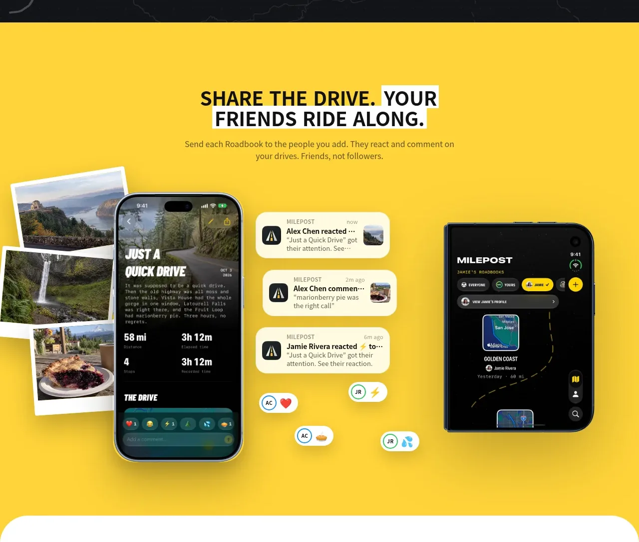
Design analysis
A saturated yellow field makes the collaboration message feel energetic, while phones, notifications, and media cards demonstrate social reactions around a shared activity.
Prompt preview
## Reference images

Study these alongside the description below: hierarchy, rhythm, spacing, colour. Build for the product you are asked about, using this design language.

- Component: https://kage-design-assets.t3.tigrisfiles.io/components/milepost/daa1b44b-e646-4a0f-860e-b6d9c76440c8-1791871476-4.webp
- Full page it was cut from: https://kage-design-assets.t3.tigrisfiles.io/screenshots/milepost/daa1b44b-e646-4a0f-860e-b6d9c76440c8-1791871382204-full.webp
- Component on Kage: https://kage.design/component/milepost-feature-grid-3

## Before you start
Ask what users share, who participates, and which collaboration behavior should be demonstrated. Translate that behavior into the user's own product and brand system.

Build an energetic collaboration feature section with a saturated yellow background around #ffd43d. Center a short uppercase headline and supporting copy near the top, using near-black #111315 and a bold sans-serif. Use the lower area as a balanced product collage: one or two large device screens, a column of rounded notification cards, and a few offset media tiles. Give cards white or pale-yellow surfaces, 14–22px corner radii, subtle shadows, and compact metadata styling. Keep a clear visual center and avoid evenly distributing every object; use overlap and scale to create motion. Include tasteful reaction chips or micro-interactions, but preserve accessibility and responsive stacking on mobile.

Never: use logos, product names, copy, illustrations or imagery from the reference.
More components
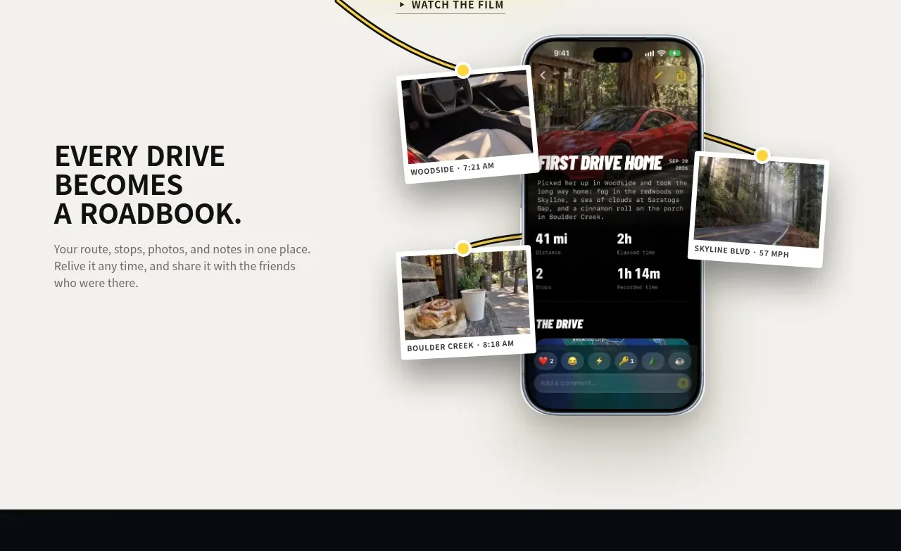
 Roadbook feature story
Milepost · Feature grid
Roadbook feature story
Milepost · Feature grid
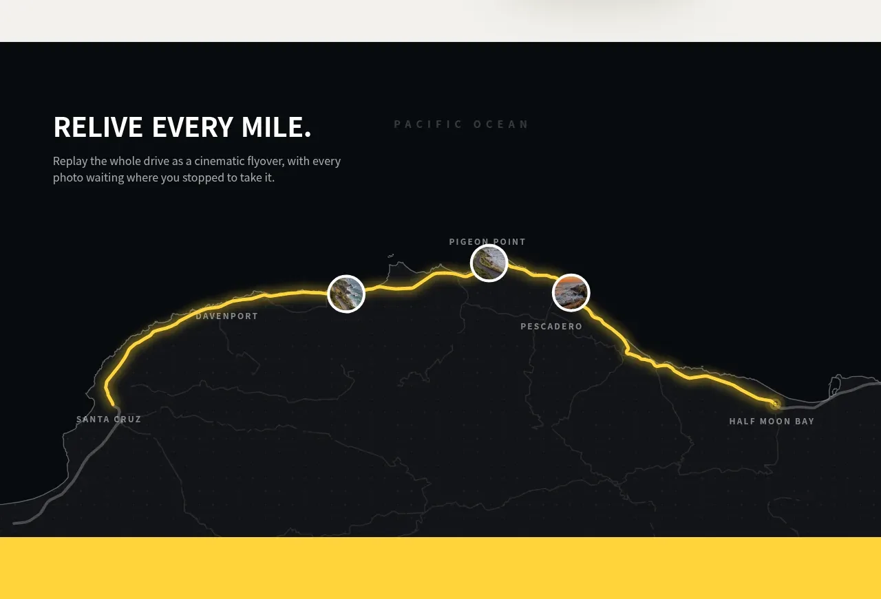 Route replay map feature
Milepost · Feature grid
Route replay map feature
Milepost · Feature grid
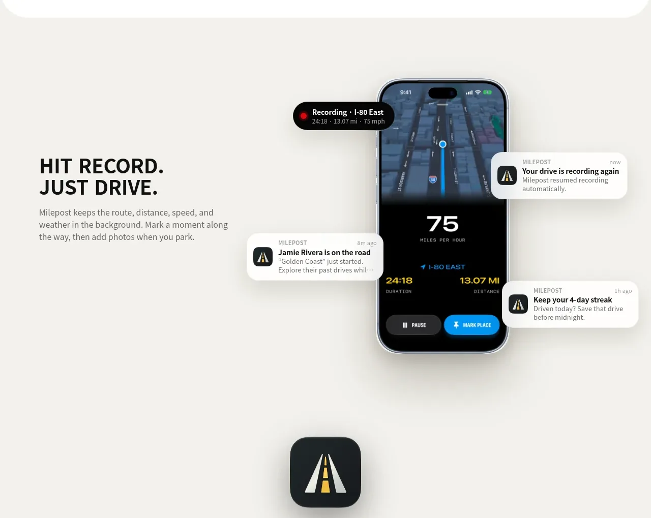 Automatic recording feature
Milepost · Feature grid
Automatic recording feature
Milepost · Feature grid
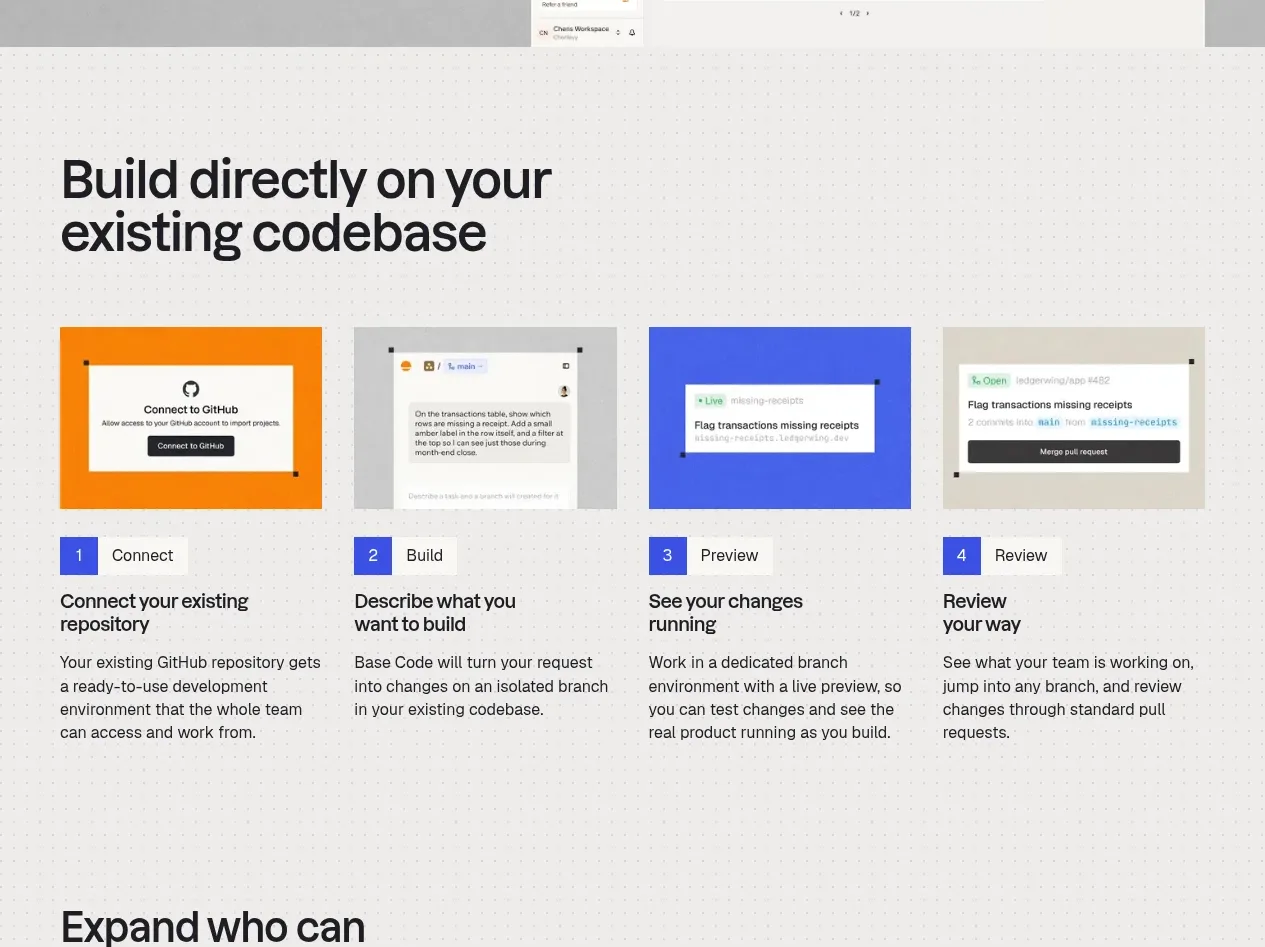
 Four-step build workflow
Base Code · Feature grid
Four-step build workflow
Base Code · Feature grid
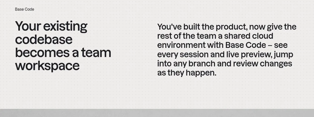 From codebase to team workspace
Base Code · Feature grid
From codebase to team workspace
Base Code · Feature grid
 Cross-functional collaboration accordion
Base Code · Feature grid
Cross-functional collaboration accordion
Base Code · Feature grid