 kage
kage
ancher.ai
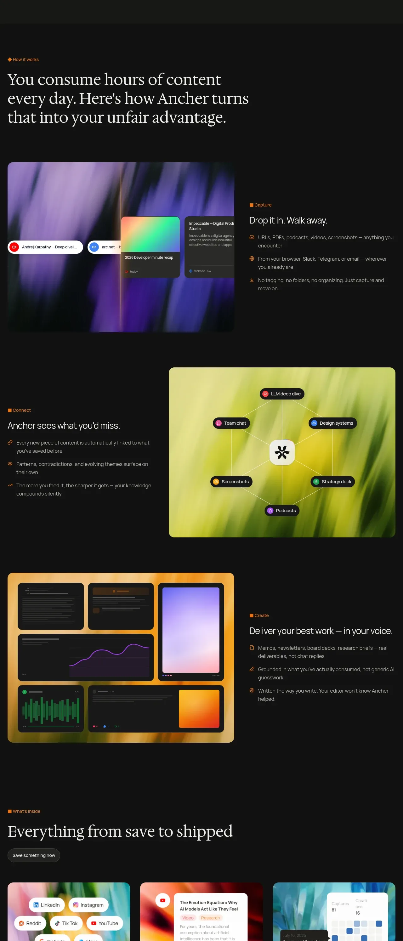
Design analysis
Three alternating image-and-copy rows explain a sequential workflow, using vivid rounded product visuals against a quiet dark canvas.
Prompt preview
## Reference images

Study these alongside the description below: hierarchy, rhythm, spacing, colour. Build for the product you are asked about, using this design language.

- Component: https://kage-design-assets.t3.tigrisfiles.io/components/ancher-2-0/49a60068-1f5d-45e9-9623-df337c2895cf-1791871459-4.webp
- Full page it was cut from: https://kage-design-assets.t3.tigrisfiles.io/screenshots/ancher-2-0/49a60068-1f5d-45e9-9623-df337c2895cf-1791871353691-full.webp
- Component on Kage: https://kage.design/component/ancher-2-0-feature-grid-2

## Before you start
Ask what the user's product workflow is and which three steps best explain its value. Adapt the sequence, visuals, and wording to that product.

Build a three-row feature narrative on a dark background. Begin with a left-aligned eyebrow and large editorial heading. Each row should contain a large rounded abstract product visual and a concise copy column with an orange eyebrow, short heading, and three bullet benefits. Alternate the visual from left to right between rows so the section has rhythm. Use a 58/42 or 60/40 media-to-copy split, 48–72px row gaps, 12px image radius, and muted thin dividers only where helpful. Use near-black #111111, ivory #eeeae2, muted #9b958d, orange #e18420, and vivid but original visual gradients. Product visuals may be UI-like compositions, but keep them clearly subordinate to the explanatory text. Stack media above copy on mobile.

Never: use logos, product names, copy, illustrations, or imagery from the reference.
More components
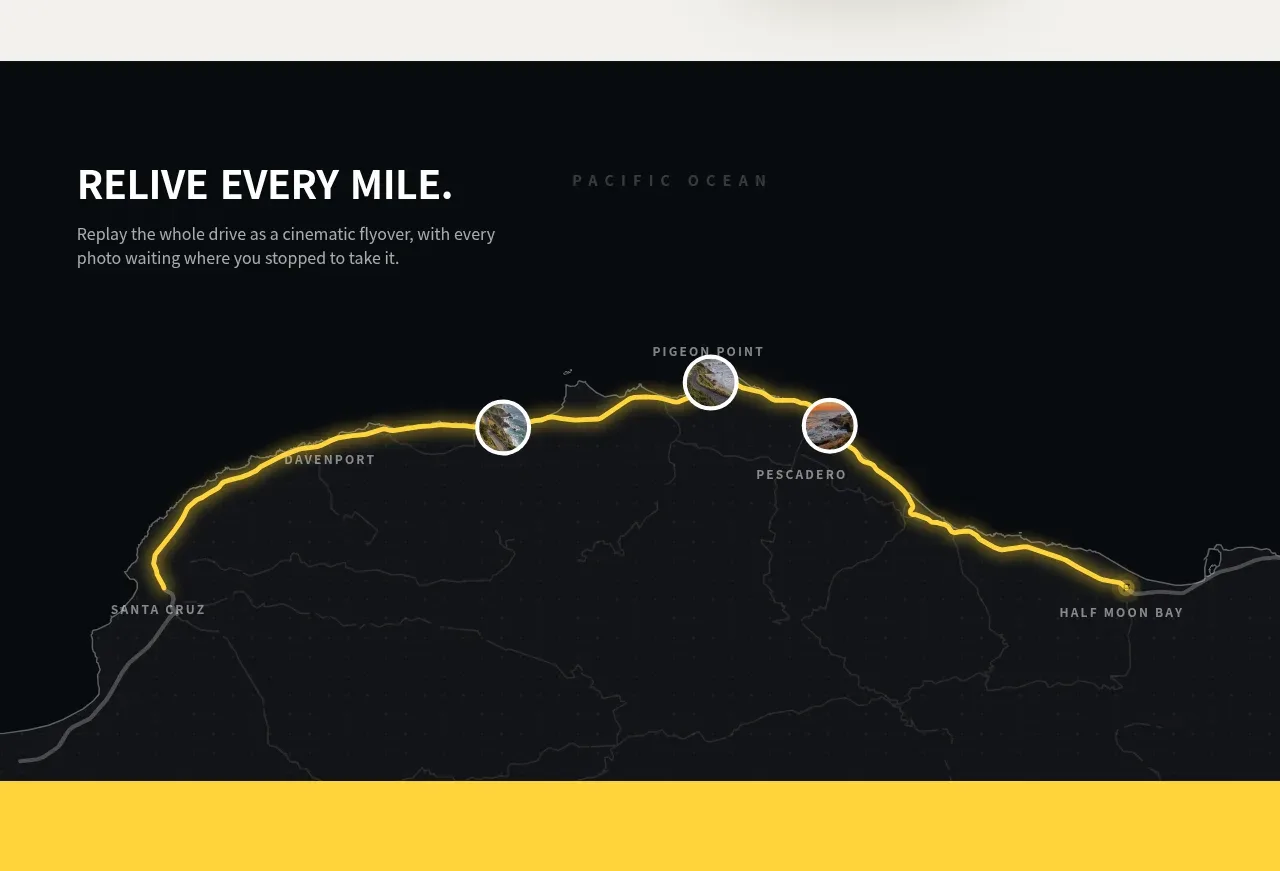
 Route replay map feature
Milepost · Feature grid
Route replay map feature
Milepost · Feature grid
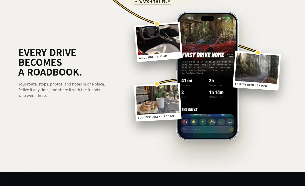 Roadbook feature story
Milepost · Feature grid
Roadbook feature story
Milepost · Feature grid
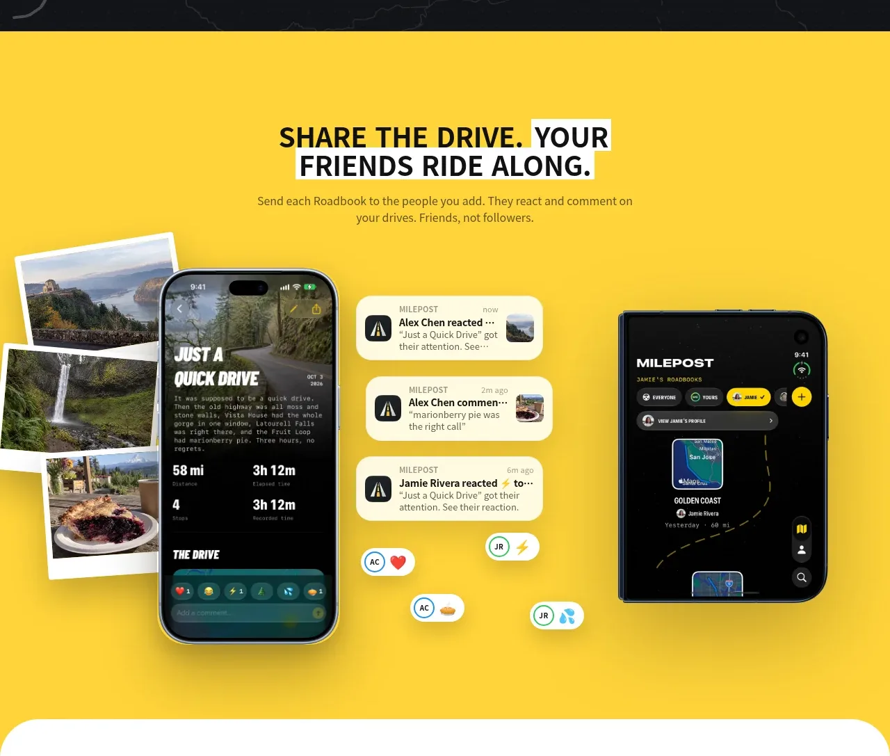 Shared drive feature
Milepost · Feature grid
Shared drive feature
Milepost · Feature grid
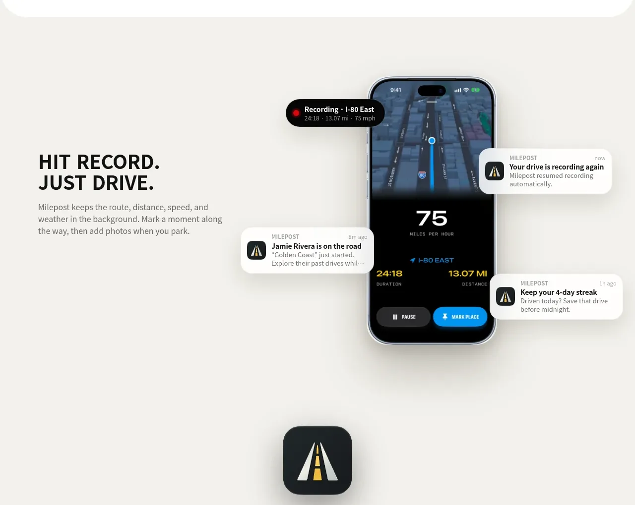 Automatic recording feature
Milepost · Feature grid
Automatic recording feature
Milepost · Feature grid

 Cross-functional collaboration accordion
Base Code · Feature grid
Cross-functional collaboration accordion
Base Code · Feature grid
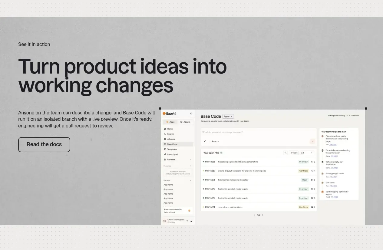 Product workflow demonstration
Base Code · Feature grid
Product workflow demonstration
Base Code · Feature grid