 kage
kage
ancher.ai
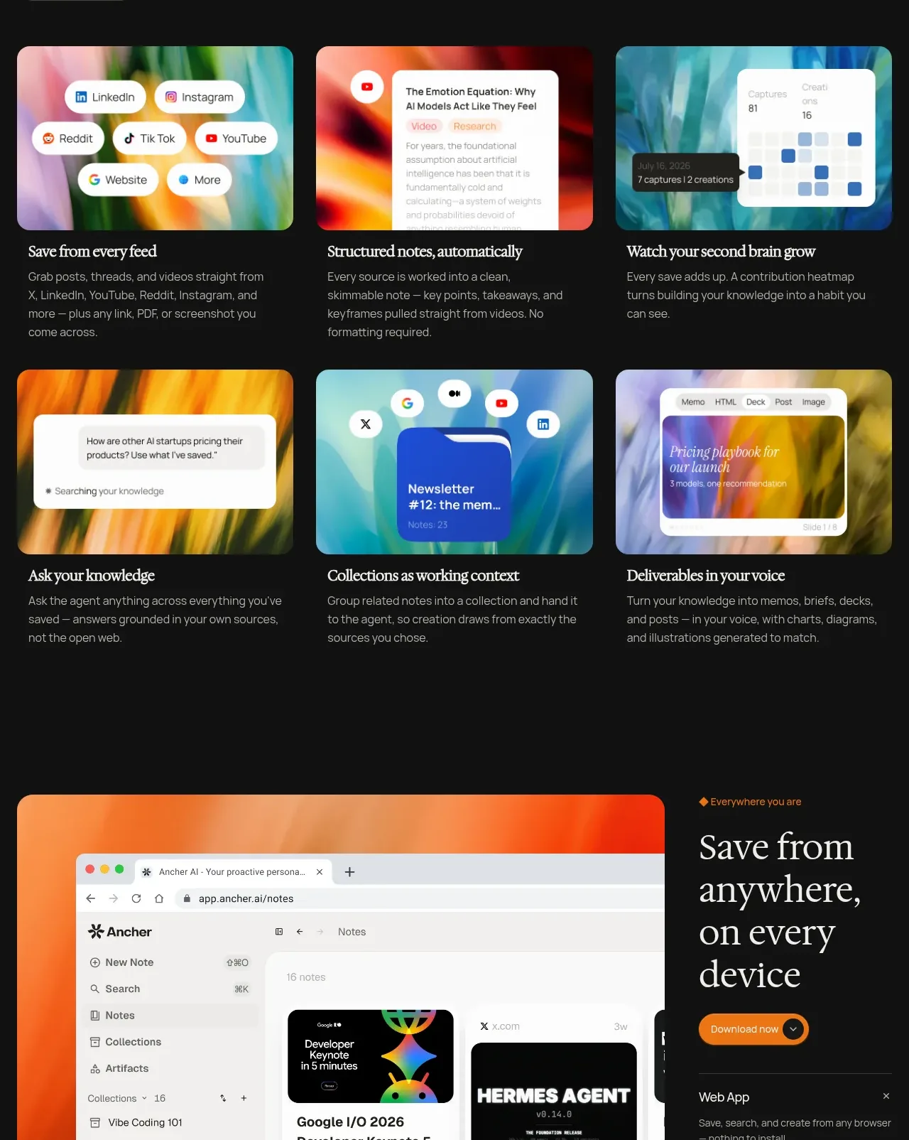
Design analysis
A section heading introduces a six-card, two-row grid that makes a broad product capability set scannable.
Prompt preview
## Reference images

Study these alongside the description below: hierarchy, rhythm, spacing, colour. Build for the product you are asked about, using this design language.

- Component: https://kage-design-assets.t3.tigrisfiles.io/components/ancher-2-0/49a60068-1f5d-45e9-9623-df337c2895cf-1791871460-5.webp
- Full page it was cut from: https://kage-design-assets.t3.tigrisfiles.io/screenshots/ancher-2-0/49a60068-1f5d-45e9-9623-df337c2895cf-1791871353691-full.webp
- Component on Kage: https://kage.design/component/ancher-2-0-feature-grid-3

## Before you start
Ask what six core capabilities the user's product offers and which audience benefit each one delivers. Build a content model around those answers.

Create a dark feature grid with a small eyebrow, a large serif heading, and a compact optional CTA. Follow with six cards in three columns by two rows on desktop, two columns on tablet, and one column on mobile. Each card has a 16:9 rounded visual tile, a clear serif title, and two or three lines of sans-serif description. Use varied abstract color fields or UI fragments created for the user's product, never generic stock imagery. Keep cards aligned to a 12px page gutter, with 16px gaps and 8–10px radii. Use #111111 page background, #1b1b1b card surfaces, #e9e4dc text, #97918a descriptions, and accent gradients chosen from the brand.

Never: use logos, product names, copy, illustrations, or imagery from the reference.
More components

 Route replay map feature
Milepost · Feature grid
Route replay map feature
Milepost · Feature grid
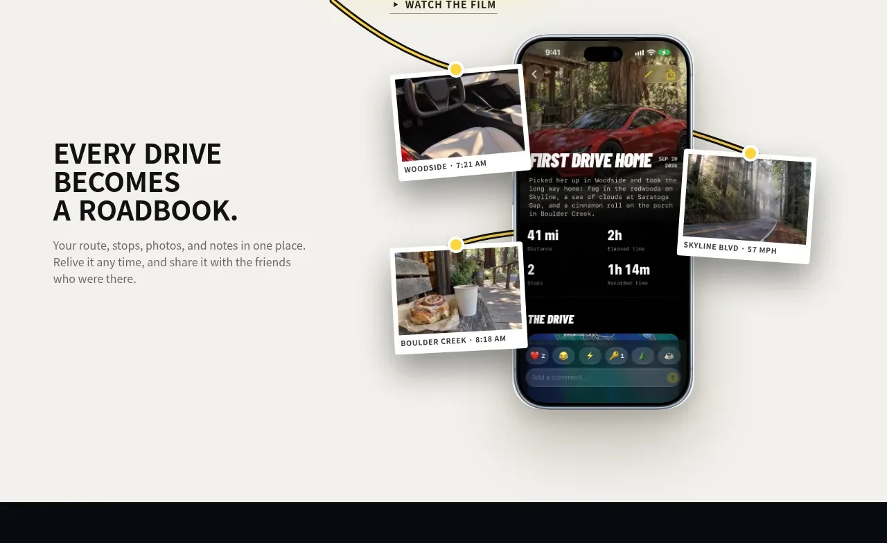 Roadbook feature story
Milepost · Feature grid
Roadbook feature story
Milepost · Feature grid
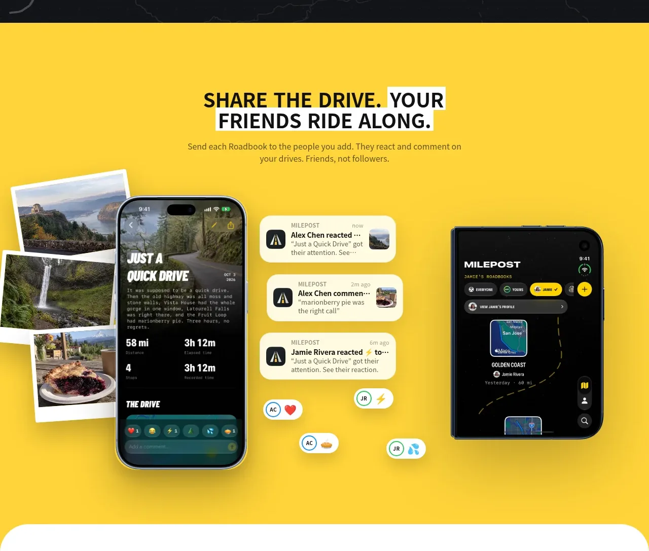 Shared drive feature
Milepost · Feature grid
Shared drive feature
Milepost · Feature grid
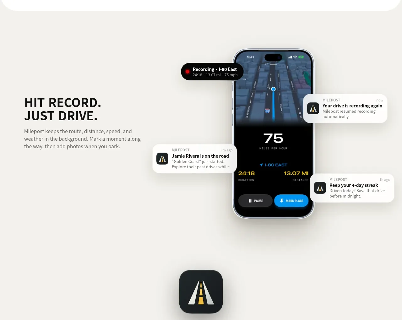 Automatic recording feature
Milepost · Feature grid
Automatic recording feature
Milepost · Feature grid
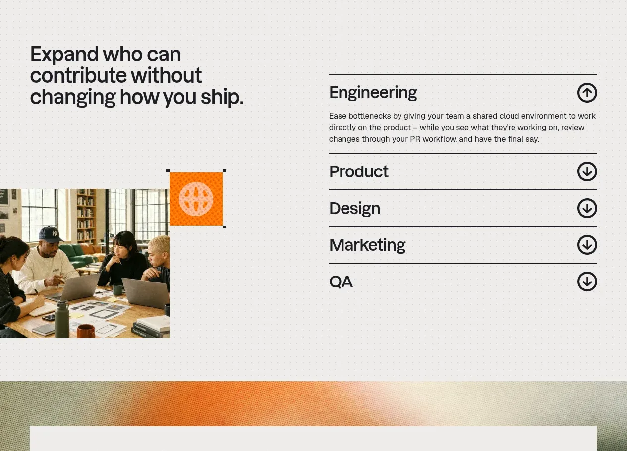
 Cross-functional collaboration accordion
Base Code · Feature grid
Cross-functional collaboration accordion
Base Code · Feature grid
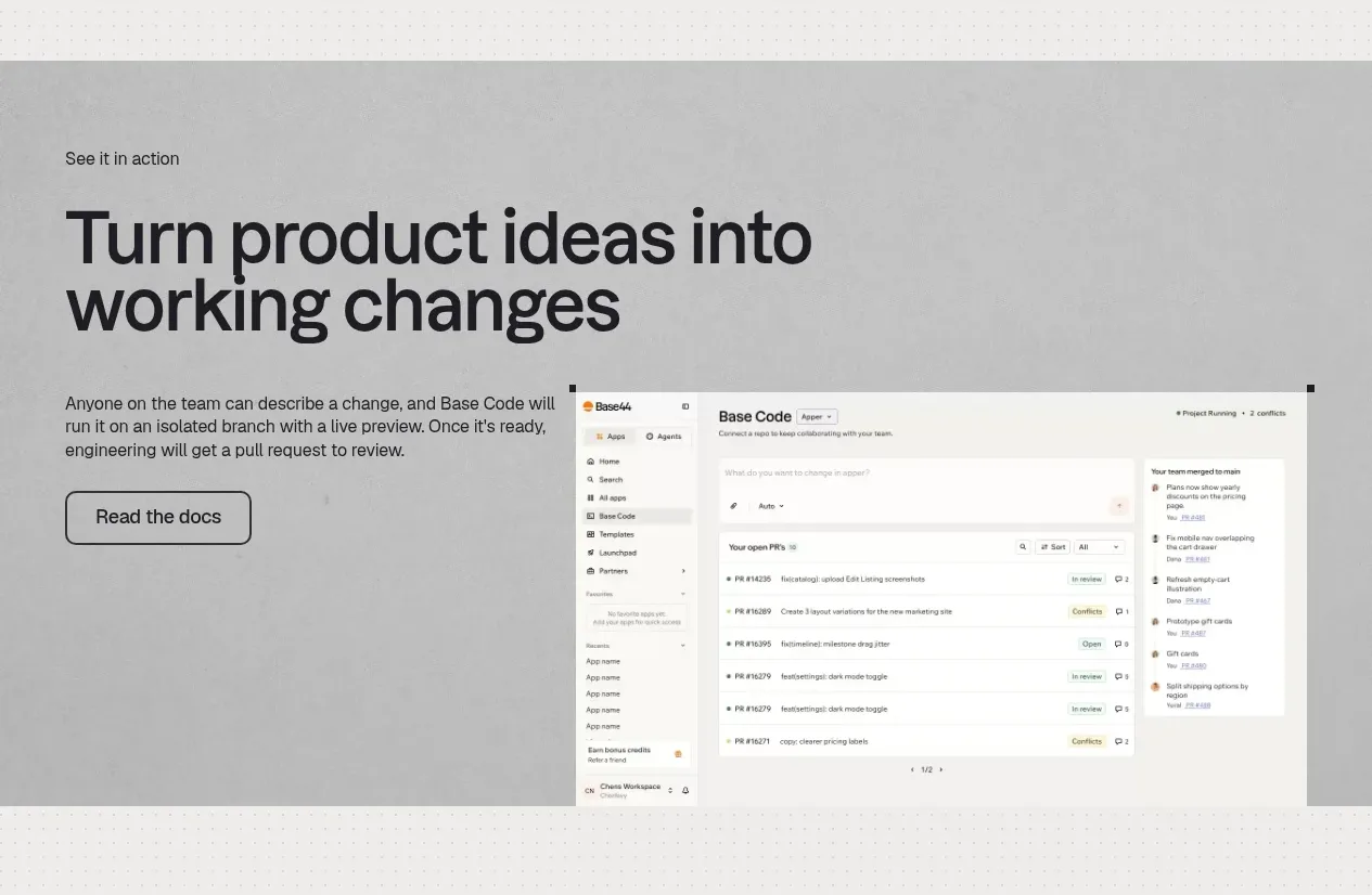 Product workflow demonstration
Base Code · Feature grid
Product workflow demonstration
Base Code · Feature grid