 kage
kage
ancher.ai
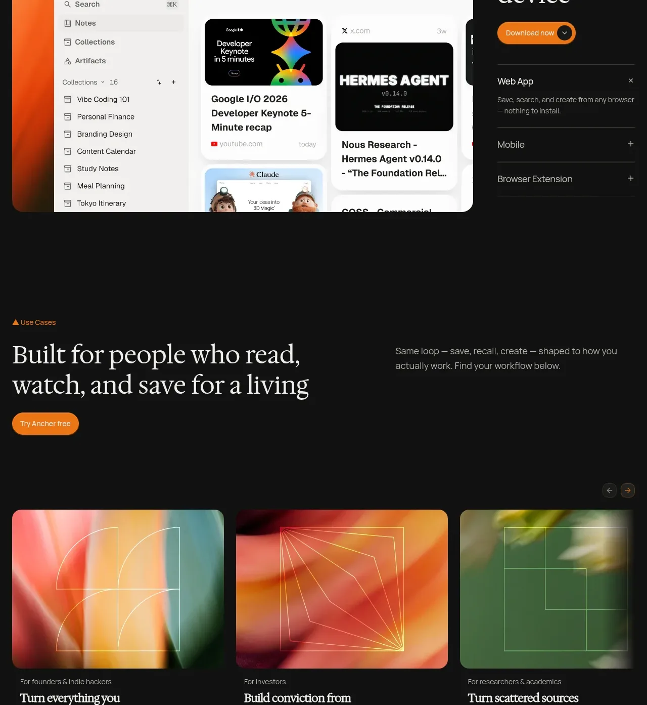
Design analysis
A large browser/product mockup sits beside an assertive headline and expandable device options, communicating availability across contexts.
Prompt preview
## Reference images

Study these alongside the description below: hierarchy, rhythm, spacing, colour. Build for the product you are asked about, using this design language.

- Component: https://kage-design-assets.t3.tigrisfiles.io/components/ancher-2-0/49a60068-1f5d-45e9-9623-df337c2895cf-1791871460-6.webp
- Full page it was cut from: https://kage-design-assets.t3.tigrisfiles.io/screenshots/ancher-2-0/49a60068-1f5d-45e9-9623-df337c2895cf-1791871353691-full.webp
- Component on Kage: https://kage.design/component/ancher-2-0-feature-grid-4

## Before you start
Ask which platforms and environments the user's product supports and which one should be the primary conversion path. Use those details to design an original showcase.

Build a split availability section. Put a large rounded browser or app mockup on the left, with enough internal detail to imply a real product without copying any reference interface. On the right use a small eyebrow, oversized serif headline, one warm CTA, and a vertical list of platform rows with plus icons or disclosure affordances. Keep the mockup vivid against the dark page and the copy column quiet. Use a 60/40 desktop split, 12–16px gap, 12px media radius, #111111 background, #efebe3 text, #918c84 secondary text, orange #e9821c button, and #2b2b2b separators. Make platform rows keyboard-accessible and expandable, and stack the columns on mobile.

Never: use logos, product names, copy, illustrations, or imagery from the reference.
More components
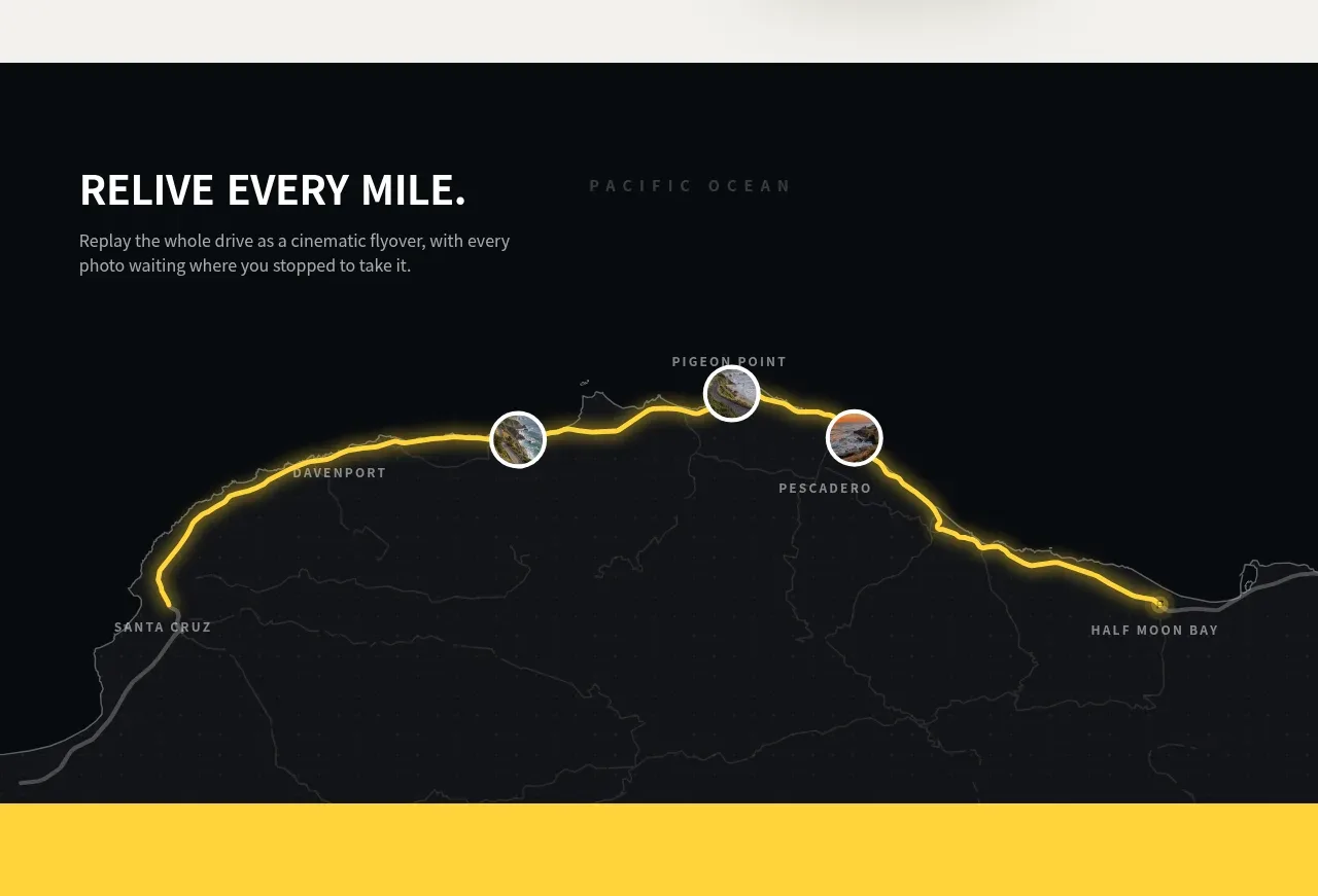
 Route replay map feature
Milepost · Feature grid
Route replay map feature
Milepost · Feature grid
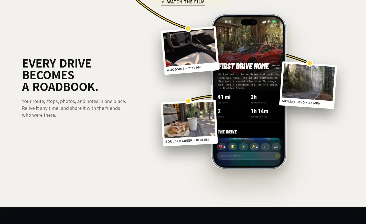 Roadbook feature story
Milepost · Feature grid
Roadbook feature story
Milepost · Feature grid
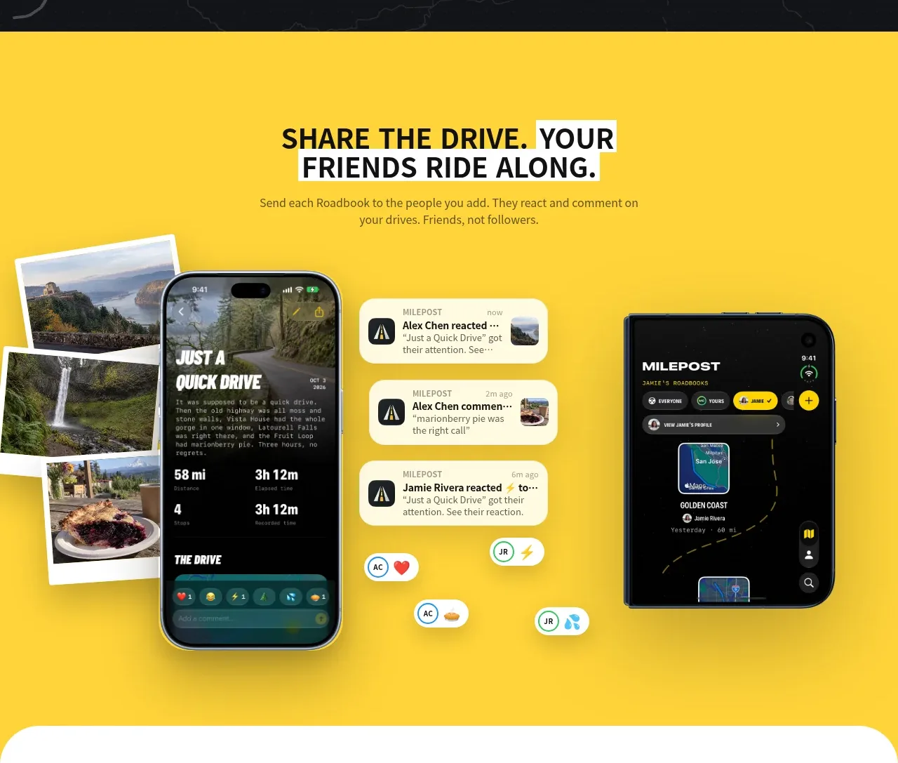 Shared drive feature
Milepost · Feature grid
Shared drive feature
Milepost · Feature grid
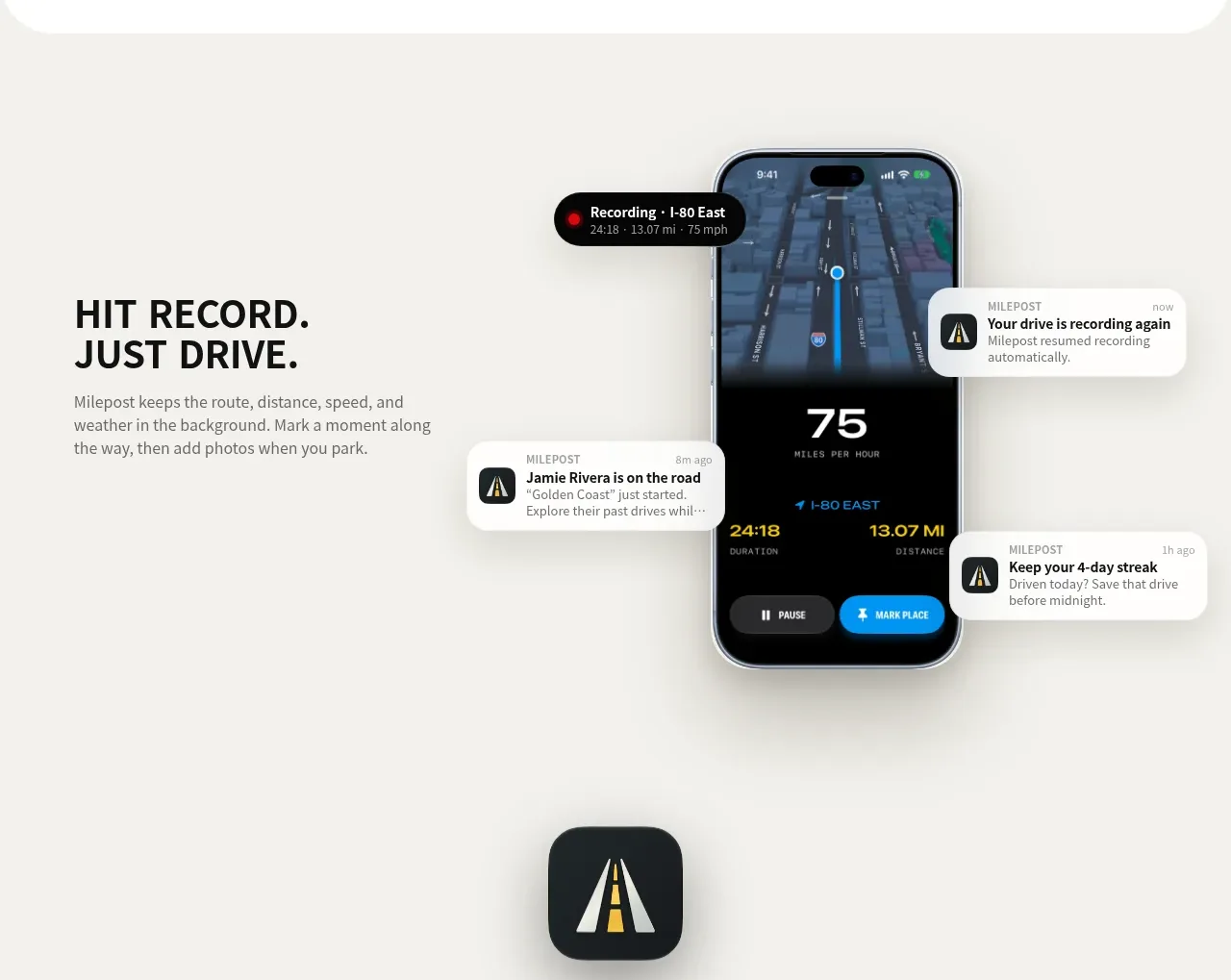 Automatic recording feature
Milepost · Feature grid
Automatic recording feature
Milepost · Feature grid
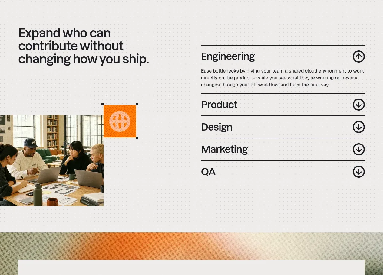
 Cross-functional collaboration accordion
Base Code · Feature grid
Cross-functional collaboration accordion
Base Code · Feature grid
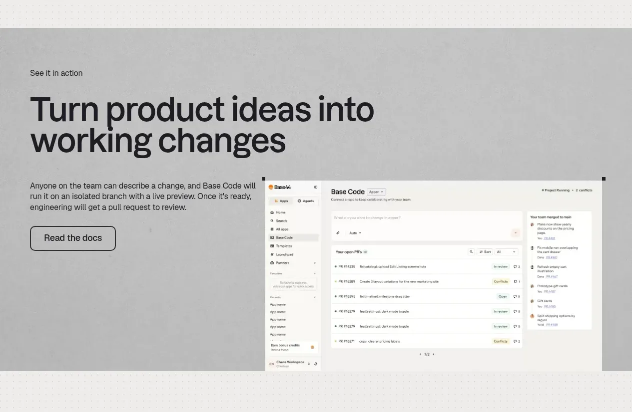 Product workflow demonstration
Base Code · Feature grid
Product workflow demonstration
Base Code · Feature grid