kage
kage
luneresearch.com
Design analysis
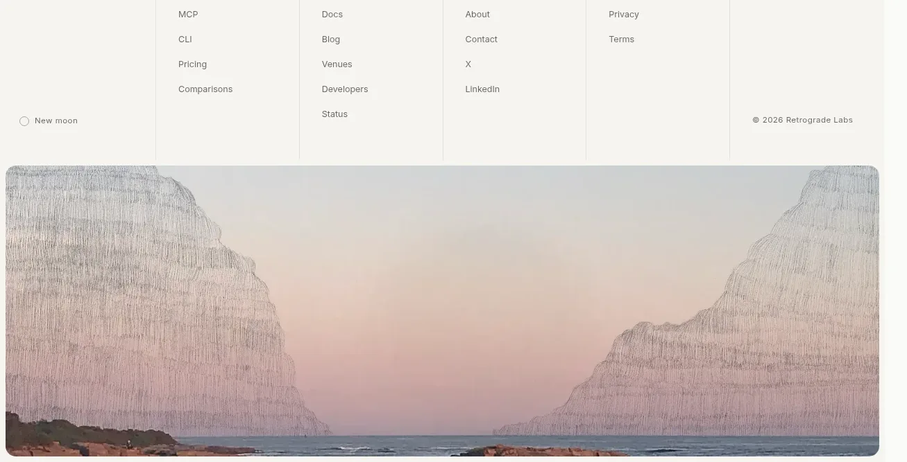
The footer has a pale multi-column link matrix, a small brand/legal row, and a wide rounded atmospheric image panel anchoring the page bottom.
Prompt preview
## Reference images

Study these alongside the description below: hierarchy, rhythm, spacing, colour. Build for the product you are asked about, using this design language.

- Component: https://kage-design-assets.t3.tigrisfiles.io/components/lune/4bf7ff48-f6a1-4cc9-aba1-cb69c6f24fa8-1791698510-7.webp
- Full page it was cut from: https://kage-design-assets.t3.tigrisfiles.io/screenshots/lune/4bf7ff48-f6a1-4cc9-aba1-cb69c6f24fa8-1791698434673-full.webp
- Component on Kage: https://kage.design/component/lune-footer

## Before you start
Ask what navigation groups, legal links, social destinations, and brand mood the user's product needs. Build an original footer around those requirements.

Design a spacious footer with a pale warm background #f3f3ee and a multi-column grid. The first column contains a compact brand mark/wordmark and a short status line; following columns contain grouped product, resources, company, and legal links. Use vertical hairlines between columns on desktop, small 11–12px labels, 13px links, and muted #777772 text. Add a lower row for theme/status, copyright, and social links. At the bottom, place a wide 8–10px rounded media panel using an original abstract or product-relevant visual supplied by the user; do not reproduce any reference artwork. Keep the footer responsive by collapsing columns into a two-column or accordion layout on narrow screens. Add hover underlines, adequate contrast, and keyboard focus styles.

Never: use the reference's logos, product names, copy, illustrations, imagery, or exact landscape artwork.