kage
kage
pinecomputer.io
Design analysis
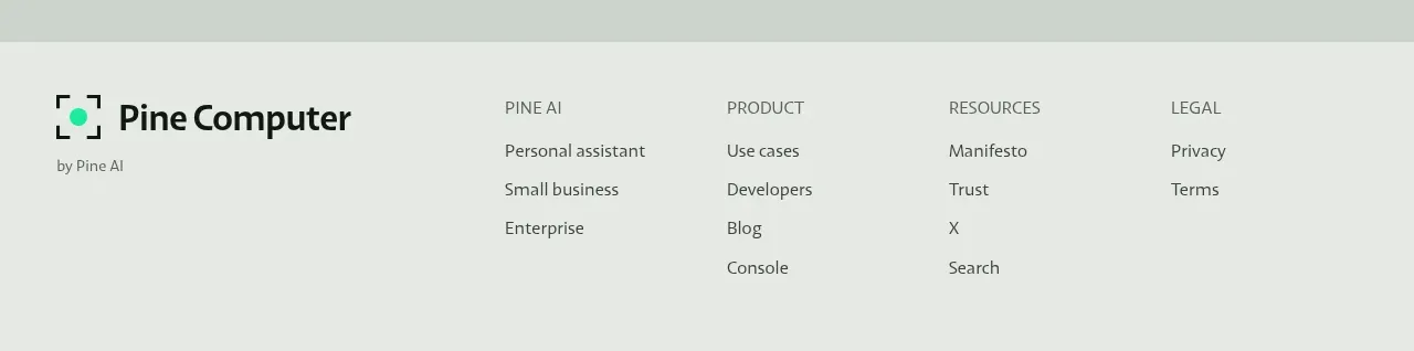
The footer closes with a compact brand lockup and several small link columns, maintaining the same grid, colour, and editorial restraint as the rest of the page.
Prompt preview
## Reference images

Study these alongside the description below: hierarchy, rhythm, spacing, colour. Build for the product you are asked about, using this design language.

- Component: https://kage-design-assets.t3.tigrisfiles.io/components/pine-computer/b47ce26e-68eb-4b09-b29e-15beff007c2f-1791612329-6.webp
- Full page it was cut from: https://kage-design-assets.t3.tigrisfiles.io/screenshots/pine-computer/b47ce26e-68eb-4b09-b29e-15beff007c2f-1791612242987-full.webp
- Component on Kage: https://kage.design/component/pine-computer-footer

## Before you start
Ask the user for their product name, brand assets, legal requirements, and the navigation groups they need. Use those answers to populate a tailored footer.

Create a full-width footer that shares the page’s pale background. Put a compact brand lockup and a tiny attribution or status line on the left, then arrange three to four link columns on the right with small uppercase headings and vertically spaced links. Include only useful product, resource, company, and legal destinations. Keep the footer aligned to the same horizontal container as the main page and separate it with a subtle top border.

Use #E3E7E1 background, #07110D text, mint #16E7A7 for a tiny status mark or hover accent, and #AEB8B0 for borders. Keep type small but readable, line-height generous, and corners minimal. On mobile, stack the brand block above a two-column link grid, with visible focus states and adequate touch targets.

Never:
- use the reference brand, product name, logo, or exact link labels
- copy the reference footer structure if it does not fit the user's sitemap
- add decorative imagery or duplicated navigation
- omit legal or accessibility essentials