kage
kage
labs.google
Design analysis
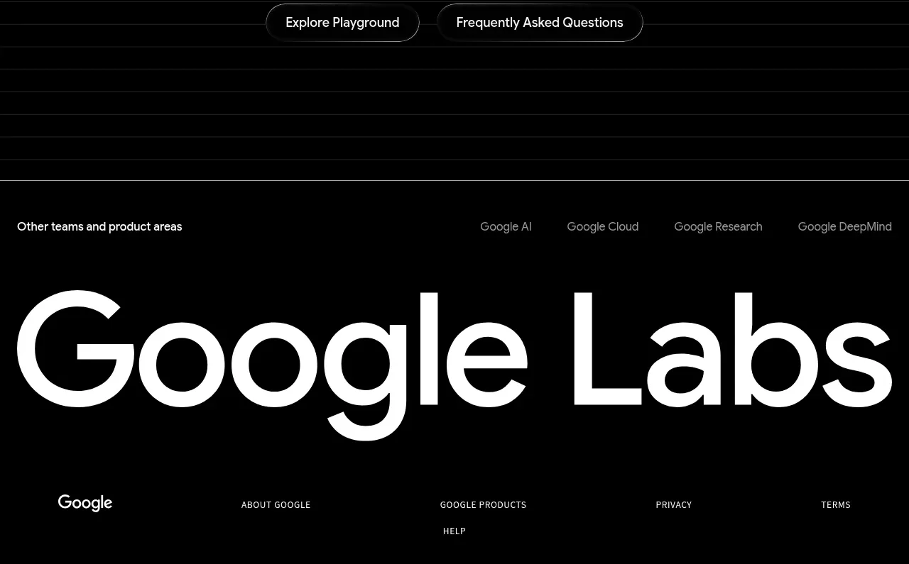
The footer expands into a large typographic brand statement, ecosystem links, and a compact multi-column legal/product link row.
Prompt preview
## Reference images

Study these alongside the description below: hierarchy, rhythm, spacing, colour. Build for the product you are asked about, using this design language.

- Component: https://kage-design-assets.t3.tigrisfiles.io/components/playground-by-google-labs/93d2afab-1def-4986-9178-dd9a071e412b-1791612311-7.webp
- Full page it was cut from: https://kage-design-assets.t3.tigrisfiles.io/screenshots/playground-by-google-labs/93d2afab-1def-4986-9178-dd9a071e412b-1791612198337-full.webp
- Component on Kage: https://kage.design/component/playground-by-google-labs-footer

## Before you start
Ask what ecosystem links, legal links, and brand signature the user's product needs. Apply the principles below to that product rather than copying the reference.

Build a spacious black footer with a thin top divider, a small row of related product-area links, and a very large responsive brand wordmark or brand statement. Below it, place a compact multi-column link row for company, product, privacy, terms, and support destinations. Use #000000 background, #F5F5F5 for the large statement, #9A9A9A for secondary links, and #2A2A2A for rules. Use CSS clamp for the oversized type so it remains intentional on mobile, preserve ample top and bottom padding, and include clear hover/focus states. Avoid relying on an image for text that must be accessible; provide semantic footer landmarks and a compact mobile accordion if the link set is large.

Never: use logos, product names, copy, illustrations, or imagery from the reference.