 kage
kage
applyseed.com
Design analysis
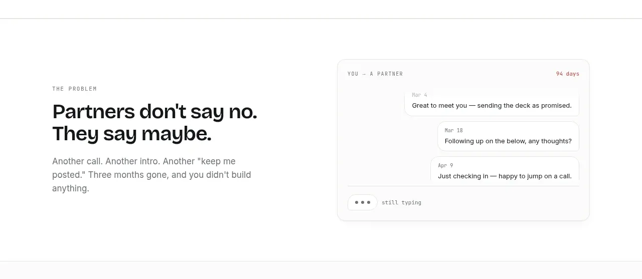
A split editorial block pairs a blunt problem headline with a concrete conversation mockup, turning an abstract pain point into a recognizable scenario.
Prompt preview
## Reference images

Study these alongside the description below: hierarchy, rhythm, spacing, colour. Build for the product you are asked about, using this design language.

- Component: https://kage-design-assets.t3.tigrisfiles.io/components/applyseed/bf723559-d370-4cf7-bc95-35bbaececd41-1789797756-3.webp
- Full page it was cut from: https://kage-design-assets.t3.tigrisfiles.io/screenshots/applyseed/bf723559-d370-4cf7-bc95-35bbaececd41-1789797723399-full.webp
- Component on Kage: https://kage.design/component/applyseed-feature-grid

## Before you start
Ask what the user's product is, who it serves, and what brand personality and colors they want. Apply these principles to that product rather than reproducing the reference.

Create a two-column problem section with an eyebrow, strong two-line heading, and short paragraph on the left. On the right, place a rounded message-thread or activity mockup that shows delayed, fragmented, or otherwise costly work through a few concise message cards. Align both columns vertically around the center and give the section ample whitespace. Use 40–48px heading typography, 17px body copy, charcoal text, gray secondary text, white cards, #e6e8e5 borders, 14–18px radii, and low-contrast shadows. Preserve a calm editorial tone rather than using loud illustrations. Stack the mockup below the copy on mobile.

Never: use logos, product names, copy, illustrations, or imagery from the reference.
More components

 AI-powered helpdesk feature section
intercom.com · Feature grid
AI-powered helpdesk feature section
intercom.com · Feature grid
 Integrations and ecosystem section
intercom.com · Feature grid
Integrations and ecosystem section
intercom.com · Feature grid
 AI agent capabilities section
intercom.com · Feature grid
AI agent capabilities section
intercom.com · Feature grid
 Unified support experience overview
intercom.com · Feature grid
Unified support experience overview
intercom.com · Feature grid

 Core invoicing capabilities
sendinvo.com · Feature grid
Core invoicing capabilities
sendinvo.com · Feature grid
 Audience and trade types
sendinvo.com · Feature grid
Audience and trade types
sendinvo.com · Feature grid