 kage
kage
applyseed.com
Design analysis
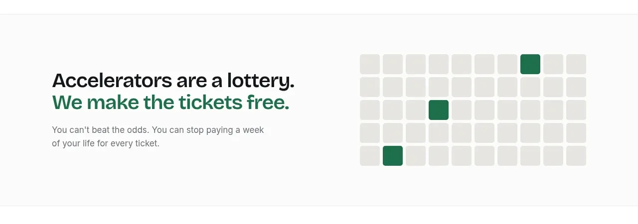
A memorable claim is reinforced by a simple grid visualization with a few highlighted cells, making an unfair or low-probability process instantly understandable.
Prompt preview
## Reference images

Study these alongside the description below: hierarchy, rhythm, spacing, colour. Build for the product you are asked about, using this design language.

- Component: https://kage-design-assets.t3.tigrisfiles.io/components/applyseed/bf723559-d370-4cf7-bc95-35bbaececd41-1789797757-4.webp
- Full page it was cut from: https://kage-design-assets.t3.tigrisfiles.io/screenshots/applyseed/bf723559-d370-4cf7-bc95-35bbaececd41-1789797723399-full.webp
- Component on Kage: https://kage.design/component/applyseed-feature-grid-2

## Before you start
Ask what the user's product is, who it serves, and what brand personality and colors they want. Apply these principles to that product rather than reproducing the reference.

Build a horizontally split insight section. Use a concise two-line statement on the left, with the key positive phrase highlighted in a muted green. Under it, add one explanatory sentence. On the right, create a simple regular matrix of rounded square cells with most cells in warm light gray (#e5e6e2) and only a few cells in a deep green (#23755b), communicating rarity or selected outcomes. Keep the visualization geometric and accessible, with a text alternative. Use 40–48px heading size, generous 80–112px vertical padding, and no distracting card chrome. Collapse the grid beneath the copy on narrow screens.

Never: use logos, product names, copy, illustrations, or imagery from the reference.
More components

 AI-powered helpdesk feature section
intercom.com · Feature grid
AI-powered helpdesk feature section
intercom.com · Feature grid
 Integrations and ecosystem section
intercom.com · Feature grid
Integrations and ecosystem section
intercom.com · Feature grid
 AI agent capabilities section
intercom.com · Feature grid
AI agent capabilities section
intercom.com · Feature grid
 Unified support experience overview
intercom.com · Feature grid
Unified support experience overview
intercom.com · Feature grid

 Core invoicing capabilities
sendinvo.com · Feature grid
Core invoicing capabilities
sendinvo.com · Feature grid
 Audience and trade types
sendinvo.com · Feature grid
Audience and trade types
sendinvo.com · Feature grid