 kage
kage
applyseed.com
Design analysis
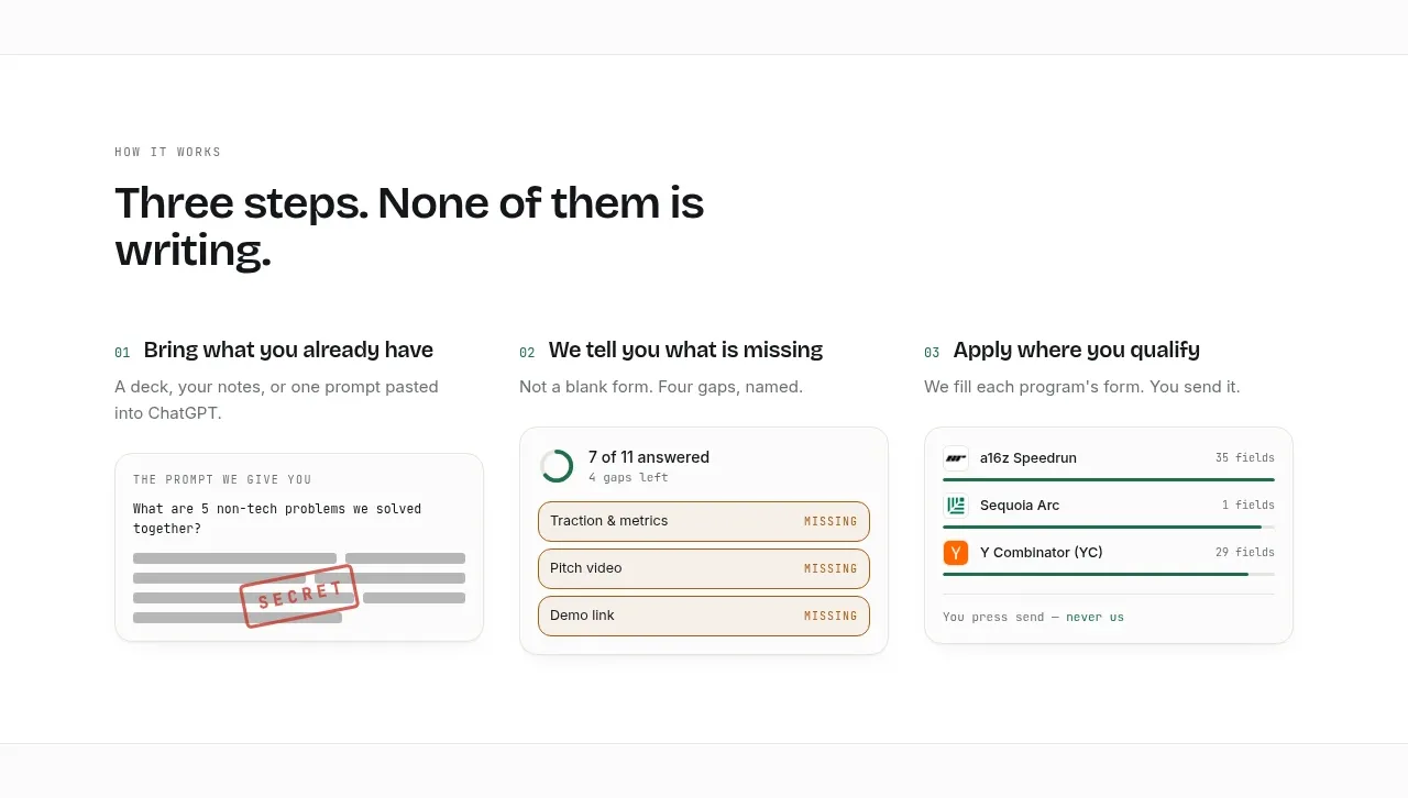
Three evenly weighted steps explain the product through a clear sequence, each supported by a small interface card that makes the process tangible.
Prompt preview
## Reference images

Study these alongside the description below: hierarchy, rhythm, spacing, colour. Build for the product you are asked about, using this design language.

- Component: https://kage-design-assets.t3.tigrisfiles.io/components/applyseed/bf723559-d370-4cf7-bc95-35bbaececd41-1789797757-5.webp
- Full page it was cut from: https://kage-design-assets.t3.tigrisfiles.io/screenshots/applyseed/bf723559-d370-4cf7-bc95-35bbaececd41-1789797723399-full.webp
- Component on Kage: https://kage.design/component/applyseed-feature-grid-3

## Before you start
Ask what the user's product is, who it serves, and what brand personality and colors they want. Apply these principles to that product rather than reproducing the reference.

Create a three-column how-it-works section. Start with a small eyebrow and a large heading that frames the process. Each column should have a numbered step label, a short action-oriented title, one explanatory sentence, and a compact product mockup beneath it. Keep columns equal width, align their headings, and use consistent card heights. Mockups should use off-white surfaces, thin #e5e7e4 borders, 12–16px radius, tiny status labels, progress indicators, and restrained accent green. Use 36–48px section heading type, 14–16px body copy, and 24–32px column gaps. Stack the steps on mobile while preserving numbering.

Never: use logos, product names, copy, illustrations, or imagery from the reference.
More components

 AI-powered helpdesk feature section
intercom.com · Feature grid
AI-powered helpdesk feature section
intercom.com · Feature grid
 Integrations and ecosystem section
intercom.com · Feature grid
Integrations and ecosystem section
intercom.com · Feature grid
 AI agent capabilities section
intercom.com · Feature grid
AI agent capabilities section
intercom.com · Feature grid
 Unified support experience overview
intercom.com · Feature grid
Unified support experience overview
intercom.com · Feature grid

 Core invoicing capabilities
sendinvo.com · Feature grid
Core invoicing capabilities
sendinvo.com · Feature grid
 Audience and trade types
sendinvo.com · Feature grid
Audience and trade types
sendinvo.com · Feature grid