 kage
kage
applyseed.com
Design analysis
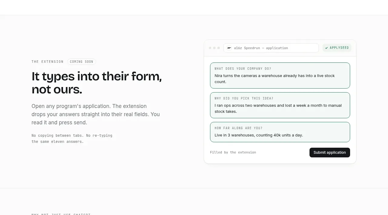
The section presents a concrete automation benefit with explanatory copy beside a realistic form-filling interface, emphasizing reduced repetitive work.
Prompt preview
## Reference images

Study these alongside the description below: hierarchy, rhythm, spacing, colour. Build for the product you are asked about, using this design language.

- Component: https://kage-design-assets.t3.tigrisfiles.io/components/applyseed/bf723559-d370-4cf7-bc95-35bbaececd41-1789797757-6.webp
- Full page it was cut from: https://kage-design-assets.t3.tigrisfiles.io/screenshots/applyseed/bf723559-d370-4cf7-bc95-35bbaececd41-1789797723399-full.webp
- Component on Kage: https://kage.design/component/applyseed-feature-grid-4

## Before you start
Ask what the user's product is, who it serves, and what brand personality and colors they want. Apply these principles to that product rather than reproducing the reference.

Build a split feature section for an automation or browser-extension capability. Put a small status eyebrow and concise headline on the left, followed by supporting copy and a tiny monospace reassurance line. On the right, show a browser-like form card with stacked labeled fields, subtle green outlines for completed values, a compact action button, and a small completion status. Keep the interface plausible and legible but generic. Use a white background, charcoal type, muted #6f7371 copy, green #27745d for completion states, dark #111315 for the main action, 14–18px radii, #e5e8e5 borders, and broad 80–112px section padding. On mobile, place the mockup below the text.

Never: use logos, product names, copy, illustrations, or imagery from the reference.
More components

 AI-powered helpdesk feature section
intercom.com · Feature grid
AI-powered helpdesk feature section
intercom.com · Feature grid
 Integrations and ecosystem section
intercom.com · Feature grid
Integrations and ecosystem section
intercom.com · Feature grid
 AI agent capabilities section
intercom.com · Feature grid
AI agent capabilities section
intercom.com · Feature grid
 Unified support experience overview
intercom.com · Feature grid
Unified support experience overview
intercom.com · Feature grid

 Core invoicing capabilities
sendinvo.com · Feature grid
Core invoicing capabilities
sendinvo.com · Feature grid
 Audience and trade types
sendinvo.com · Feature grid
Audience and trade types
sendinvo.com · Feature grid