 kage
kage
applyseed.com
Design analysis
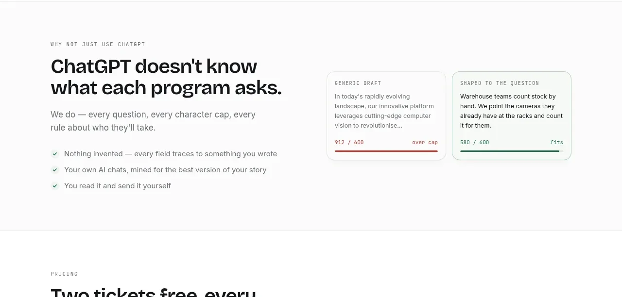
A left-side explanation and right-side before/after cards clearly contrast generic output with tailored output, using color and metrics as evidence.
Prompt preview
## Reference images

Study these alongside the description below: hierarchy, rhythm, spacing, colour. Build for the product you are asked about, using this design language.

- Component: https://kage-design-assets.t3.tigrisfiles.io/components/applyseed/bf723559-d370-4cf7-bc95-35bbaececd41-1789797757-7.webp
- Full page it was cut from: https://kage-design-assets.t3.tigrisfiles.io/screenshots/applyseed/bf723559-d370-4cf7-bc95-35bbaececd41-1789797723399-full.webp
- Component on Kage: https://kage.design/component/applyseed-feature-grid-5

## Before you start
Ask what the user's product is, who it serves, and what brand personality and colors they want. Apply these principles to that product rather than reproducing the reference.

Create a comparison-oriented feature section. Use a left column with eyebrow, assertive heading, supporting paragraph, and a short checklist of principles. Use the right column for two adjacent content cards: one neutral or lightly red-accented card showing a generic result with an over-limit or warning metric, and one pale-green card showing a tailored result with a positive fit metric. Keep cards equal height and make the contrast understandable without color alone by adding labels and icons. Use 36–44px heading type, 15–17px body text, 16px card radius, thin borders, and restrained red #b94e46 and green #28765d accents. Stack cards on mobile.

Never: use logos, product names, copy, illustrations, or imagery from the reference.
More components

 AI-powered helpdesk feature section
intercom.com · Feature grid
AI-powered helpdesk feature section
intercom.com · Feature grid
 Integrations and ecosystem section
intercom.com · Feature grid
Integrations and ecosystem section
intercom.com · Feature grid
 AI agent capabilities section
intercom.com · Feature grid
AI agent capabilities section
intercom.com · Feature grid
 Unified support experience overview
intercom.com · Feature grid
Unified support experience overview
intercom.com · Feature grid

 Core invoicing capabilities
sendinvo.com · Feature grid
Core invoicing capabilities
sendinvo.com · Feature grid
 Audience and trade types
sendinvo.com · Feature grid
Audience and trade types
sendinvo.com · Feature grid