kage
kage
applyseed.com
Design analysis
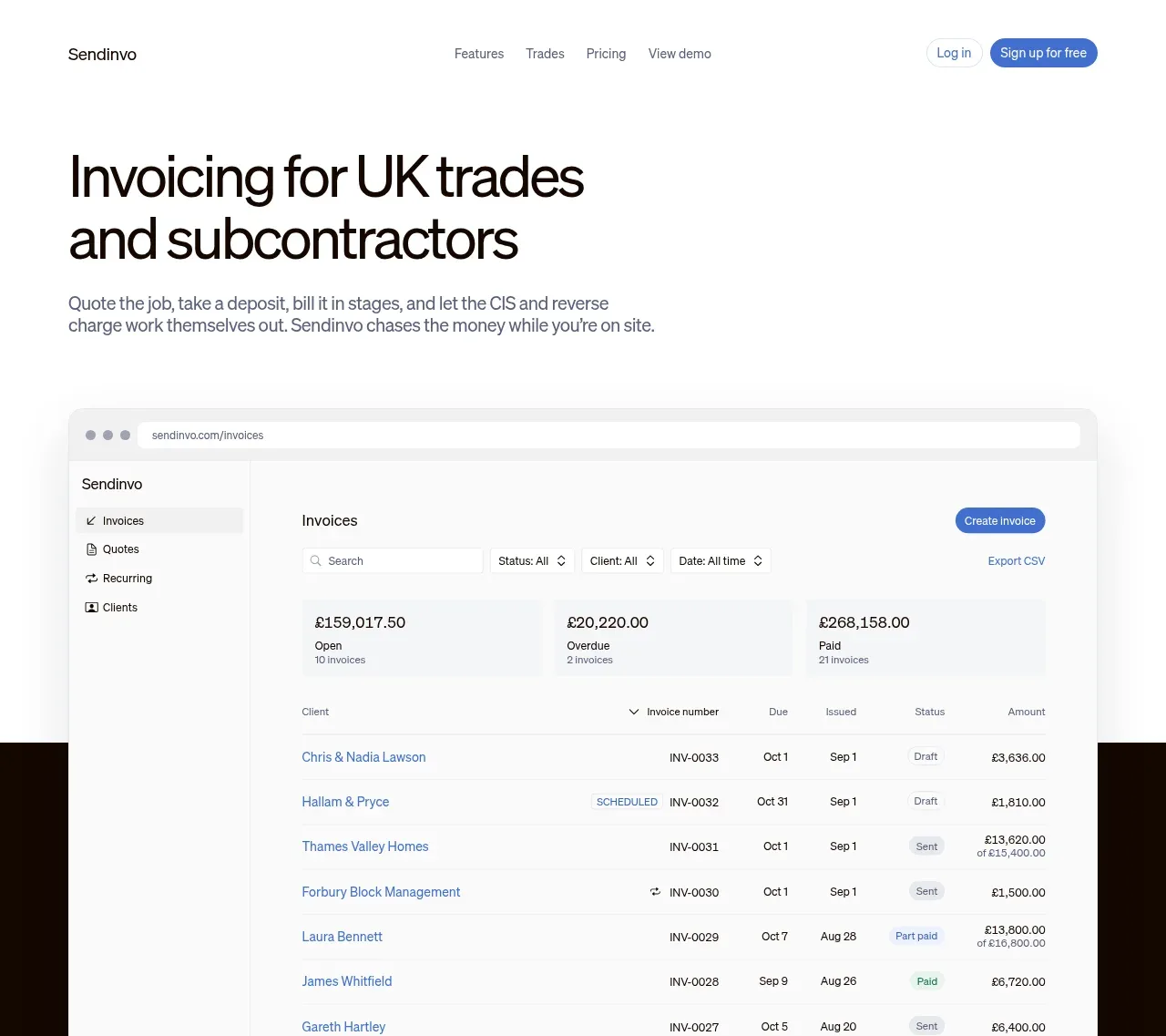
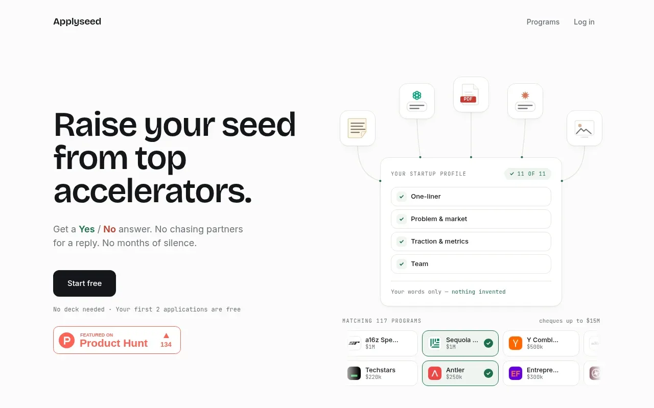
The oversized left-aligned promise, short explanatory copy, primary button, and lightweight product interface visual make the value proposition immediately legible.
Prompt preview
## Reference images

Study these alongside the description below: hierarchy, rhythm, spacing, colour. Build for the product you are asked about, using this design language.

- Component: https://kage-design-assets.t3.tigrisfiles.io/components/applyseed/bf723559-d370-4cf7-bc95-35bbaececd41-1789797756-1.webp
- Full page it was cut from: https://kage-design-assets.t3.tigrisfiles.io/screenshots/applyseed/bf723559-d370-4cf7-bc95-35bbaececd41-1789797723399-full.webp
- Component on Kage: https://kage.design/component/applyseed-hero

## Before you start
Ask what the user's product is, who it serves, and what brand personality and colors they want. Apply these principles to that product rather than reproducing the reference.

Create a two-column hero beneath the navigation. Put a bold, tightly leading headline on the left, a concise two-line explanation beneath it, and one dark rounded primary CTA. Add a small reassuring note below the CTA. On the right, show an abstract product workflow made from softly bordered cards, floating document/status tiles, and a larger rounded interface panel; it should demonstrate the product outcome without relying on literal illustration. Use a near-white background, charcoal text (#111315), muted gray copy (#6f7371), a dark CTA (#111315), and a restrained green accent (#24745d) with an occasional warm red accent (#bd4b43). Use a max-width around 760px, a 48–64px headline on desktop, 24–32px gaps, 16–24px card radii, subtle #e7e9e6 borders, and very soft shadows. Stack columns on mobile and keep the CTA prominent.

Never: use logos, product names, copy, illustrations, or imagery from the reference.