 kage
kage
applyseed.com
Design analysis
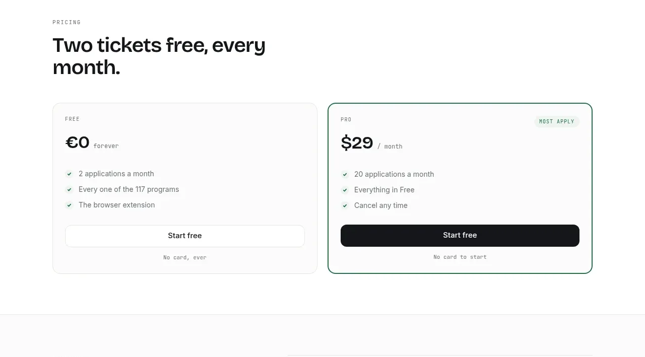
A simple free-versus-paid comparison reduces decision friction, with the paid option visually emphasized and benefits kept short.
Prompt preview
## Reference images

Study these alongside the description below: hierarchy, rhythm, spacing, colour. Build for the product you are asked about, using this design language.

- Component: https://kage-design-assets.t3.tigrisfiles.io/components/applyseed/bf723559-d370-4cf7-bc95-35bbaececd41-1789797757-8.webp
- Full page it was cut from: https://kage-design-assets.t3.tigrisfiles.io/screenshots/applyseed/bf723559-d370-4cf7-bc95-35bbaececd41-1789797723399-full.webp
- Component on Kage: https://kage.design/component/applyseed-pricing-table

## Before you start
Ask what the user's product is, who it serves, and what brand personality and colors they want. Apply these principles to that product rather than reproducing the reference.

Build a two-tier pricing section with a small eyebrow, a bold heading, and two equal pricing cards. Each card needs a tier label, prominent price and billing cadence, three or four concise benefits with checkmarks, a full-width CTA, and a small reassurance below. Make the recommended or paid card stand out with a 1–2px green border (#28765d) and a small pale-green badge, while the free card uses a neutral #e8eae7 border. Use white cards, 16px radius, 32px internal padding, 36–44px heading type, and clear price hierarchy. Keep CTAs consistent but use dark fill on the emphasized tier and a light outlined or white action on the other. Stack cards on mobile.

Never: use logos, product names, copy, illustrations, or imagery from the reference.
More components
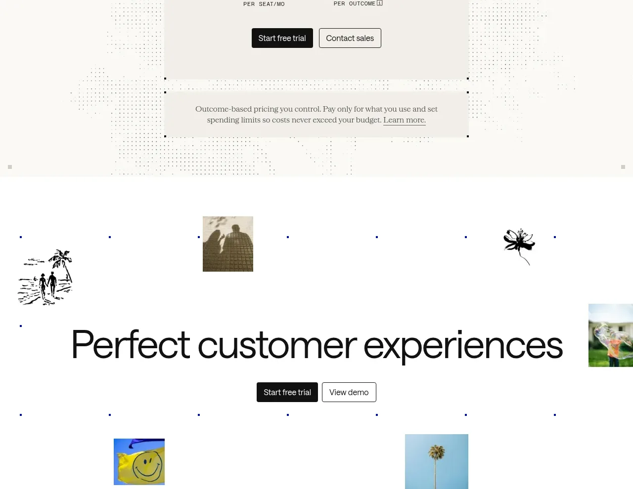
 Transparent pricing card
intercom.com · Pricing table
Transparent pricing card
intercom.com · Pricing table
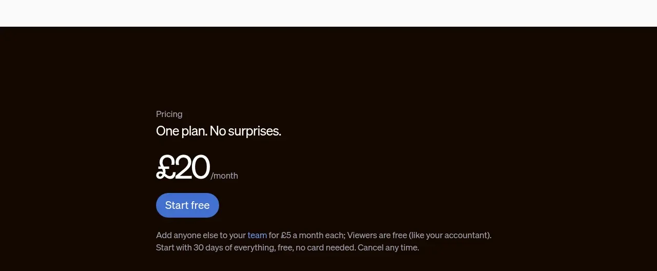
 Single-plan pricing offer
sendinvo.com · Pricing table
Single-plan pricing offer
sendinvo.com · Pricing table
F
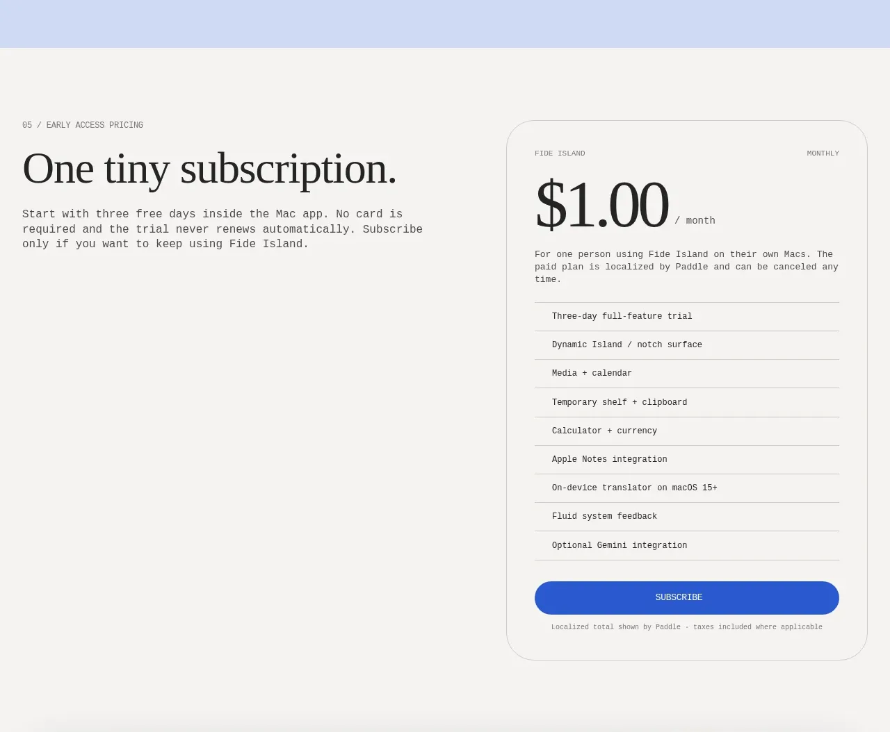
Single-plan early access pricing
Fide Island · Pricing table
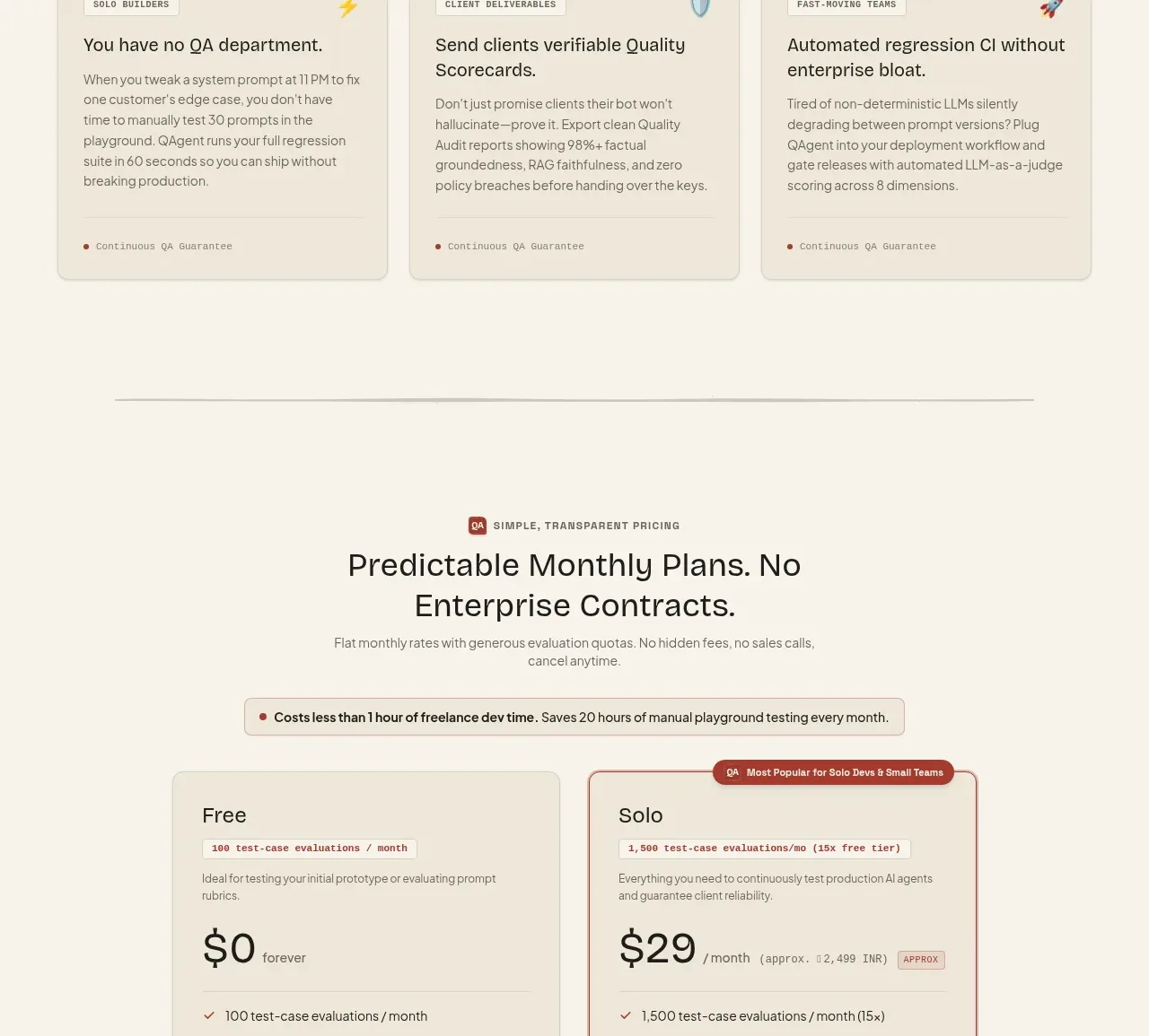
 Two-tier pricing table
QAgent · Pricing table
Two-tier pricing table
QAgent · Pricing table
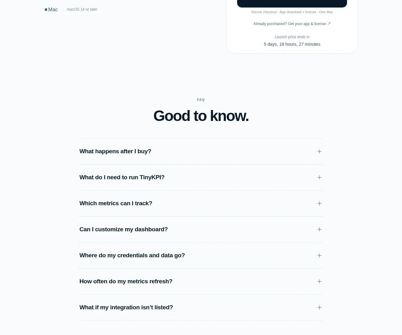
 Single launch price offer
TinyKPI · Pricing table
Single launch price offer
TinyKPI · Pricing table
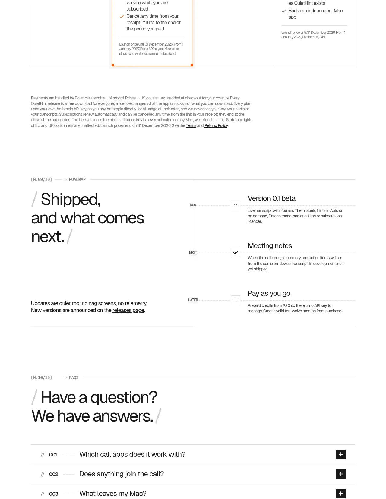
 Flexible four-plan pricing
QuietHint® · Pricing table
Flexible four-plan pricing
QuietHint® · Pricing table