 kage
kage
arcjet.com
Design analysis
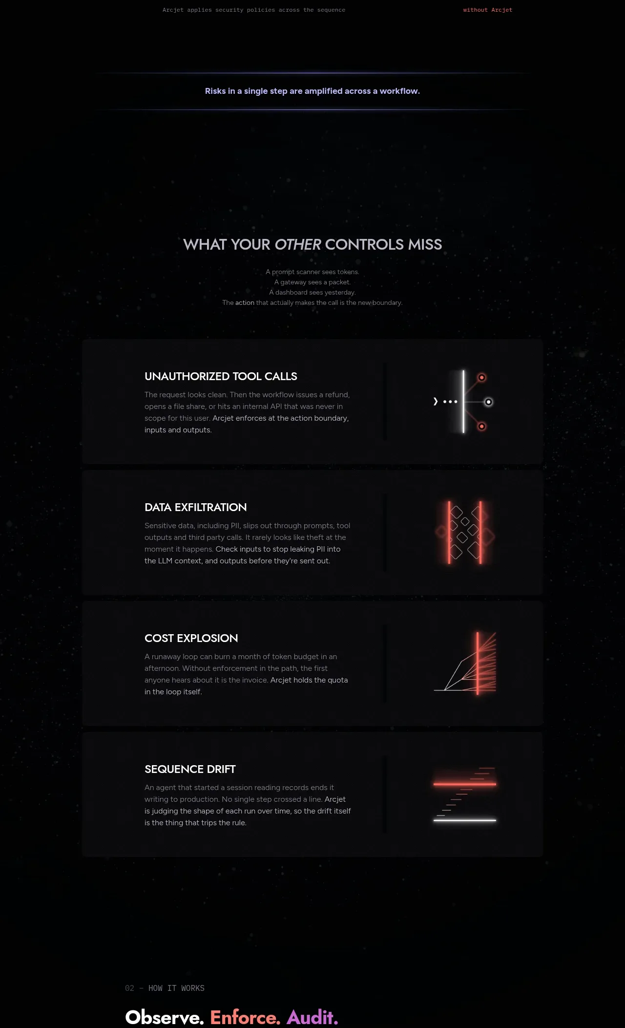
A section heading introduces four vertically stacked risk cards, each pairing an explanatory text block with a distinct abstract signal graphic.
Prompt preview
## Reference images

Study these alongside the description below: hierarchy, rhythm, spacing, colour. Build for the product you are asked about, using this design language.

- Component: https://kage-design-assets.t3.tigrisfiles.io/components/arcjet/88e490fa-ec93-4198-849b-d528e634d4ff-1790057131-4.webp
- Full page it was cut from: https://kage-design-assets.t3.tigrisfiles.io/screenshots/arcjet/88e490fa-ec93-4198-849b-d528e634d4ff-1790056993895-full.webp
- Component on Kage: https://kage.design/component/arcjet-feature-grid-2

## Before you start
Ask what categories of risk or failure matter for the user's product and what brand palette should guide the visuals. Then build an original card section, not a replica.

Create a dark feature section with a centered heading and short supporting line followed by four large stacked cards. Each card should contain a concise uppercase or title-case label, two or three sentences of explanation, and an abstract decorative visualization area on the right such as lines, gates, nodes, or bars. Use a 2-column card layout on desktop and stack text above the visual on mobile. Cards should be wide, low-contrast panels using `#101114` and `#17171b`, with 1px `#24252b` borders and 8px radius. Set headings in warm white `#e8e5e3`, body copy in `#8e8b92`, and use different restrained accents—coral `#f05d62`, violet `#8b79ff`, amber `#e2a24d`, blue `#6e9cff`—for the abstract visualizations. Keep decorative graphics subtle and non-literal, with no image dependencies. Never: use logos, product names, copy, illustrations or imagery from the reference.
More components

 Spend visibility and daily-cost breakdown
Subscrr · Feature grid
Spend visibility and daily-cost breakdown
Subscrr · Feature grid
 Reminders and simple setup flow
Subscrr · Feature grid
Reminders and simple setup flow
Subscrr · Feature grid

 Security and permissions cards
NotchPop · Feature grid
Security and permissions cards
NotchPop · Feature grid
 Focused feature cards
NotchPop · Feature grid
Focused feature cards
NotchPop · Feature grid
 Interactive product demonstration
NotchPop · Feature grid
Interactive product demonstration
NotchPop · Feature grid
 Quiet information cards
NotchPop · Feature grid
Quiet information cards
NotchPop · Feature grid