 kage
kage
arcjet.com
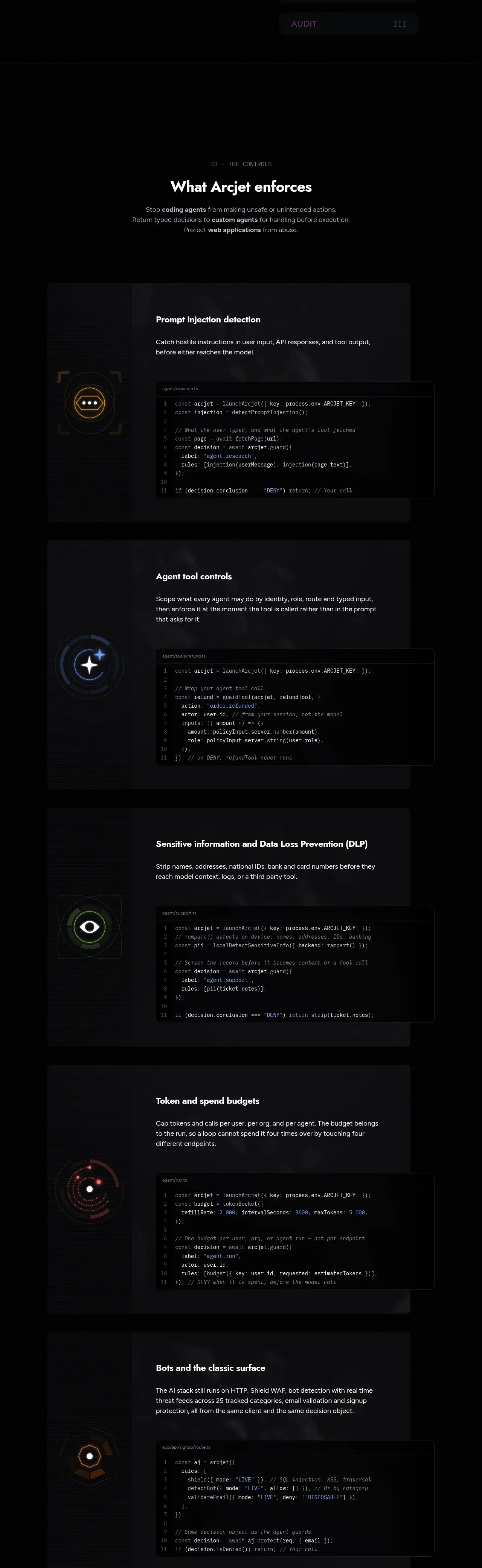
Design analysis
A long controls section presents several repeatable capability cards, each pairing a capability explanation with a code sample and a small abstract icon.
Prompt preview
## Reference images

Study these alongside the description below: hierarchy, rhythm, spacing, colour. Build for the product you are asked about, using this design language.

- Component: https://kage-design-assets.t3.tigrisfiles.io/components/arcjet/88e490fa-ec93-4198-849b-d528e634d4ff-1790057133-6.webp
- Full page it was cut from: https://kage-design-assets.t3.tigrisfiles.io/screenshots/arcjet/88e490fa-ec93-4198-849b-d528e634d4ff-1790056993895-full.webp
- Component on Kage: https://kage.design/component/arcjet-feature-grid-3

## Before you start
Ask what capabilities the user's product enforces, what developer stack it targets, and what code style and brand palette to use. Then create an original implementation of this pattern.

Create a long dark feature section with a numbered eyebrow, a strong centered heading, and a short intro followed by four or five vertically stacked capability cards. Each card should have a small abstract icon or signal on the left, a title and concise explanation above, and a dark syntax-highlighted code sample on the right or below. Make each card feel like a product proof unit rather than a generic feature tile. Use a centered max-width around 1000px, card background `#111216`, border `#25262c`, 10–12px radius, and generous 56–80px internal padding. Typography: 28–42px section heading, 18–22px card title, 13–15px body copy, 11–12px code. Use warm white `#f1eeeb`, muted gray `#96929a`, code background `#070809`, and accent colors violet `#8e7aff`, coral `#ef6564`, cyan `#78c7d8`, and green `#7dbb91`. Provide copy-to-clipboard for code, syntax contrast, responsive stacking, and reduced-motion support. Never: use logos, product names, copy, illustrations or imagery from the reference.
More components

 Spend visibility and daily-cost breakdown
Subscrr · Feature grid
Spend visibility and daily-cost breakdown
Subscrr · Feature grid
 Reminders and simple setup flow
Subscrr · Feature grid
Reminders and simple setup flow
Subscrr · Feature grid

 Security and permissions cards
NotchPop · Feature grid
Security and permissions cards
NotchPop · Feature grid
 Focused feature cards
NotchPop · Feature grid
Focused feature cards
NotchPop · Feature grid
 Interactive product demonstration
NotchPop · Feature grid
Interactive product demonstration
NotchPop · Feature grid
 Quiet information cards
NotchPop · Feature grid
Quiet information cards
NotchPop · Feature grid