 kage
kage
arcjet.com
Design analysis
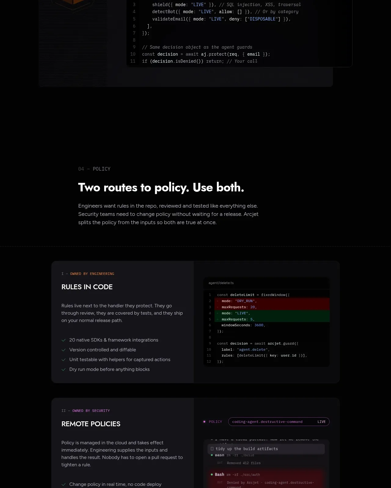
Two side-by-side policy cards clarify complementary ways to configure the system, with text on one side and a visual/code preview on the other.
Prompt preview
## Reference images

Study these alongside the description below: hierarchy, rhythm, spacing, colour. Build for the product you are asked about, using this design language.

- Component: https://kage-design-assets.t3.tigrisfiles.io/components/arcjet/88e490fa-ec93-4198-849b-d528e634d4ff-1790057133-7.webp
- Full page it was cut from: https://kage-design-assets.t3.tigrisfiles.io/screenshots/arcjet/88e490fa-ec93-4198-849b-d528e634d4ff-1790056993895-full.webp
- Component on Kage: https://kage.design/component/arcjet-feature-grid-4

## Before you start
Ask how the user's product is configured and what two complementary routes or audiences need to be compared. Then build an original comparison section with these principles.

Create a dark section with a small eyebrow, a clear heading, and a short paragraph, followed by two large horizontally arranged cards. Each card should have an overline identifying the audience or approach, a title, a short explanation, a short checklist, and a contrasting code or interface preview. Use an 8–12px radius, `#151519` surfaces, `#29282e` borders, and a subtle gradient or divider between text and preview. Use white `#eeeae7`, muted gray `#96929a`, and small accent labels in amber `#d69b59` or violet `#957cf0`. Make cards equal height on desktop and stack cleanly on mobile. Never: use logos, product names, copy, illustrations or imagery from the reference.
More components

 Spend visibility and daily-cost breakdown
Subscrr · Feature grid
Spend visibility and daily-cost breakdown
Subscrr · Feature grid
 Reminders and simple setup flow
Subscrr · Feature grid
Reminders and simple setup flow
Subscrr · Feature grid

 Security and permissions cards
NotchPop · Feature grid
Security and permissions cards
NotchPop · Feature grid
 Focused feature cards
NotchPop · Feature grid
Focused feature cards
NotchPop · Feature grid
 Interactive product demonstration
NotchPop · Feature grid
Interactive product demonstration
NotchPop · Feature grid
 Quiet information cards
NotchPop · Feature grid
Quiet information cards
NotchPop · Feature grid