 kage
kage
arcjet.com
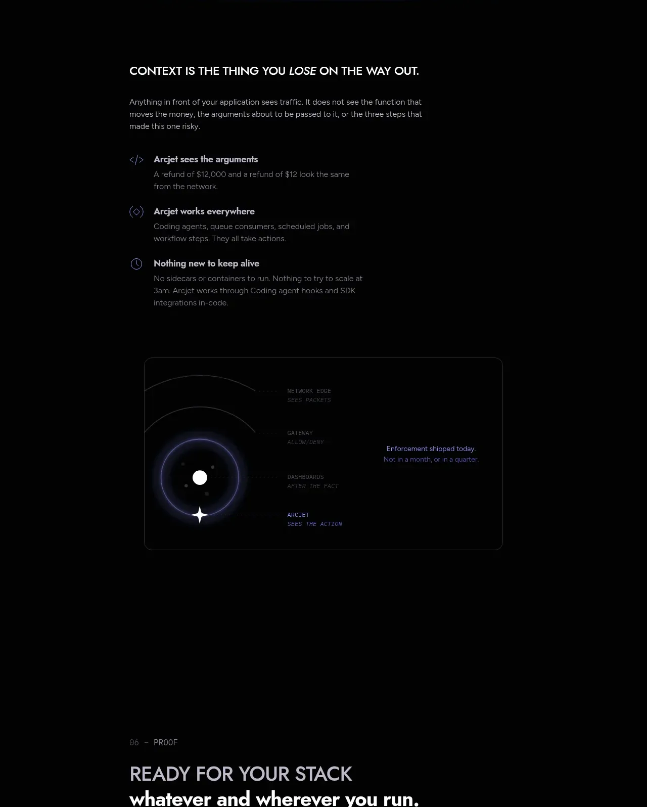
Design analysis
This section explains several practical benefits in a vertical list and supports them with a compact abstract system diagram below.
Prompt preview
## Reference images

Study these alongside the description below: hierarchy, rhythm, spacing, colour. Build for the product you are asked about, using this design language.

- Component: https://kage-design-assets.t3.tigrisfiles.io/components/arcjet/88e490fa-ec93-4198-849b-d528e634d4ff-1790057134-9.webp
- Full page it was cut from: https://kage-design-assets.t3.tigrisfiles.io/screenshots/arcjet/88e490fa-ec93-4198-849b-d528e634d4ff-1790056993895-full.webp
- Component on Kage: https://kage.design/component/arcjet-feature-grid-5

## Before you start
Ask what context, visibility, or operational benefit the user's product provides and which three proof points matter most. Then create an original explanatory section.

Build a dark benefits section with a heading, short paragraph, and three vertically stacked benefit rows. Each row should include a small line icon, a concise title, and one or two lines of supporting copy. Below or beside the list, add a compact abstract diagram that communicates layered context or system flow without relying on literal imagery. Use a narrow readable text column, clear 28–40px heading hierarchy, 14px body copy, and 12px metadata. Colors: `#070809` background, `#f0edeb` text, `#8d8991` copy, cool violet `#8d80ed`, muted cyan `#74aebc`, and coral `#df6267`. Separate rows with subtle rules and use 12px icon containers. Never: use logos, product names, copy, illustrations or imagery from the reference.
More components

 Spend visibility and daily-cost breakdown
Subscrr · Feature grid
Spend visibility and daily-cost breakdown
Subscrr · Feature grid
 Reminders and simple setup flow
Subscrr · Feature grid
Reminders and simple setup flow
Subscrr · Feature grid

 Security and permissions cards
NotchPop · Feature grid
Security and permissions cards
NotchPop · Feature grid
 Focused feature cards
NotchPop · Feature grid
Focused feature cards
NotchPop · Feature grid
 Interactive product demonstration
NotchPop · Feature grid
Interactive product demonstration
NotchPop · Feature grid
 Quiet information cards
NotchPop · Feature grid
Quiet information cards
NotchPop · Feature grid