kage
kage
arcjet.com
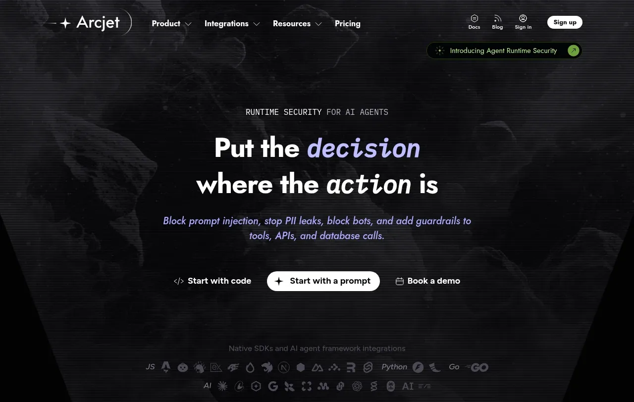
Design analysis
The hero uses centered editorial typography, a short eyebrow, clear action hierarchy, and a subdued atmospheric technical background to establish the product promise.
Prompt preview
## Reference images

Study these alongside the description below: hierarchy, rhythm, spacing, colour. Build for the product you are asked about, using this design language.

- Component: https://kage-design-assets.t3.tigrisfiles.io/components/arcjet/88e490fa-ec93-4198-849b-d528e634d4ff-1790057130-1.webp
- Full page it was cut from: https://kage-design-assets.t3.tigrisfiles.io/screenshots/arcjet/88e490fa-ec93-4198-849b-d528e634d4ff-1790056993895-full.webp
- Component on Kage: https://kage.design/component/arcjet-hero

## Before you start
Ask what the user's product is, what problem it solves, and what brand voice and palette it should use. Then create an original hero using these principles rather than reproducing the reference.

Create a cinematic, full-width hero directly below the navigation for a developer-focused software product. Center a small uppercase eyebrow, a two-line bold headline with one emphasized phrase in a contrasting accent, one concise supporting sentence, and three actions: a text link, a bright pill primary CTA, and a secondary text link. Keep the hero between 320 and 460px tall with a centered max-width of roughly 720px and generous vertical breathing room. Use a nearly black background `#050607`, warm white text `#f4f1ee`, muted lavender-gray copy `#aaa5ae`, and a restrained electric violet-to-coral accent gradient. Add only abstract low-contrast scanlines, grain, or soft radial glow behind the content; no literal illustration. Headline should be 42–64px, tight line-height, and semibold/bold; eyebrow and labels 10–12px uppercase with tracking. Make the primary button high contrast and pill-shaped, with visible keyboard focus. Never: use logos, product names, copy, illustrations or imagery from the reference.