kage
kage
arsaze.com
Design analysis
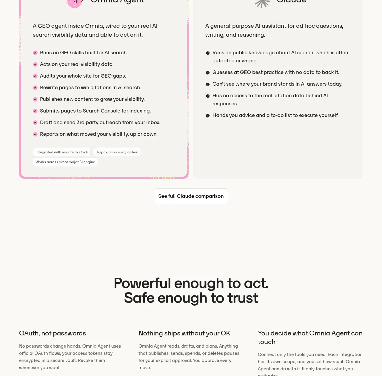
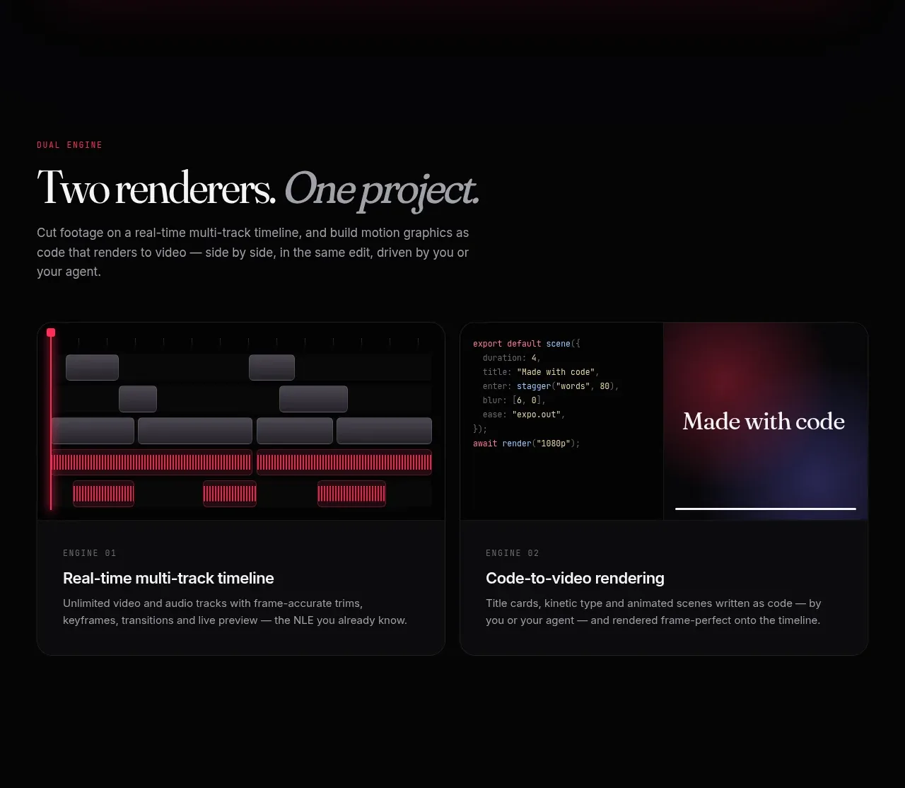
A short section introduces two complementary ways to work, presented as adjacent dark cards with distinct visual previews and concise explanatory footers.
Prompt preview
## Reference images

Study these alongside the description below: hierarchy, rhythm, spacing, colour. Build for the product you are asked about, using this design language.

- Component: https://kage-design-assets.t3.tigrisfiles.io/components/arsaze/e4f15c51-7821-4e39-ba4c-e316208d7c18-1790748085-5.webp
- Full page it was cut from: https://kage-design-assets.t3.tigrisfiles.io/screenshots/arsaze/e4f15c51-7821-4e39-ba4c-e316208d7c18-1790748036683-full.webp
- Component on Kage: https://kage.design/component/arsaze-card

## Before you start
Ask whether the user's product has complementary modes, engines, or workflows that should be compared. Then design an original comparison that makes the distinction immediately useful.

Build a dark comparison section with a small pink eyebrow, an editorial serif heading with one italic phrase, and a brief muted paragraph. Below, place two equal-width cards in a responsive grid. Each card has a 180–230px visual area with a different abstract product preview, a thin #25252a border, 14px radius, and a lower text area containing a tiny uppercase label, a 17px semibold title, and concise gray copy. Give the cards subtle gradient lighting—pink/purple for one and cool blue for the other—without overpowering the UI. On hover, lift the card 2px and brighten its border.

Never: use logos, product names, copy, illustrations, or imagery from the reference.