kage
vibeide.dev
Design analysis
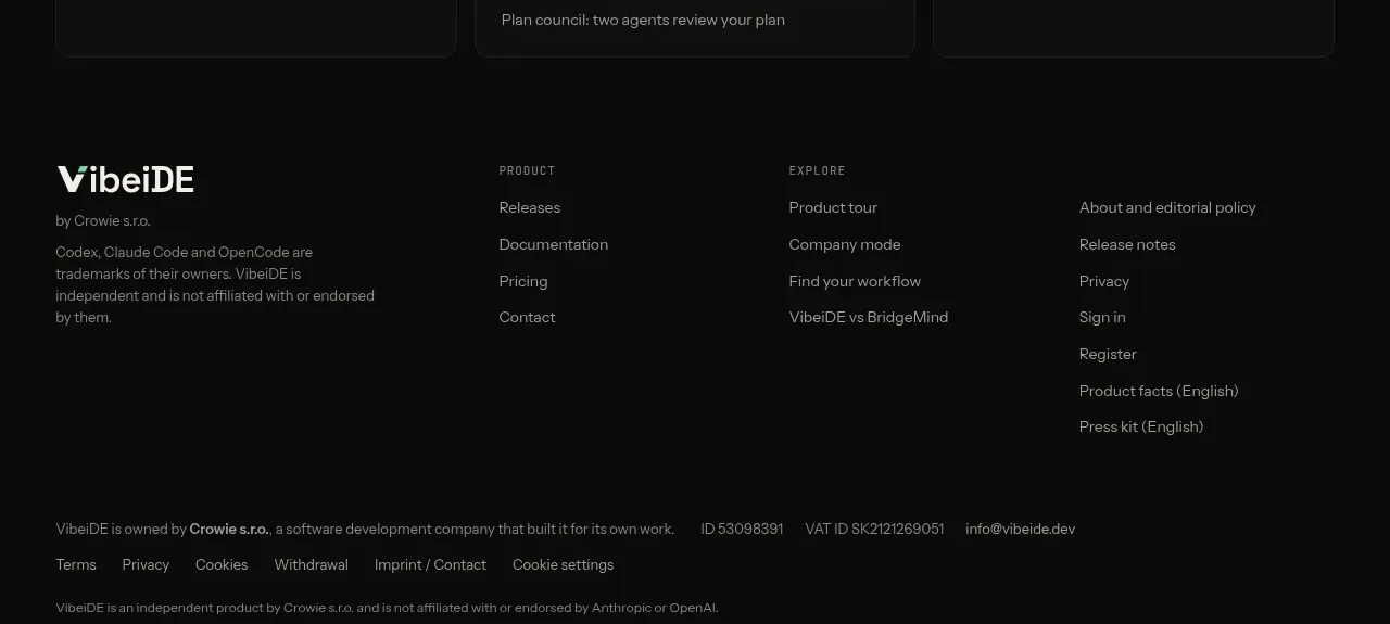
Three dark cards organize further exploration into tools and teams, use cases, and comparisons, turning the lower page into a useful content directory.
Prompt preview
## Reference images

Study these alongside the description below: hierarchy, rhythm, spacing, colour. Build for the product you are asked about, using this design language.

- Component: https://kage-design-assets.t3.tigrisfiles.io/components/vibeide/07b340e8-2f64-4d74-b3e0-eba165a9aca9-1793080890-7.webp
- Full page it was cut from: https://kage-design-assets.t3.tigrisfiles.io/screenshots/vibeide/07b340e8-2f64-4d74-b3e0-eba165a9aca9-1793080830929-full.webp
- Component on Kage: https://kage.design/component/vibeide-card

## Before you start
Ask what the user's product and brand are, then apply the principles below to that product rather than reproducing this reference.

Create a resource-discovery section with a short heading and three equal-width dark cards. Each card has a tiny uppercase category label, a list of 5–8 compact linked topics, and generous internal padding. Use a near-black background, cards #101211, 1px #242725 borders, 8px radius, white headings, muted gray links, and a mint hover accent. Align card tops and keep line-height around 1.5; make the entire card or each row keyboard-focusable. On mobile, stack the cards while preserving clear grouping.

Never use the reference product name, category labels, links, copy, or exact card contents.