kage
throxy.com
Design analysis
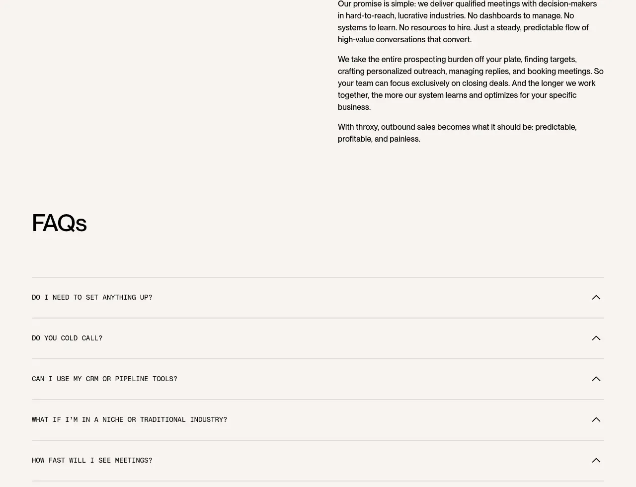
A quiet editorial section places a large promise heading on the left and several tightly grouped paragraphs on the right, relying on whitespace and alignment for authority.
Prompt preview
## Reference images

Study these alongside the description below: hierarchy, rhythm, spacing, colour. Build for the product you are asked about, using this design language.

- Component: https://kage-design-assets.t3.tigrisfiles.io/components/throxy/4d577be3-3944-4c06-b2f6-094c0e693ab7-1793253972-10.webp
- Full page it was cut from: https://kage-design-assets.t3.tigrisfiles.io/screenshots/throxy/4d577be3-3944-4c06-b2f6-094c0e693ab7-1793253814515-full.webp
- Component on Kage: https://kage.design/component/throxy-card

### Before you start
Ask what the user's product, audience, and brand are, then apply these principles to that product.

Create an editorial promise section on an ivory background with a two-column grid. Use a large 30–40px heading in the left column and a narrow stack of three to five paragraphs in the right column. Give paragraphs 16px text, 1.45 line-height, and 20–28px spacing; keep the left heading top-aligned and let generous whitespace frame the message. Use #F7F5F0, #111011, and muted #6F6A6B with no decorative imagery or oversized card treatment. On mobile, stack the heading above the copy.

Never: use logos, product names, copy, illustrations, or imagery from the reference.