kage
kage
arsaze.com
Design analysis
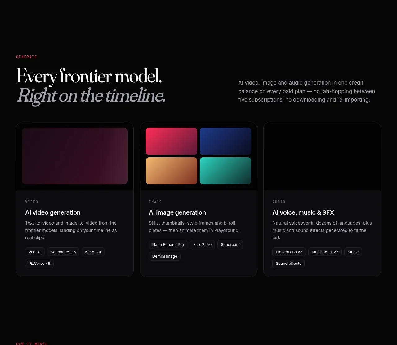
Three equal cards summarize media-generation categories, each with a colorful abstract preview, category label, capability description, and compact model chips.
Prompt preview
## Reference images

Study these alongside the description below: hierarchy, rhythm, spacing, colour. Build for the product you are asked about, using this design language.

- Component: https://kage-design-assets.t3.tigrisfiles.io/components/arsaze/e4f15c51-7821-4e39-ba4c-e316208d7c18-1790748086-6.webp
- Full page it was cut from: https://kage-design-assets.t3.tigrisfiles.io/screenshots/arsaze/e4f15c51-7821-4e39-ba4c-e316208d7c18-1790748036683-full.webp
- Component on Kage: https://kage.design/component/arsaze-card-2

## Before you start
Ask which generation or service categories the user's product actually offers and how users choose between them. Apply the following visual system to those categories.

Create a three-column capability card row on a black background. Each card uses a dark charcoal shell (#0d0d10), a thin near-black border, 14px radius, and a 150–190px visual header with an abstract gradient block in a distinct color family. Below the visual, use a tiny spaced uppercase category label, a 17px off-white title, short muted description, and a wrapping row of compact dark chips with 11px text. Keep all cards equal height, align their bottoms, and stack them cleanly on mobile. Use color as a category signal, not decoration; support keyboard focus and a modest hover border glow.

Never: use logos, product names, copy, illustrations, or imagery from the reference.