kage
kage
arsaze.com
Design analysis
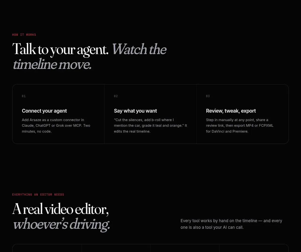
A compact three-column process explains how a user connects an agent, gives instructions, and reviews or exports the result. Numbering and dividers make the sequence easy to scan.
Prompt preview
## Reference images

Study these alongside the description below: hierarchy, rhythm, spacing, colour. Build for the product you are asked about, using this design language.

- Component: https://kage-design-assets.t3.tigrisfiles.io/components/arsaze/e4f15c51-7821-4e39-ba4c-e316208d7c18-1790748086-7.webp
- Full page it was cut from: https://kage-design-assets.t3.tigrisfiles.io/screenshots/arsaze/e4f15c51-7821-4e39-ba4c-e316208d7c18-1790748036683-full.webp
- Component on Kage: https://kage.design/component/arsaze-card-3

## Before you start
Ask what the user's actual onboarding or task flow is and what the three most useful stages are. Translate those stages into original labels and copy.

Build a process section with a left-aligned editorial heading and a bordered three-column step panel. Use a near-black background, 1px #26262a border, 14px radius, and vertical dividers between columns. Each step includes a tiny monospace or uppercase number, a 16px semibold title, and 2–3 lines of muted gray explanation. Preserve generous internal padding (24–32px), strong alignment, and a responsive one-column stack with horizontal separators on mobile. Add a subtle pink accent to the active or hovered step, but do not make the sequence feel like a dashboard.

Never: use logos, product names, copy, illustrations, or imagery from the reference.