 kage
kage
arsaze.com
Design analysis
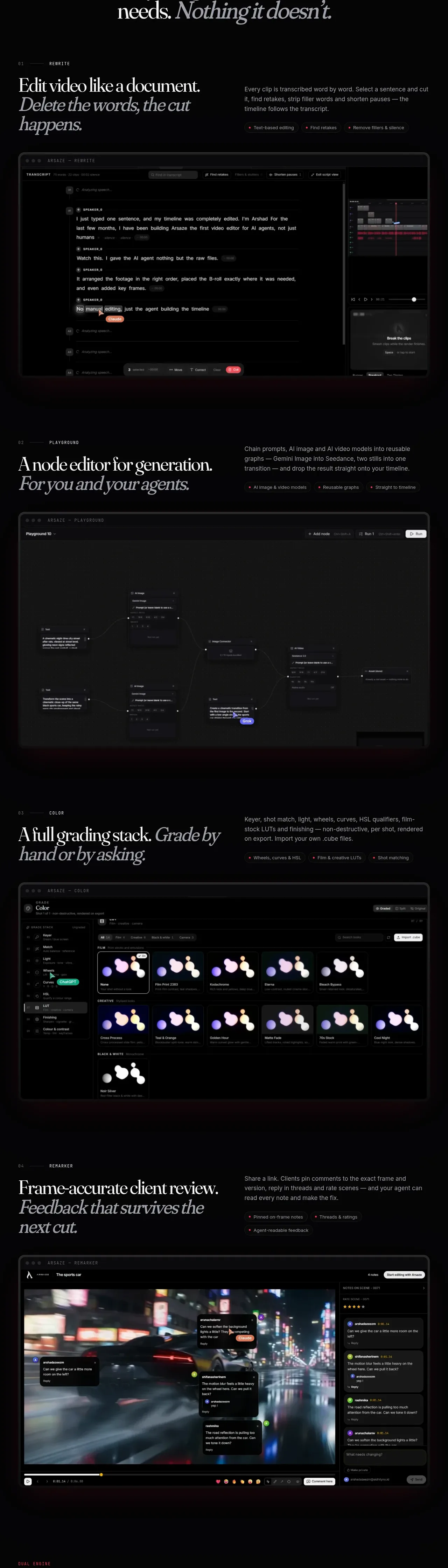
Four sequential feature modules explain the core workflow: document-like editing, generative node work, color control, and review. Each repeats a strong left headline/right explanation pattern above a large application screenshot, creating a consistent product-story cadence.
Prompt preview
## Reference images

Study these alongside the description below: hierarchy, rhythm, spacing, colour. Build for the product you are asked about, using this design language.

- Component: https://kage-design-assets.t3.tigrisfiles.io/components/arsaze/e4f15c51-7821-4e39-ba4c-e316208d7c18-1790748084-4.webp
- Full page it was cut from: https://kage-design-assets.t3.tigrisfiles.io/screenshots/arsaze/e4f15c51-7821-4e39-ba4c-e316208d7c18-1790748036683-full.webp
- Component on Kage: https://kage.design/component/arsaze-feature-grid

## Before you start
Ask what the user's product's three or four most important workflows are, what users need to understand first, and what visual assets are available. Build original modules around those answers.

Create a vertically stacked feature-story section on #050505 with four modules. Each module begins with a two-column heading row: a small numbered eyebrow and large editorial serif headline on the left, and concise muted-gray explanatory copy with 2–4 tiny pink-bulleted capability chips on the right. Under each row, place a wide realistic product UI preview in a dark framed container (#151519 border, 12px radius, subtle bottom glow); vary the UI composition per module while keeping the frame treatment consistent. Use roughly 72–110px vertical separation between modules, 32px side gutters, 44–64px headlines, 15px body copy, and clear responsive stacking on mobile. Add restrained scroll reveal and hover states only to capability chips or the preview frame.

Never: use logos, product names, copy, illustrations, or imagery from the reference.
More components

 Three-step process cards
godaylight.com · Feature grid
Three-step process cards
godaylight.com · Feature grid

 Use-case selector with vertical video preview
Spira Maxima · Feature grid
Use-case selector with vertical video preview
Spira Maxima · Feature grid

 Insights and enterprise model access
FastRouter.ai · Feature grid
Insights and enterprise model access
FastRouter.ai · Feature grid
 Solutions by organizational role
FastRouter.ai · Feature grid
Solutions by organizational role
FastRouter.ai · Feature grid
 Routing reliability and model collaboration
FastRouter.ai · Feature grid
Routing reliability and model collaboration
FastRouter.ai · Feature grid
 Goal-oriented product capabilities
FastRouter.ai · Feature grid
Goal-oriented product capabilities
FastRouter.ai · Feature grid