 kage
kage
arsaze.com
Design analysis
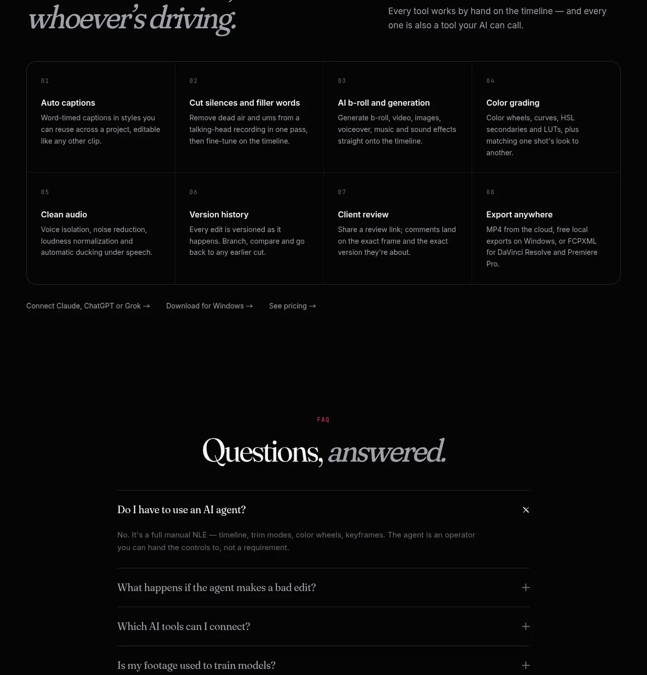
An eight-item capability matrix reassures users that the product remains a complete manual tool, not only an AI wrapper. The uniform grid makes a broad feature set scannable.
Prompt preview
## Reference images

Study these alongside the description below: hierarchy, rhythm, spacing, colour. Build for the product you are asked about, using this design language.

- Component: https://kage-design-assets.t3.tigrisfiles.io/components/arsaze/e4f15c51-7821-4e39-ba4c-e316208d7c18-1790748086-8.webp
- Full page it was cut from: https://kage-design-assets.t3.tigrisfiles.io/screenshots/arsaze/e4f15c51-7821-4e39-ba4c-e316208d7c18-1790748036683-full.webp
- Component on Kage: https://kage.design/component/arsaze-feature-grid-2

## Before you start
Ask what hands-on capabilities the user's product must support and which should be highlighted for trust. Build the matrix from those real capabilities.

Create a capability section with an editorial left-aligned heading, italic emphasis, and a bordered 4×2 matrix on desktop. Use a nearly black background, 1px charcoal borders, and equal cells with 24px padding. Each cell has a tiny two-digit index, a compact 15–16px title, and two lines of gray explanatory text. Keep typography restrained and technical: off-white titles, #8c878b body, tiny uppercase labels with letter spacing. Collapse to two columns then one on small screens, preserving borders without doubled lines. Include a quiet row of text links below only if useful, with pink hover underlines.

Never: use logos, product names, copy, illustrations, or imagery from the reference.
More components

 Three-step process cards
godaylight.com · Feature grid
Three-step process cards
godaylight.com · Feature grid

 Use-case selector with vertical video preview
Spira Maxima · Feature grid
Use-case selector with vertical video preview
Spira Maxima · Feature grid

 Insights and enterprise model access
FastRouter.ai · Feature grid
Insights and enterprise model access
FastRouter.ai · Feature grid
 Solutions by organizational role
FastRouter.ai · Feature grid
Solutions by organizational role
FastRouter.ai · Feature grid
 Routing reliability and model collaboration
FastRouter.ai · Feature grid
Routing reliability and model collaboration
FastRouter.ai · Feature grid
 Goal-oriented product capabilities
FastRouter.ai · Feature grid
Goal-oriented product capabilities
FastRouter.ai · Feature grid