 kage
kage
arsaze.com
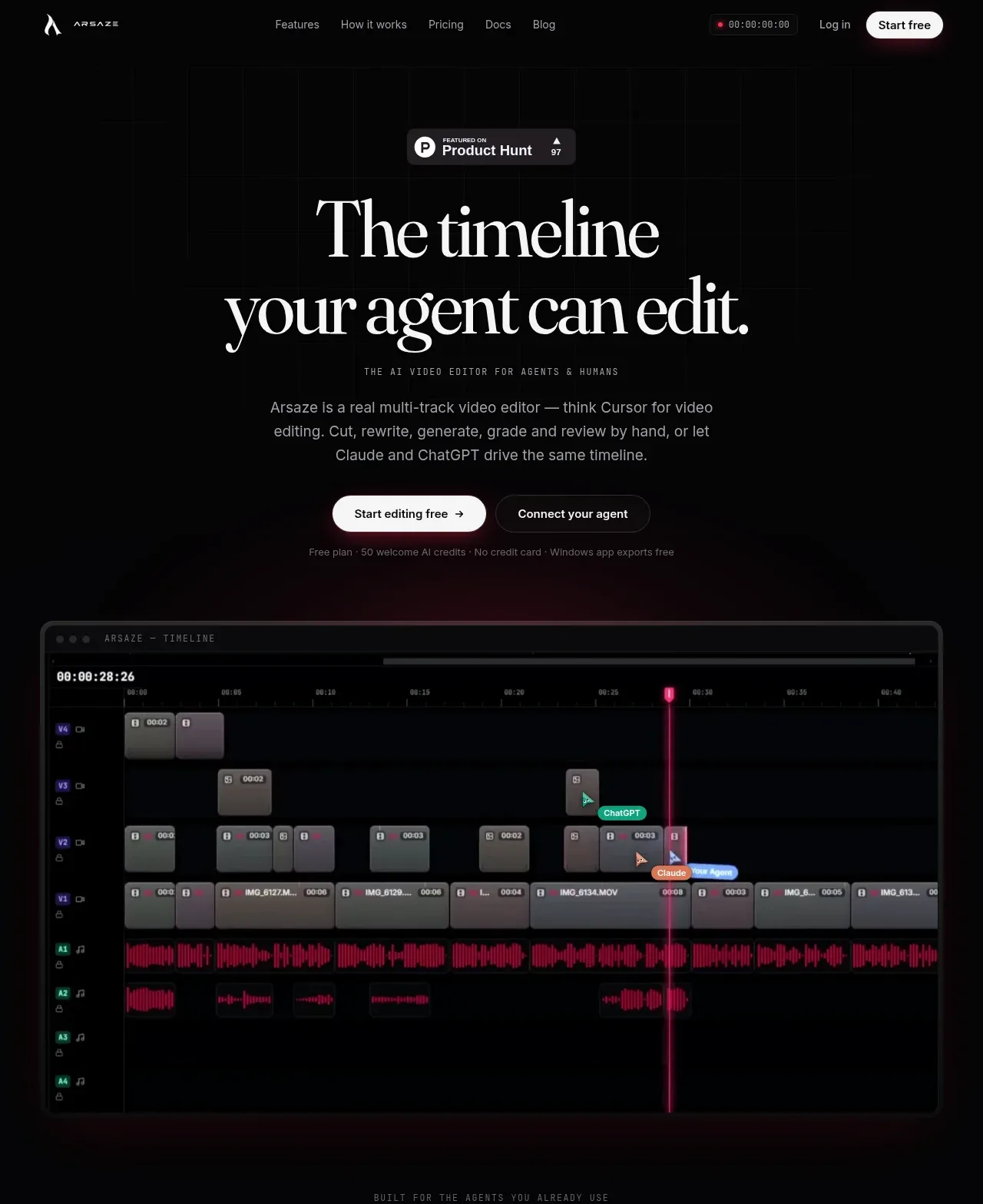
Design analysis
The hero uses a centered editorial serif headline, a small credibility badge, concise supporting copy, two CTAs, and a large dark application preview. The luminous pink accents and generous black space make the product visual feel premium.
Prompt preview
## Reference images

Study these alongside the description below: hierarchy, rhythm, spacing, colour. Build for the product you are asked about, using this design language.

- Component: https://kage-design-assets.t3.tigrisfiles.io/components/arsaze/e4f15c51-7821-4e39-ba4c-e316208d7c18-1790748083-1.webp
- Full page it was cut from: https://kage-design-assets.t3.tigrisfiles.io/screenshots/arsaze/e4f15c51-7821-4e39-ba4c-e316208d7c18-1790748036683-full.webp
- Component on Kage: https://kage.design/component/arsaze-hero

## Before you start
Ask what the user's product does, who the audience is, and which action matters most. Apply the following design logic to that brand and product.

Create a tall, centered hero on a near-black canvas (#050505). Start with a small neutral credibility or category badge, then use a very large high-contrast serif headline (roughly 56–76px desktop) with an italic serif emphasis line. Add a short muted-gray explanatory paragraph, a bright white rounded primary CTA, and a dark outlined secondary CTA. Include a wide product preview below the CTA inside a thin charcoal border (#25252a), 12–16px radius, soft pink/black atmospheric glow, and enough inner padding to feel like a real app window. Keep the content column narrow and the visual wide; use a mobile stack and scale the headline fluidly. Buttons should have subtle hover lift and the product preview should support a gentle reveal or glow, not distracting animation.

Never: use logos, product names, copy, illustrations, or imagery from the reference.
More components
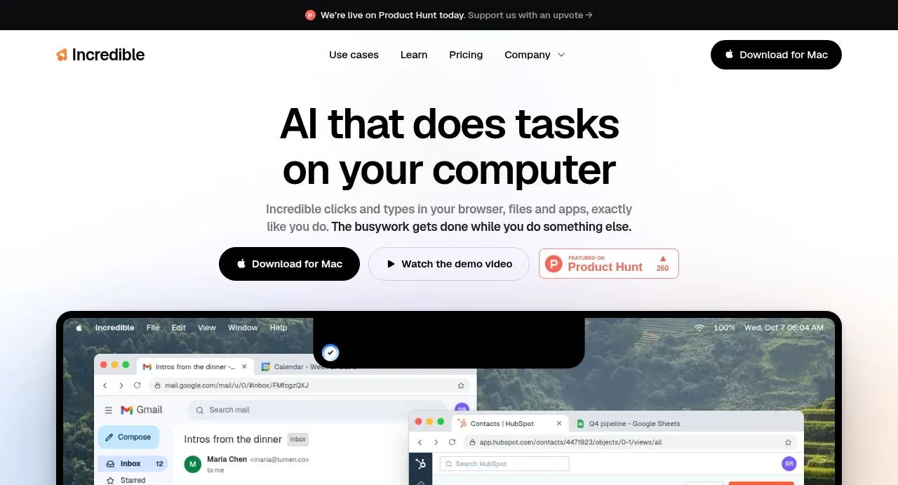
 AI workflow hero
Incredible · Hero
AI workflow hero
Incredible · Hero
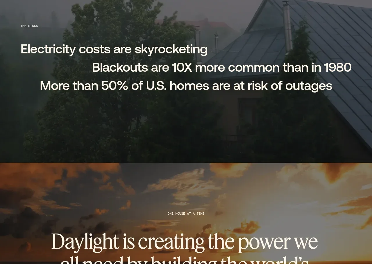
 Decentralized energy statement
godaylight.com · Hero
Decentralized energy statement
godaylight.com · Hero
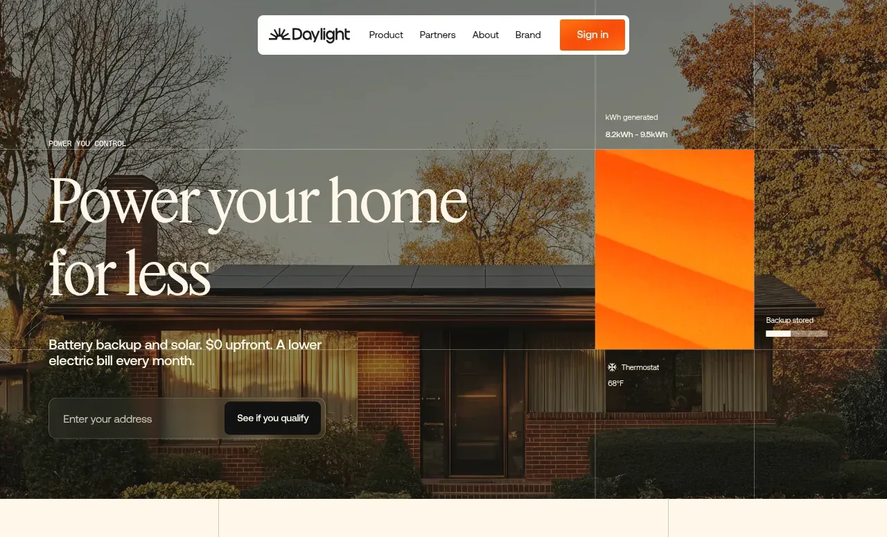 Photographic power-home hero
godaylight.com · Hero
Photographic power-home hero
godaylight.com · Hero
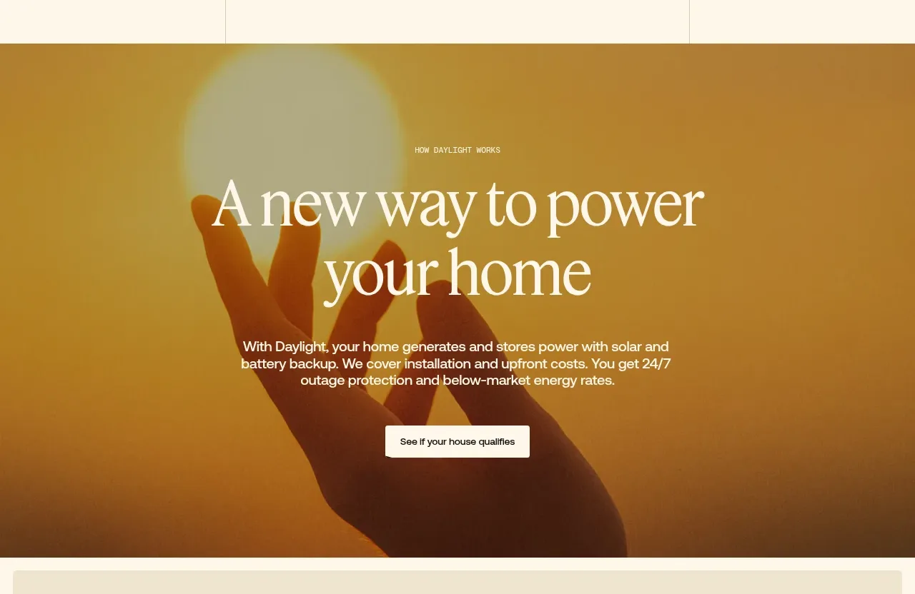 Warm mission statement panel
godaylight.com · Hero
Warm mission statement panel
godaylight.com · Hero
 Grid problem statement
godaylight.com · Hero
Grid problem statement
godaylight.com · Hero
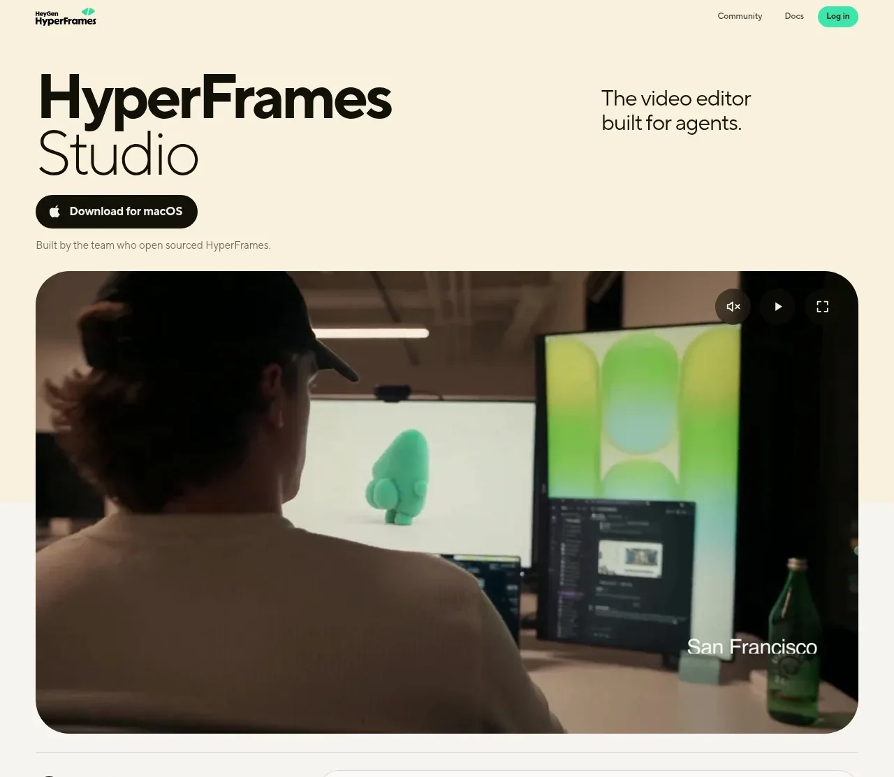
 Product hero with download action and video
HyperFrames Studio (Desktop) · Hero
Product hero with download action and video
HyperFrames Studio (Desktop) · Hero