 kage
kage
art4.app
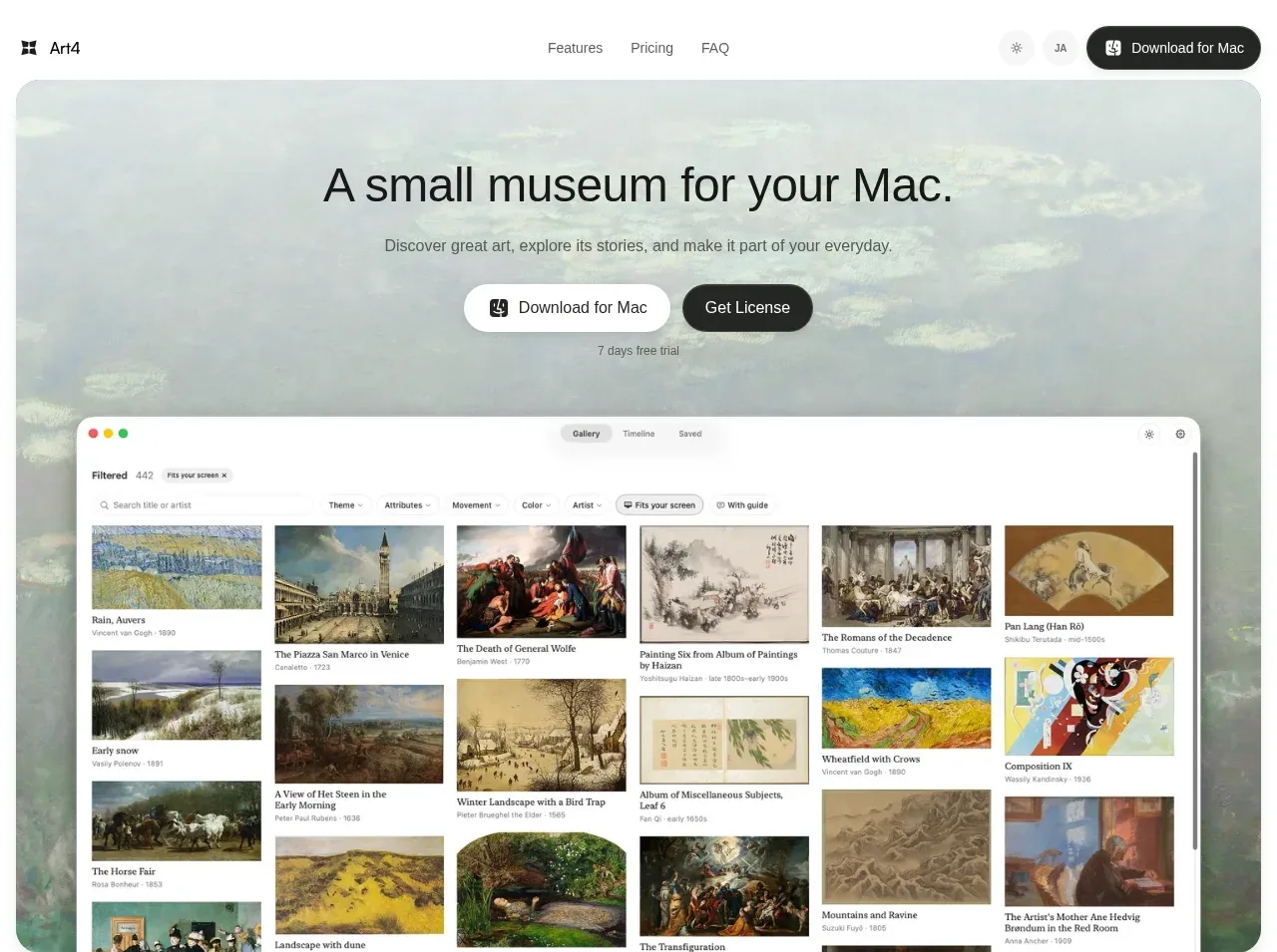
Design analysis
The hero uses a quiet artwork background, a concise promise, paired actions, and a large product preview to explain the app immediately while retaining an editorial mood.
Prompt preview
## Reference images

Study these alongside the description below: hierarchy, rhythm, spacing, colour. Build for the product you are asked about, using this design language.

- Component: https://kage-design-assets.t3.tigrisfiles.io/components/art4/7829dcfa-a9d2-43f5-a84e-0a12e7aa84a2-1791180358-1.webp
- Full page it was cut from: https://kage-design-assets.t3.tigrisfiles.io/screenshots/art4/7829dcfa-a9d2-43f5-a84e-0a12e7aa84a2-1791180184357-full.webp
- Component on Kage: https://kage.design/component/art4-hero

## Before you start
Ask what the user's product is, what outcome it creates, and what brand mood should guide the visual treatment. Apply the principles below to that product.

Create a rounded, full-width hero directly below the navigation. Use a softly muted, low-contrast background visual or texture behind the content, with a readable translucent or pale overlay if needed. Center a short, large headline around 34–42px, a restrained supporting sentence around 14–16px, and two actions: a light secondary action and a dark primary action. Add a small trial or reassurance line below. Place a large polished product preview in the lower half, with generous inset margins, rounded corners around 18–24px, and a soft shadow. Preserve a calm, museum-like rhythm: ample whitespace, black #151817 type, warm white surfaces, and muted gray #6d716f copy. The hero should make the first action obvious and remain responsive by stacking the controls and reducing the preview on mobile.

Never use logos, product names, copy, illustrations, or imagery from the reference.
More components
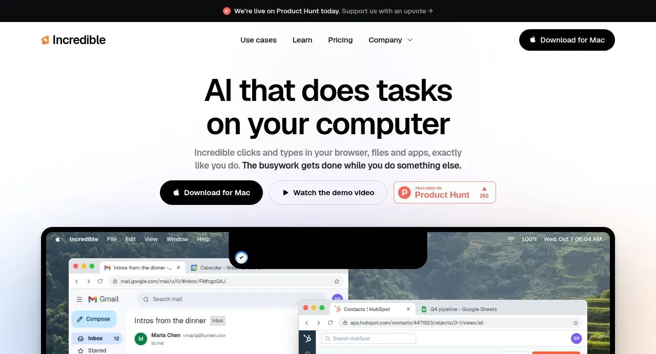
 AI workflow hero
Incredible · Hero
AI workflow hero
Incredible · Hero
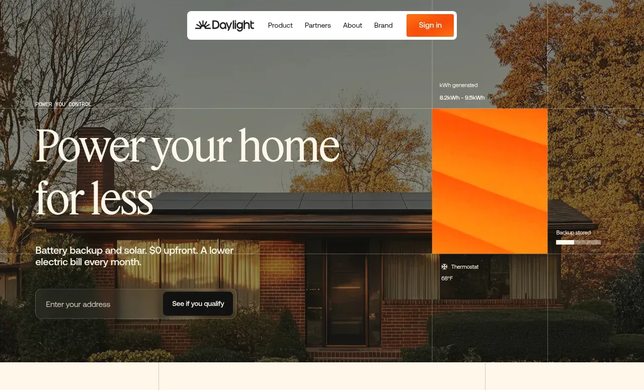
 Photographic power-home hero
godaylight.com · Hero
Photographic power-home hero
godaylight.com · Hero
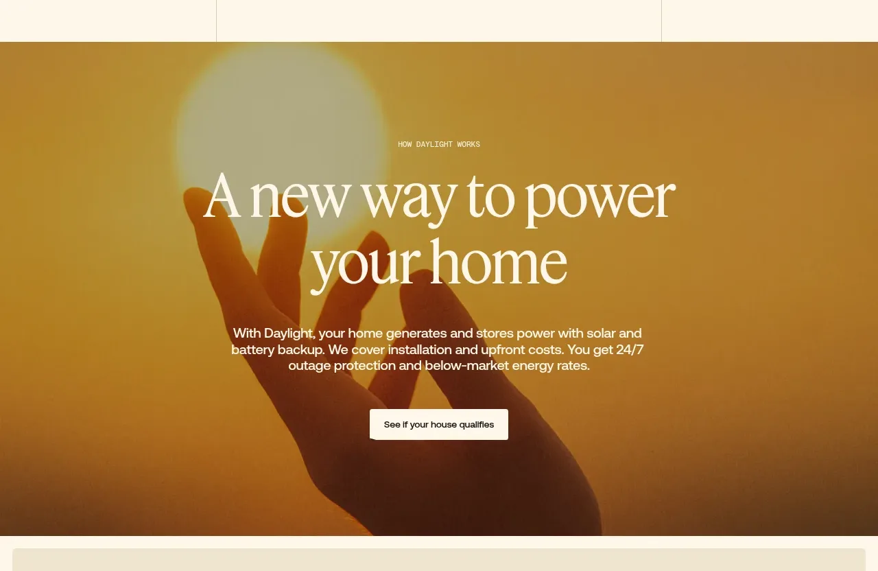 Warm mission statement panel
godaylight.com · Hero
Warm mission statement panel
godaylight.com · Hero
 Grid problem statement
godaylight.com · Hero
Grid problem statement
godaylight.com · Hero
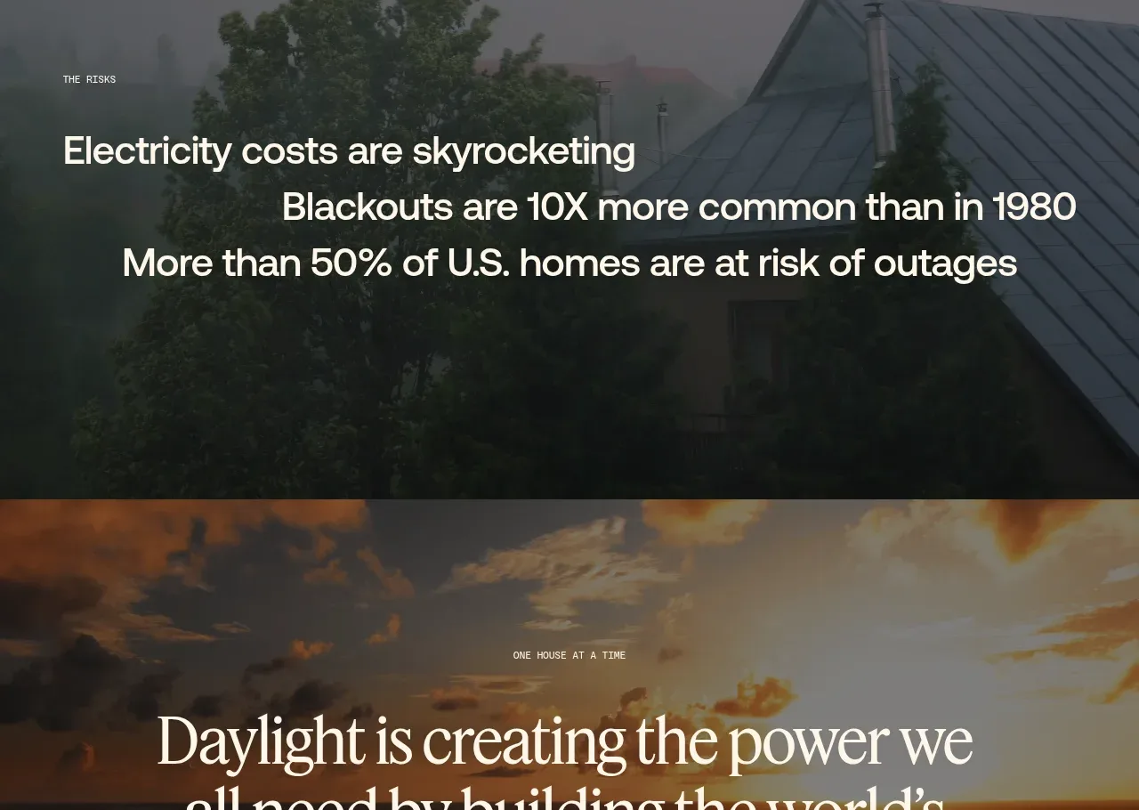 Decentralized energy statement
godaylight.com · Hero
Decentralized energy statement
godaylight.com · Hero
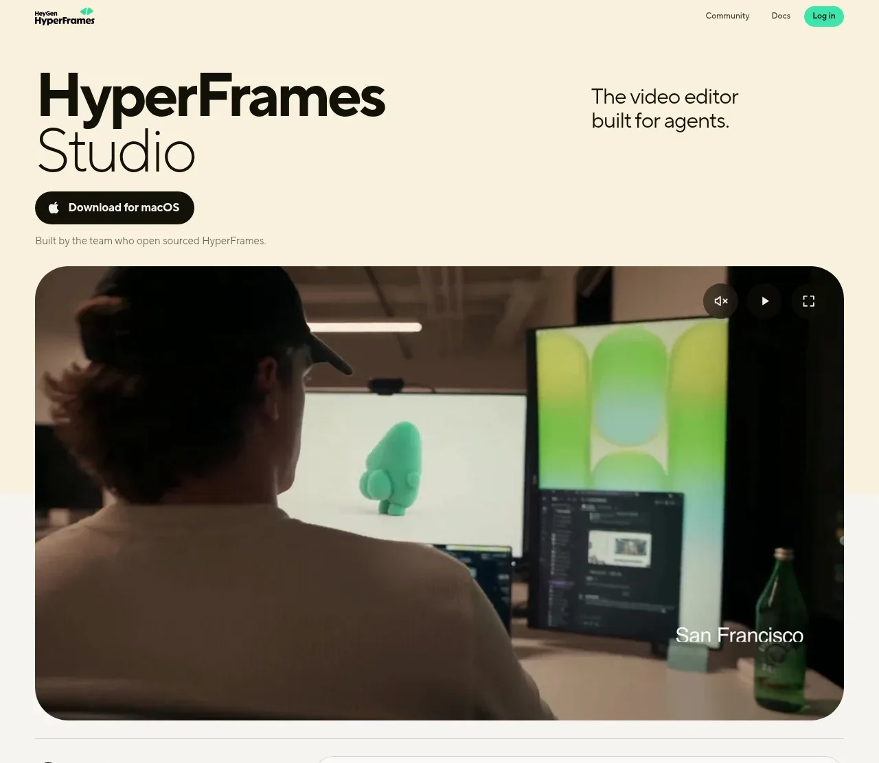
 Product hero with download action and video
HyperFrames Studio (Desktop) · Hero
Product hero with download action and video
HyperFrames Studio (Desktop) · Hero