 kage
kage
art4.app
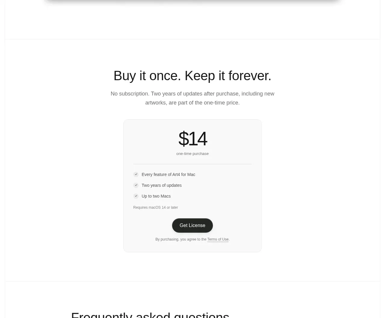
Design analysis
The pricing section makes the commercial model explicit with a plain-language heading, a single focused price card, a short benefits list, and one decisive purchase button.
Prompt preview
## Reference images

Study these alongside the description below: hierarchy, rhythm, spacing, colour. Build for the product you are asked about, using this design language.

- Component: https://kage-design-assets.t3.tigrisfiles.io/components/art4/7829dcfa-a9d2-43f5-a84e-0a12e7aa84a2-1791180359-4.webp
- Full page it was cut from: https://kage-design-assets.t3.tigrisfiles.io/screenshots/art4/7829dcfa-a9d2-43f5-a84e-0a12e7aa84a2-1791180184357-full.webp
- Component on Kage: https://kage.design/component/art4-pricing-table

## Before you start
Ask what the user's product costs, what is included, and whether it is a subscription, one-time purchase, or usage-based offer. Apply the principles below to that product.

Build a centered pricing section with a direct headline, a short clarification of the pricing model, and one dominant pricing card. Use a max-width around 760px for the section copy and a narrow card around 320–360px. The card should use an off-white #fafafa surface, a 1px #e6e7e5 border, 14–18px radius, and a subtle shadow. Make the price the strongest element at roughly 40–48px, add a small billing label, a thin divider, three to five concise benefits with check icons, qualification text, and a full-width or centered dark pill button. Keep the offer intentionally focused; if multiple plans are needed, retain the same hierarchy and make the recommended option unmistakable.

Never use logos, product names, copy, illustrations, or imagery from the reference.
More components
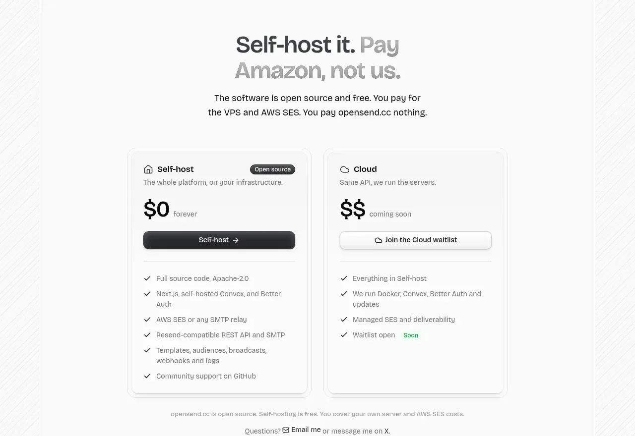
 Self-host versus cloud pricing
opensend.cc · Pricing table
Self-host versus cloud pricing
opensend.cc · Pricing table
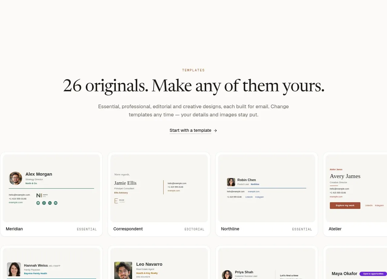
 Two-tier pricing table
esigna · Pricing table
Two-tier pricing table
esigna · Pricing table
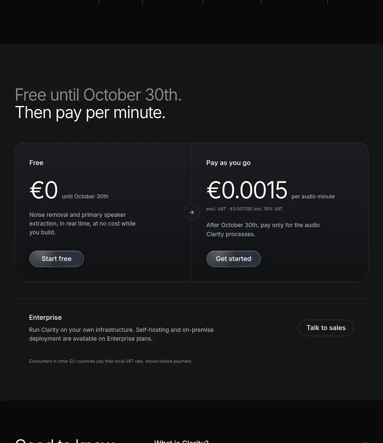
 Usage-based pricing
Clarity · Pricing table
Usage-based pricing
Clarity · Pricing table
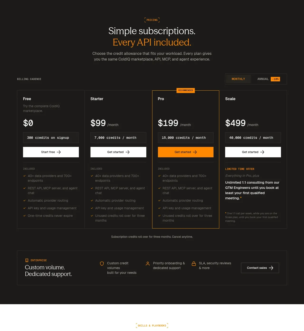
 Four-tier subscription pricing
ColdIQ x Slack · Pricing table
Four-tier subscription pricing
ColdIQ x Slack · Pricing table
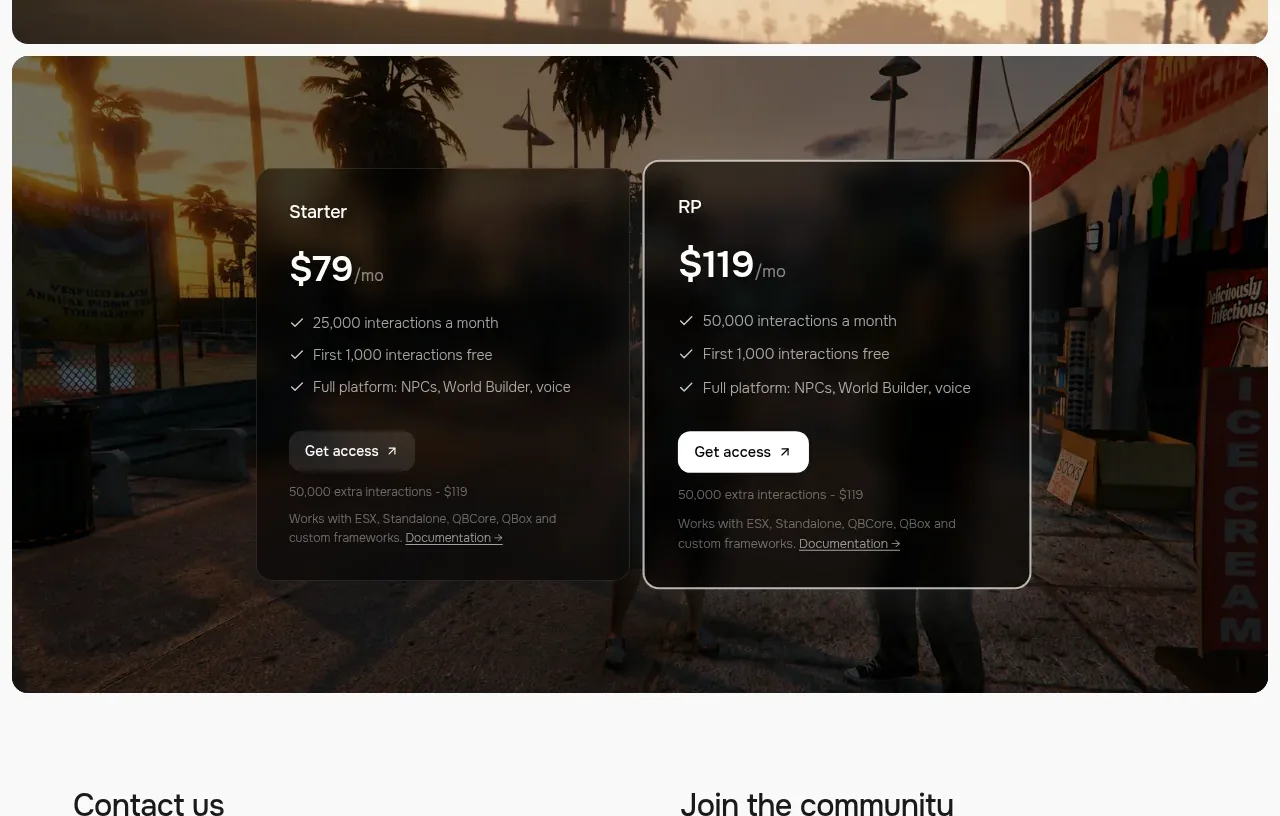
 Two-plan access pricing
Humalike x GTA RP · Pricing table
Two-plan access pricing
Humalike x GTA RP · Pricing table
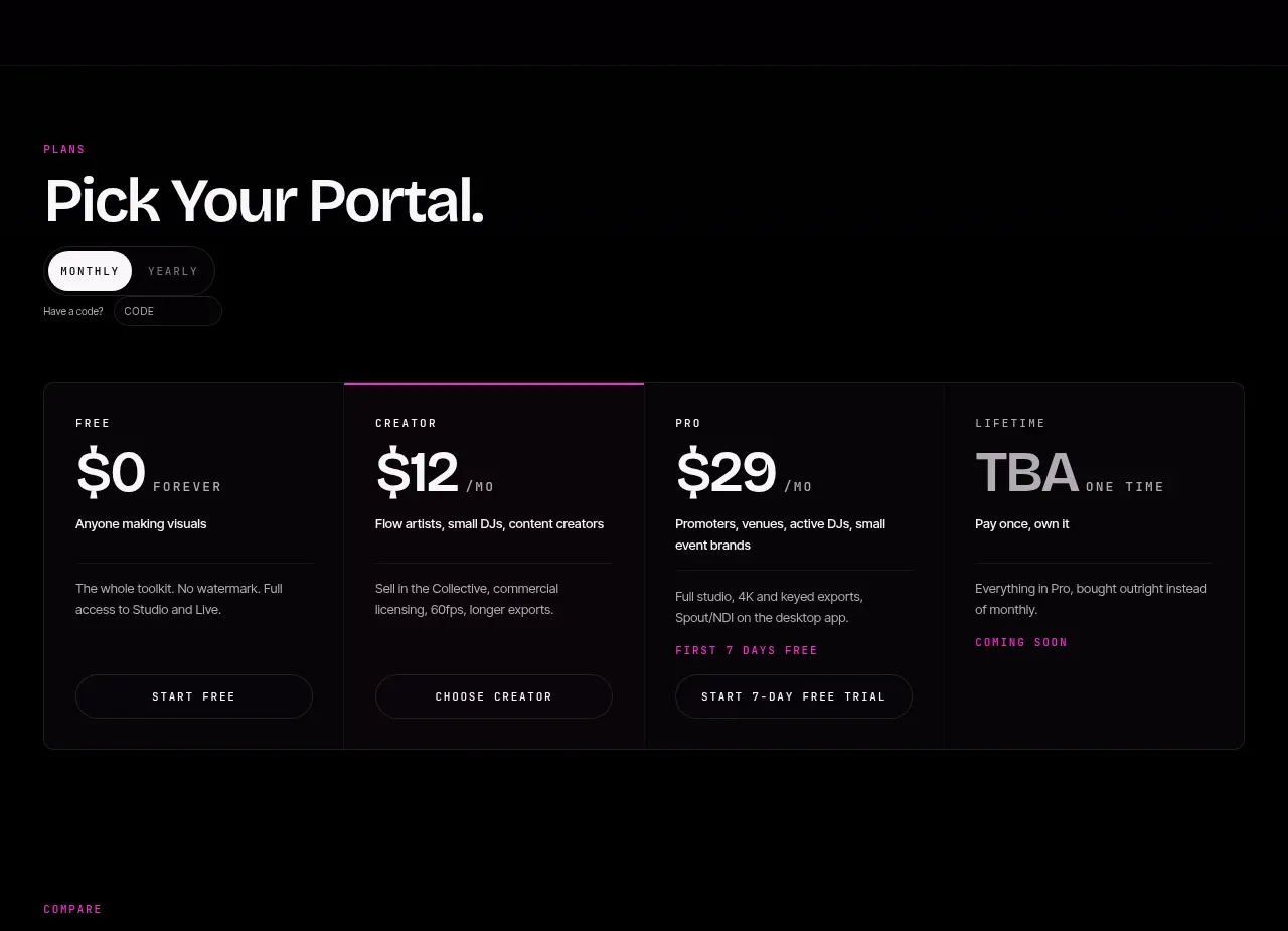
 Four-tier pricing selector
FRCTL · Pricing table
Four-tier pricing selector
FRCTL · Pricing table