 kage
kage
articos.com

Design analysis
A two-column problem section pairs a strong left-aligned argument with a restrained comparison graphic on the right, making the cost of the status quo tangible.
Prompt preview
## Reference images

Study these alongside the description below: hierarchy, rhythm, spacing, colour. Build for the product you are asked about, using this design language.

- Component: https://kage-design-assets.t3.tigrisfiles.io/components/articos-mcp/b74b5a52-121a-40b3-9410-436e13736de5-1791957711-3.webp
- Full page it was cut from: https://kage-design-assets.t3.tigrisfiles.io/screenshots/articos-mcp/b74b5a52-121a-40b3-9410-436e13736de5-1791957659853-full.webp
- Component on Kage: https://kage.design/component/articos-mcp-feature-grid

## Before you start
Ask what costly problem the user's product solves, what evidence supports it, and what visual comparison would make the problem immediately understandable.

Create a two-column problem section on a near-black background (`#0d0d0b`) with a warm editorial feel.

- Use a narrow uppercase eyebrow in muted gold (`#9e8840`), then a 32–44px ivory heading with a deliberate line break.
- Place 2–3 short paragraphs beneath in 13–15px text, around `#aaa69b`, with a maximum reading width of 360px.
- On the right, show a simple dark comparison or timeline graphic: subdued charcoal bars, one highlighted gold path, tiny labels, and a clear contrast between the old process and the improved one.
- Align the graphic vertically with the heading block and avoid decorative card chrome unless it helps explain the data.
- Use generous 96–140px section padding and a faint horizontal divider at the boundary.
- Collapse to one column on mobile, placing the explanatory text before the visual.

Never use logos, product names, copy, illustrations, or imagery from the reference.
More components
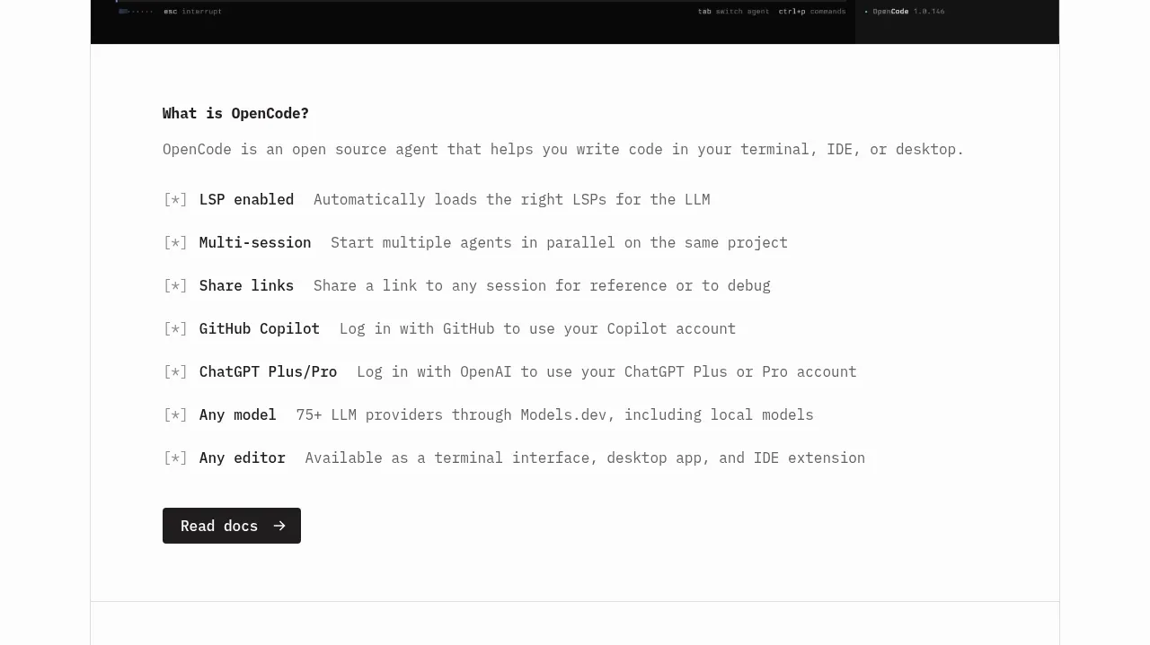
 Core capabilities overview
OpenCode 2.0 · Feature grid
Core capabilities overview
OpenCode 2.0 · Feature grid
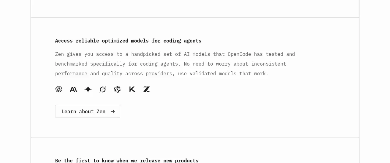 Model access feature block
OpenCode 2.0 · Feature grid
Model access feature block
OpenCode 2.0 · Feature grid

 Mobile capture workflow
Agent Craft · Feature grid
Mobile capture workflow
Agent Craft · Feature grid
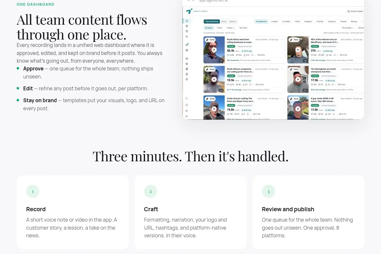 Unified dashboard workflow
Agent Craft · Feature grid
Unified dashboard workflow
Agent Craft · Feature grid
 Three-step operating model
Agent Craft · Feature grid
Three-step operating model
Agent Craft · Feature grid
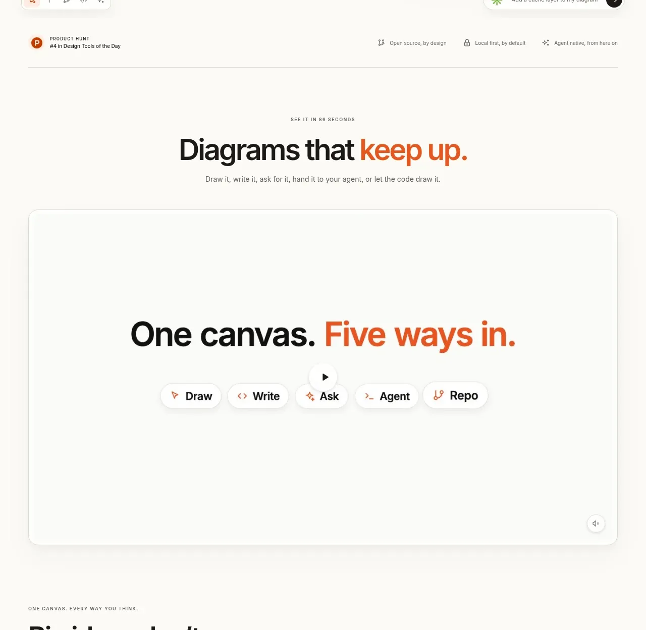
 Canvas modes showcase
OpenFlowKit 2 · Feature grid
Canvas modes showcase
OpenFlowKit 2 · Feature grid