 kage
kage
articos.com

Design analysis
A later editorial section explains the transformation from raw research to a shippable output through two numbered stages and lightweight abstract visualizations.
Prompt preview
## Reference images

Study these alongside the description below: hierarchy, rhythm, spacing, colour. Build for the product you are asked about, using this design language.

- Component: https://kage-design-assets.t3.tigrisfiles.io/components/articos-mcp/b74b5a52-121a-40b3-9410-436e13736de5-1791957712-5.webp
- Full page it was cut from: https://kage-design-assets.t3.tigrisfiles.io/screenshots/articos-mcp/b74b5a52-121a-40b3-9410-436e13736de5-1791957659853-full.webp
- Component on Kage: https://kage.design/component/articos-mcp-feature-grid-2

## Before you start
Ask what inputs become outputs in the user's product, what the two or three meaningful stages are, and what proof or artifact should be shown. Apply the structure to that journey.

Create an editorial “before and after” workflow section on a dark background around `#0d0d0b`.

- Begin with a small uppercase eyebrow and a large 34–48px heading that describes the outcome, using ivory `#eee9dd` and muted gold for labels.
- Present two numbered stages with generous separation: each stage has a tiny index, an eyebrow, a concise heading, and a short explanatory paragraph.
- Alternate text and visual emphasis between stages to create movement: one side can show a sparse scatter/network diagram, while the other shows a structured report or insight summary. Generate original CSS/SVG visuals only.
- Use thin rules around `#2a281f`, subtle gold highlights `#bda044`, and muted body copy `#aaa69d`.
- Keep the layout airy, with 96–140px vertical padding and at least 48px between stage groups.
- On mobile, stack each stage with its visual immediately after its text.

Never use logos, product names, copy, illustrations, or imagery from the reference.
More components
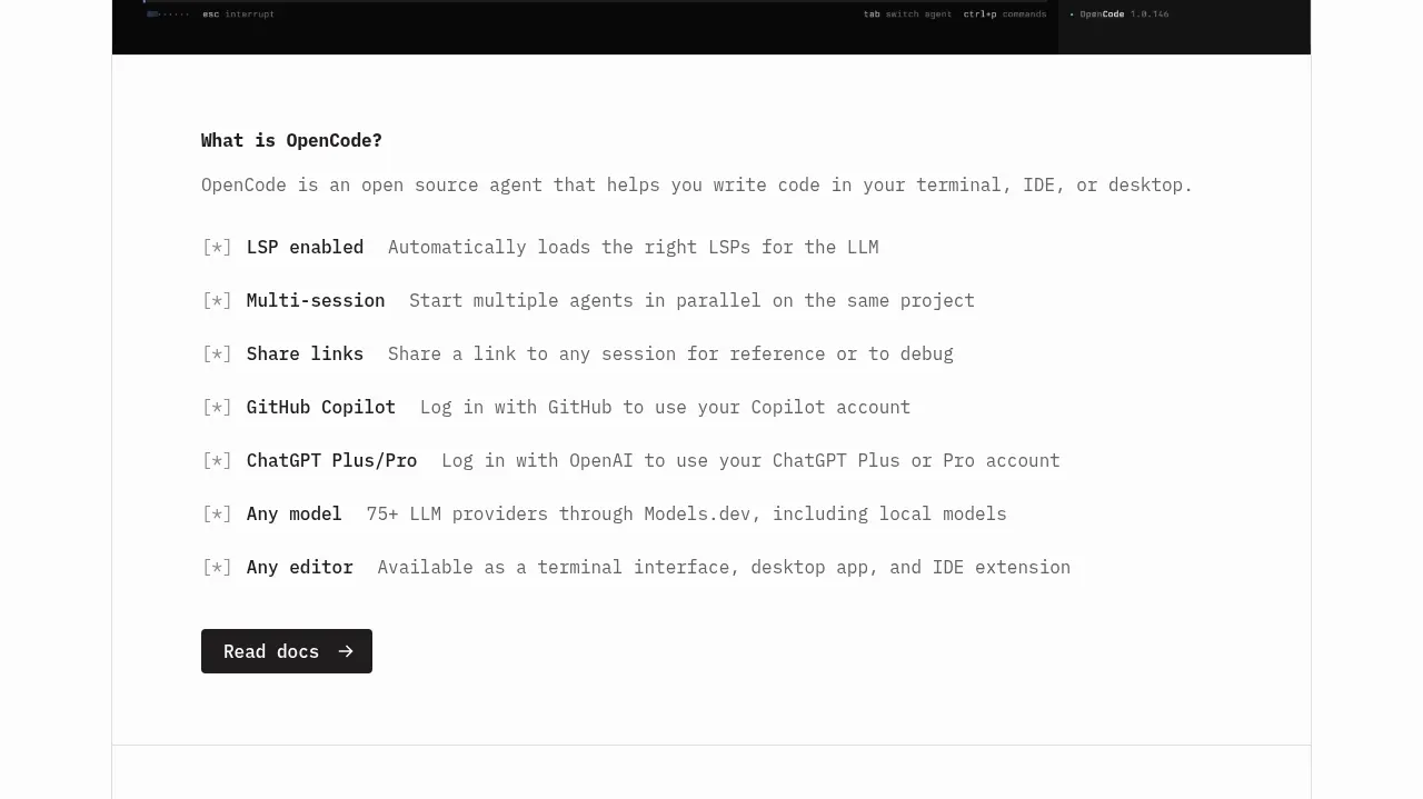
 Core capabilities overview
OpenCode 2.0 · Feature grid
Core capabilities overview
OpenCode 2.0 · Feature grid
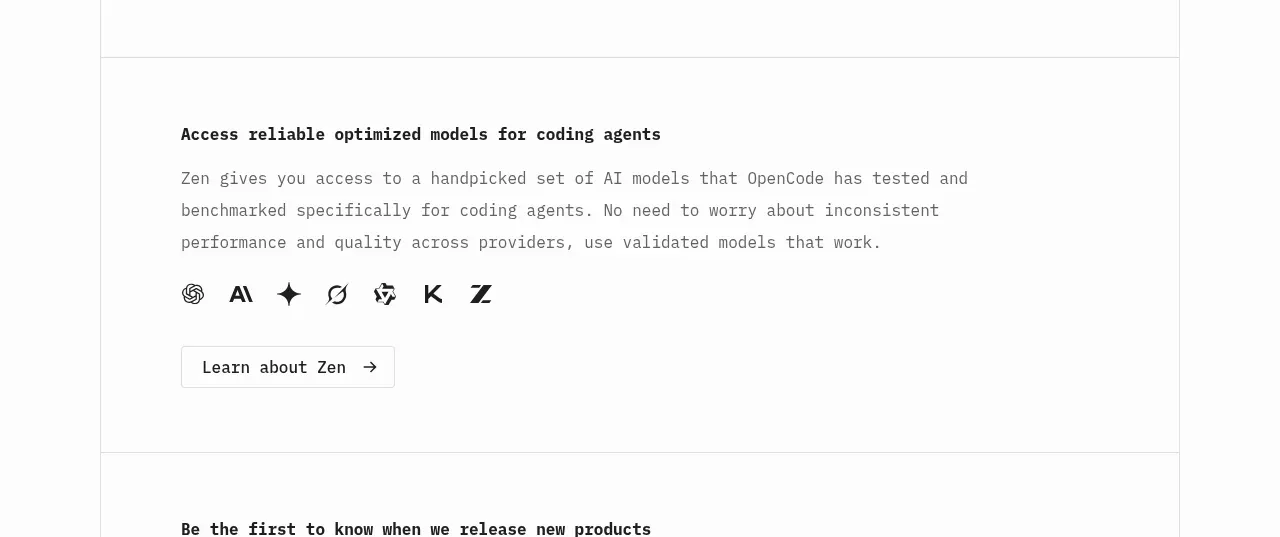 Model access feature block
OpenCode 2.0 · Feature grid
Model access feature block
OpenCode 2.0 · Feature grid

 Mobile capture workflow
Agent Craft · Feature grid
Mobile capture workflow
Agent Craft · Feature grid
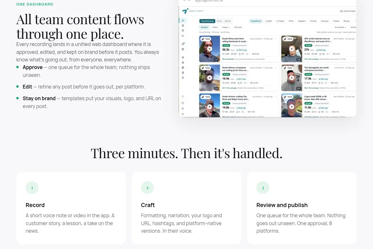 Unified dashboard workflow
Agent Craft · Feature grid
Unified dashboard workflow
Agent Craft · Feature grid
 Three-step operating model
Agent Craft · Feature grid
Three-step operating model
Agent Craft · Feature grid
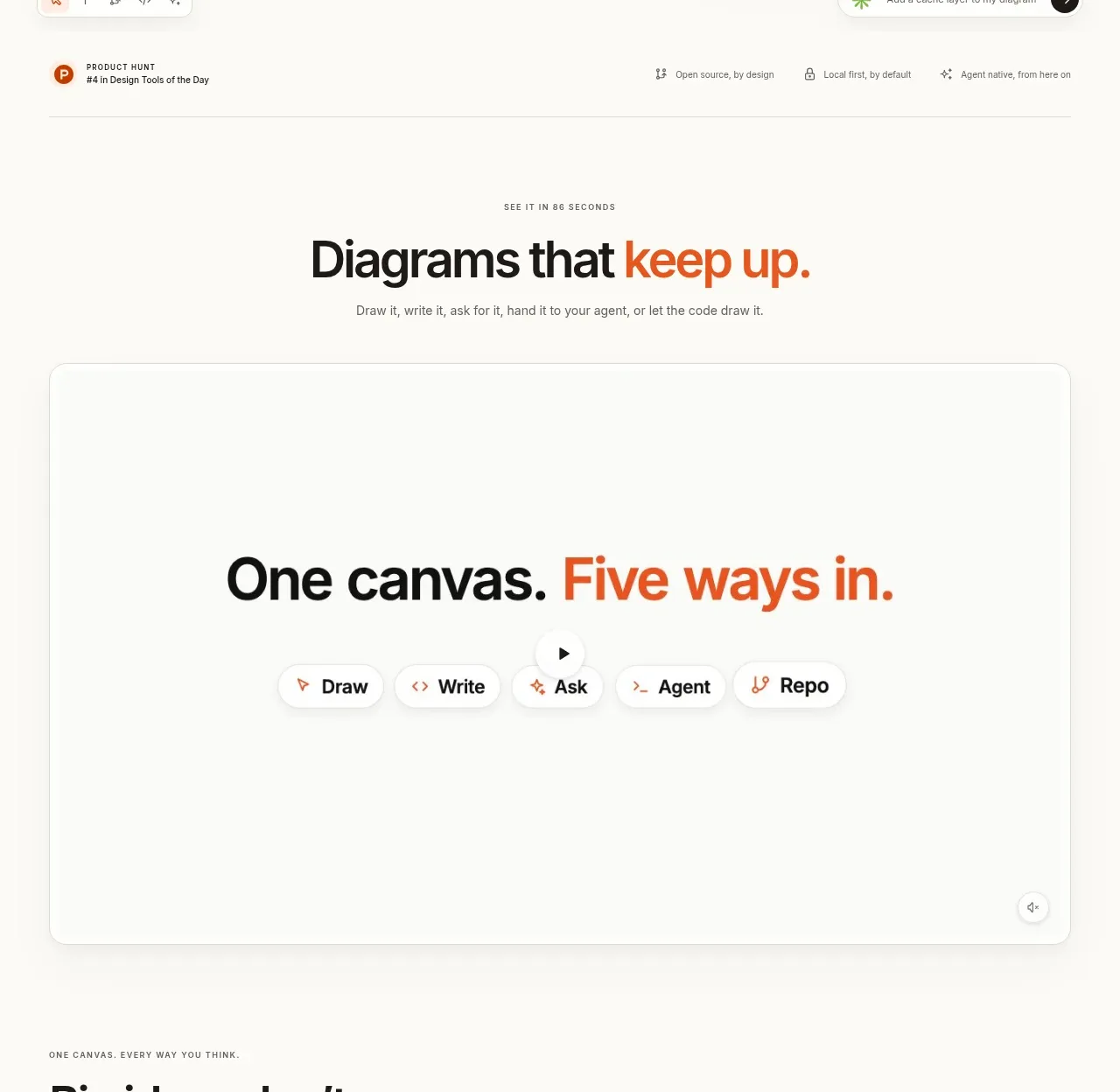
 Canvas modes showcase
OpenFlowKit 2 · Feature grid
Canvas modes showcase
OpenFlowKit 2 · Feature grid