kage
kage
aside.com
Design analysis
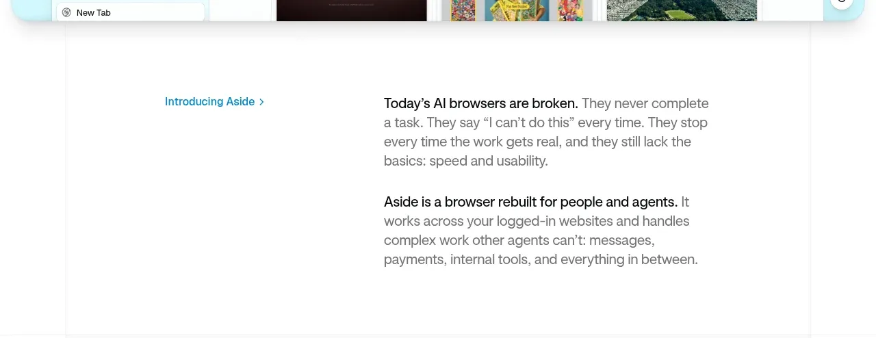
A restrained white editorial section uses a small blue label at left and a compact explanatory text block at right to establish the product category and point of view.
Prompt preview
## Reference images

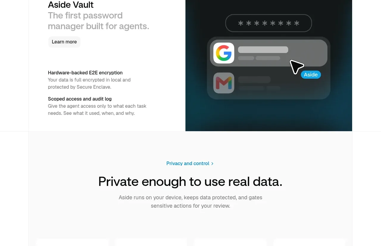
Study these alongside the description below: hierarchy, rhythm, spacing, colour. Build for the product you are asked about, using this design language.

- Component: https://kage-design-assets.t3.tigrisfiles.io/components/aside/f609b01b-1081-4ce1-af9f-cbdda1611f88-1789452074-2.webp
- Full page it was cut from: https://kage-design-assets.t3.tigrisfiles.io/screenshots/aside/f609b01b-1081-4ce1-af9f-cbdda1611f88-1789452037588-full.webp
- Component on Kage: https://kage.design/component/aside-card

## Before you start
Ask what misconception or customer pain the user's product addresses and what concise positioning statement should replace the example. Apply the principles below to that product.

Build a spacious editorial introduction on a white background. Use a two-column layout with a small accent label or linked section marker in the left column and two short paragraphs in the right column. Keep the content narrow and readable rather than filling the full viewport. Use blue accent text around #1685A5, body text #686868 at 15–17px with 1.45 line-height, and bold black lead-ins inside paragraphs. Leave large whitespace above and below; avoid cards, borders, and decorative imagery. On smaller screens, stack the label above the copy.

Never: copy logos, product names, copy, illustrations, or imagery from the reference.