kage
kage
aside.com
Design analysis
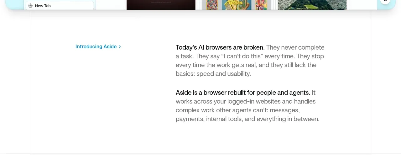
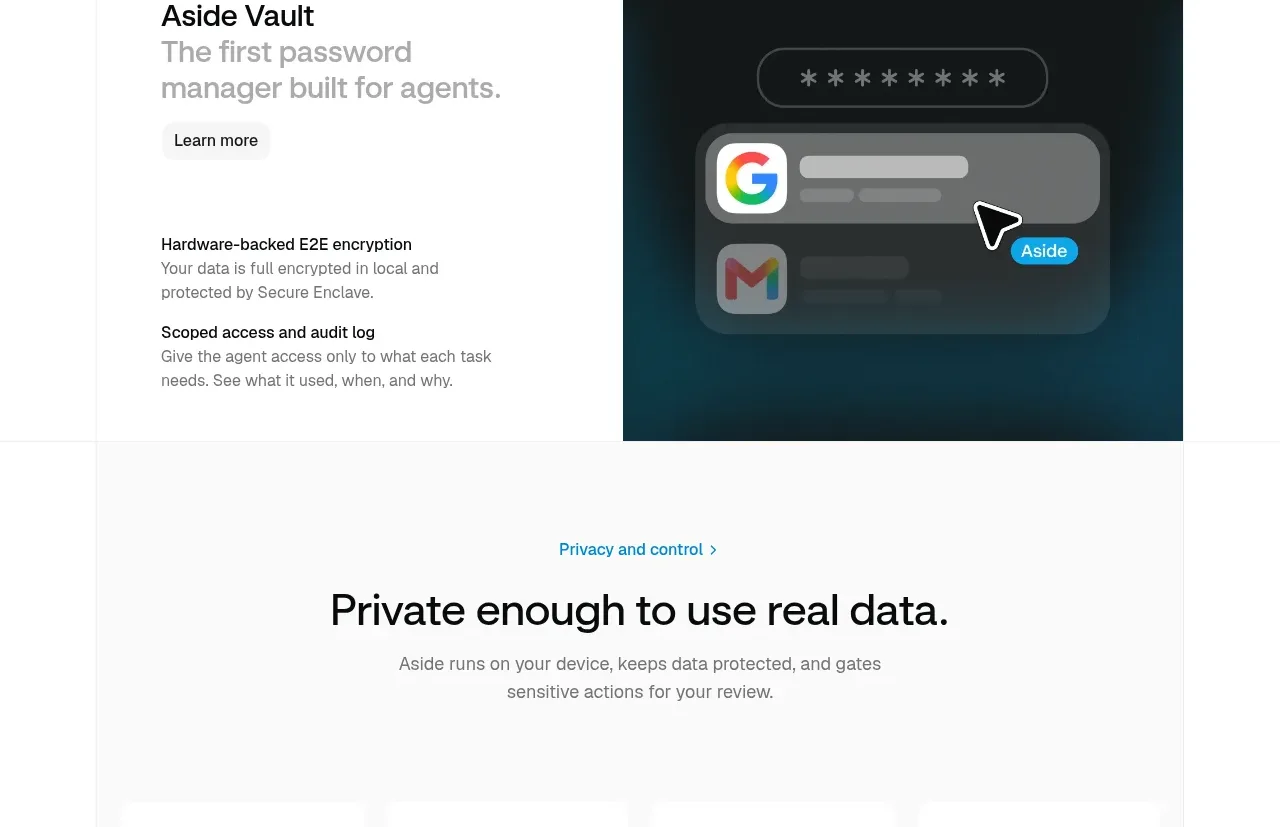
A dark visual panel balances a concise vault pitch and two supporting security principles, creating a distinct product spotlight after the introductory tiles.
Prompt preview
## Reference images

Study these alongside the description below: hierarchy, rhythm, spacing, colour. Build for the product you are asked about, using this design language.

- Component: https://kage-design-assets.t3.tigrisfiles.io/components/aside/f609b01b-1081-4ce1-af9f-cbdda1611f88-1789452076-7.webp
- Full page it was cut from: https://kage-design-assets.t3.tigrisfiles.io/screenshots/aside/f609b01b-1081-4ce1-af9f-cbdda1611f88-1789452037588-full.webp
- Component on Kage: https://kage.design/component/aside-card-2

## Before you start
Ask what adjacent product or premium capability should be spotlighted, its strongest promise, and the two proof points that support it. Apply the principles below to that product.

Create a split spotlight section with text on the left and a large original product visual on the right. Use a clear title, a softer secondary line, a compact pill link, and two stacked proof-point paragraphs with bold labels. The visual can be a dark interface abstraction using #11191A, deep teal #073A4B, soft gray controls, and one accent colour; it should communicate the concept without reproducing any reference UI. Keep the split balanced at roughly 42/58, use generous padding, and add a 16px radius only to the visual if desired. Maintain strong text hierarchy with 26–32px heading and 14–16px body. Stack vertically on small screens.

Never: copy logos, product names, copy, illustrations, or imagery from the reference.