 kage
kage
aside.com
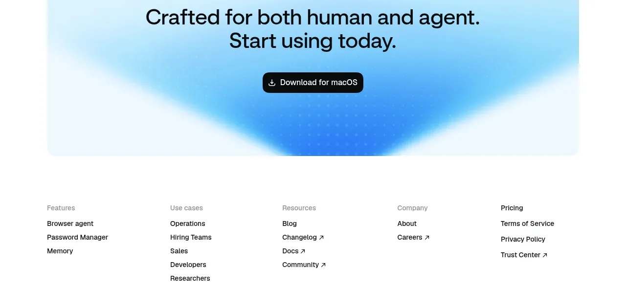
Design analysis
A rounded, atmospheric blue panel closes the marketing story with one direct promise and a repeated download action.
Prompt preview
## Reference images

Study these alongside the description below: hierarchy, rhythm, spacing, colour. Build for the product you are asked about, using this design language.

- Component: https://kage-design-assets.t3.tigrisfiles.io/components/aside/f609b01b-1081-4ce1-af9f-cbdda1611f88-1789452077-9.webp
- Full page it was cut from: https://kage-design-assets.t3.tigrisfiles.io/screenshots/aside/f609b01b-1081-4ce1-af9f-cbdda1611f88-1789452037588-full.webp
- Component on Kage: https://kage.design/component/aside-cta

## Before you start
Ask what final action the user's product wants visitors to take and what concise motivating promise should sit above it. Apply the principles below to that product.

Create a contained closing CTA with generous vertical padding, centered headline, and one primary button. Use a pale cyan background #DDF6FB with a soft radial blue glow toward the lower center, keeping the treatment abstract and original. The headline should be 30–40px, black, tightly set over one or two lines; the button should be a black #111111 pill with white text and an optional download icon. Give the panel a 16px radius, keep its width inset from the page edges, and preserve ample whitespace. Add hover elevation or colour transition to the button, and ensure the layout remains centered on mobile.

Never: copy logos, product names, copy, illustrations, or imagery from the reference.
More components
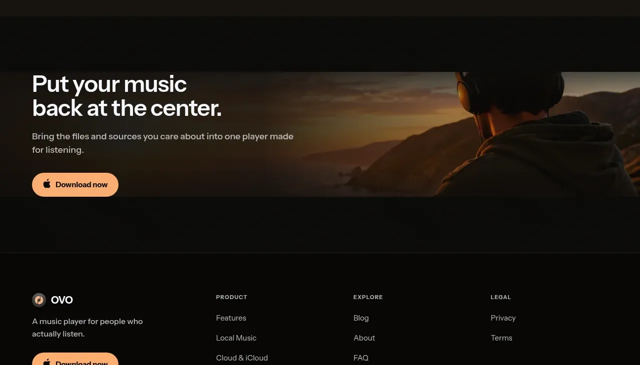
 Closing download call to action
OVO · Call to action
Closing download call to action
OVO · Call to action
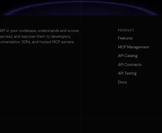
 Final conversion CTA
Elva · Call to action
Final conversion CTA
Elva · Call to action

 Download call to action
Oats · Call to action
Download call to action
Oats · Call to action

 Website migration CTA
Neopress · Call to action
Website migration CTA
Neopress · Call to action
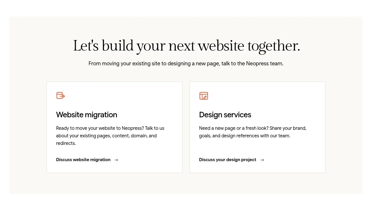 Build or migrate services CTA
Neopress · Call to action
Build or migrate services CTA
Neopress · Call to action
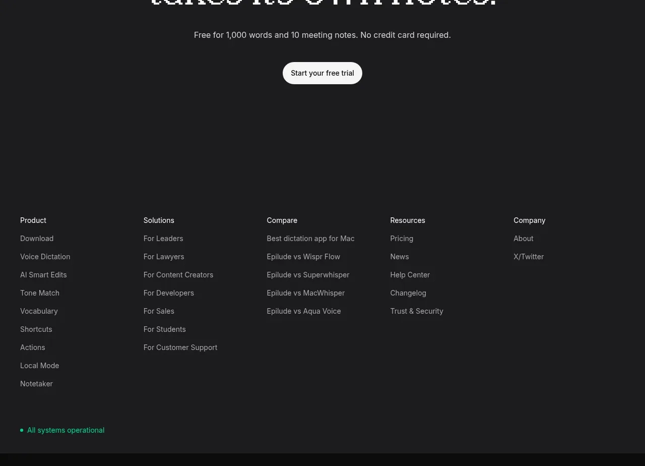
 Final trial call to action
Epilude Notetaker · Call to action
Final trial call to action
Epilude Notetaker · Call to action