 kage
kage
aside.com
Design analysis
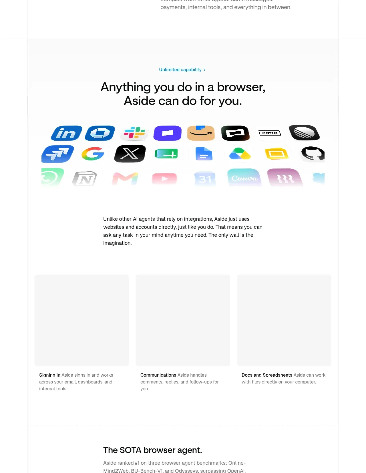
A capability statement is followed by a broad, fading field of application icons and then three plain-language capability columns, making breadth feel tangible without dense UI.
Prompt preview
## Reference images

Study these alongside the description below: hierarchy, rhythm, spacing, colour. Build for the product you are asked about, using this design language.

- Component: https://kage-design-assets.t3.tigrisfiles.io/components/aside/f609b01b-1081-4ce1-af9f-cbdda1611f88-1789452075-3.webp
- Full page it was cut from: https://kage-design-assets.t3.tigrisfiles.io/screenshots/aside/f609b01b-1081-4ce1-af9f-cbdda1611f88-1789452037588-full.webp
- Component on Kage: https://kage.design/component/aside-feature-grid

## Before you start
Ask what the user's product can do across tools or workflows and which three capability themes matter most. Apply the principles below to that product.

Create a feature section with a centered blue eyebrow, a large centered two-line heading, and a visual breadth moment beneath it. Represent integrations or supported contexts using original abstract app tiles, generic glyphs, or user-provided assets arranged in loose rows with a soft fade toward the bottom; do not rely on copied logos. Follow with a short centered explanation and a three-column grid of plain text feature summaries. Use white #FFFFFF, near-black #111111 headings, muted #666666 body text, and a restrained cyan accent #1685A5. Keep the grid airy with 28–40px column gaps and no card chrome; use subtle dividers only if needed. On mobile, collapse to one column and reduce the icon field density.

Never: copy logos, product names, copy, illustrations, or imagery from the reference.







