 kage
kage
aside.com
Design analysis
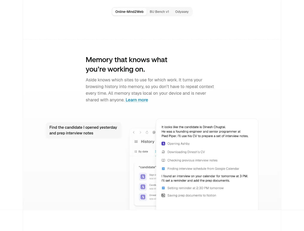
A focused feature block explains contextual memory with a headline and supporting copy above a wide, lightly framed workflow demonstration.
Prompt preview
## Reference images

Study these alongside the description below: hierarchy, rhythm, spacing, colour. Build for the product you are asked about, using this design language.

- Component: https://kage-design-assets.t3.tigrisfiles.io/components/aside/f609b01b-1081-4ce1-af9f-cbdda1611f88-1789452075-5.webp
- Full page it was cut from: https://kage-design-assets.t3.tigrisfiles.io/screenshots/aside/f609b01b-1081-4ce1-af9f-cbdda1611f88-1789452037588-full.webp
- Component on Kage: https://kage.design/component/aside-feature-grid-2

## Before you start
Ask what recurring context your user's product remembers or automates and what workflow should be demonstrated. Apply the principles below to that product.

Create a single-feature showcase. Align a concise headline and explanatory paragraph to a readable left column, with a subtle accent link for deeper information. Below or beside it, show an original workflow mockup inside a large pale panel: use neutral browser chrome, small cards, and a visible progression from request to result. Keep the background #FFFFFF, panel #FAFAFA, borders #E8E8E8, text #111111/#707070, and accent blue #1685A5. Use 14–18px body copy, 28–36px heading, 16px radius, and a very soft shadow. The mockup should feel like evidence, not decoration, and should collapse below the copy on mobile.

Never: copy logos, product names, copy, illustrations, or imagery from the reference.







