 kage
kage
aside.com
Design analysis
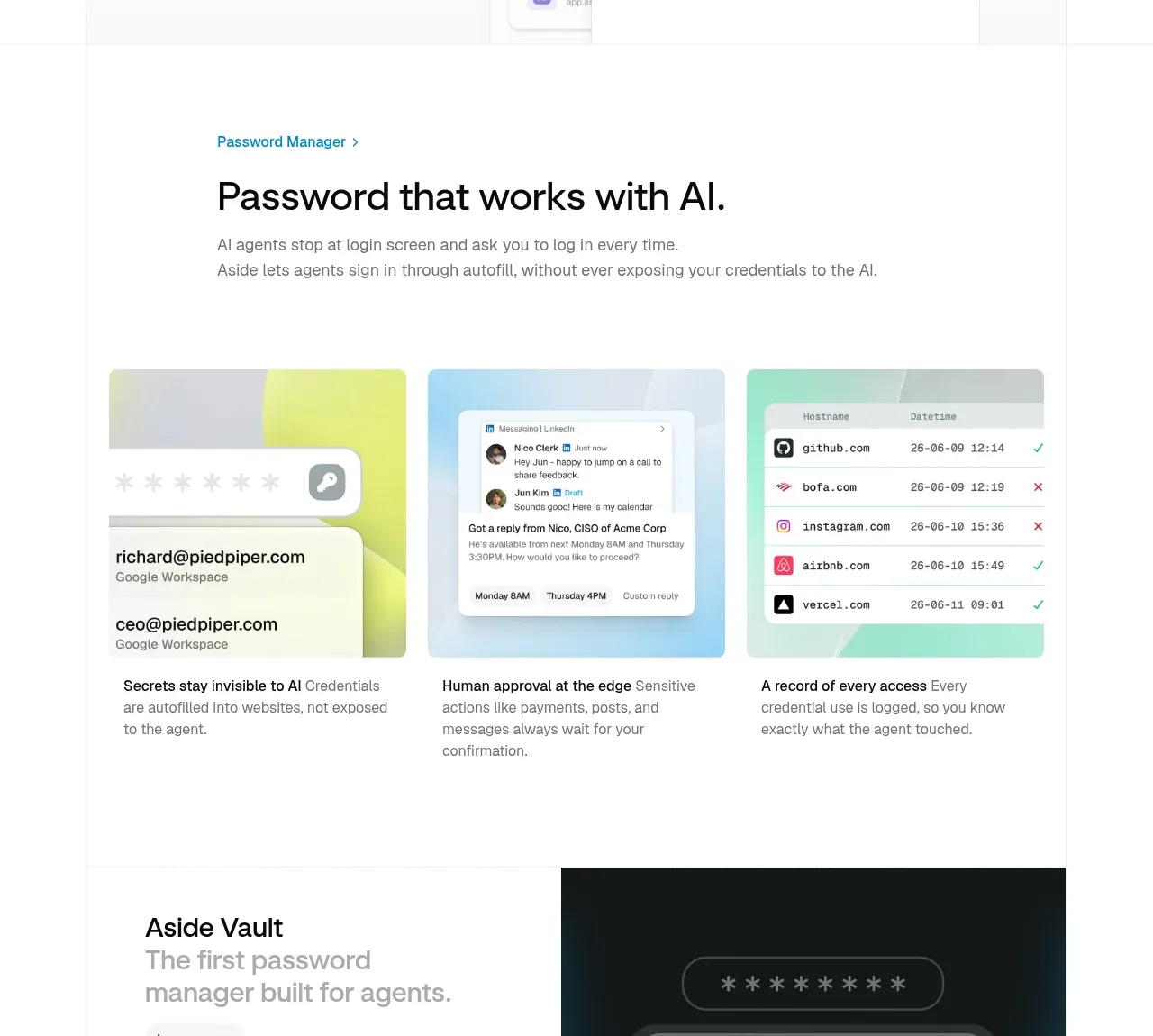
A security-oriented section introduces password assistance with a large heading, then presents three visual tiles explaining invisible credentials, human approval, and access records.
Prompt preview
## Reference images

Study these alongside the description below: hierarchy, rhythm, spacing, colour. Build for the product you are asked about, using this design language.

- Component: https://kage-design-assets.t3.tigrisfiles.io/components/aside/f609b01b-1081-4ce1-af9f-cbdda1611f88-1789452076-6.webp
- Full page it was cut from: https://kage-design-assets.t3.tigrisfiles.io/screenshots/aside/f609b01b-1081-4ce1-af9f-cbdda1611f88-1789452037588-full.webp
- Component on Kage: https://kage.design/component/aside-feature-grid-3

## Before you start
Ask what security capability the user's product provides and which three benefits need to be understood at a glance. Apply the principles below to that product.

Build a feature introduction followed by a three-column visual grid. Start with a small blue eyebrow, a strong left-aligned headline, and a short explanatory sentence. Each tile should have an original abstract image or UI illustration in a softly tinted rectangle, then a short bold lead-in and muted explanatory copy. Use pale lime, sky, and mint backgrounds around #EEF2C8, #DDF1FA, and #D9F4E9, with 12–16px rounded corners. Keep tile text black #111111 and gray #707070, align all media heights, and use 18–24px gaps. On mobile, stack tiles while preserving consistent image aspect ratios.

Never: copy logos, product names, copy, illustrations, or imagery from the reference.







