kage
kage
aside.com
Design analysis
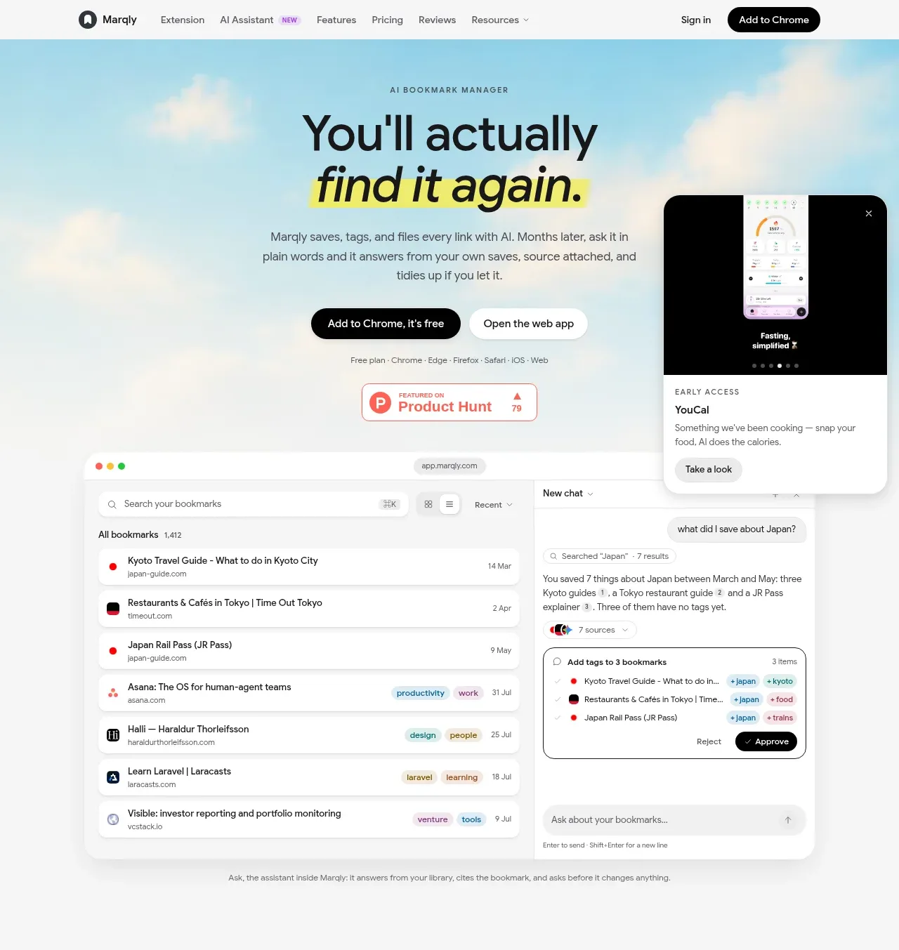
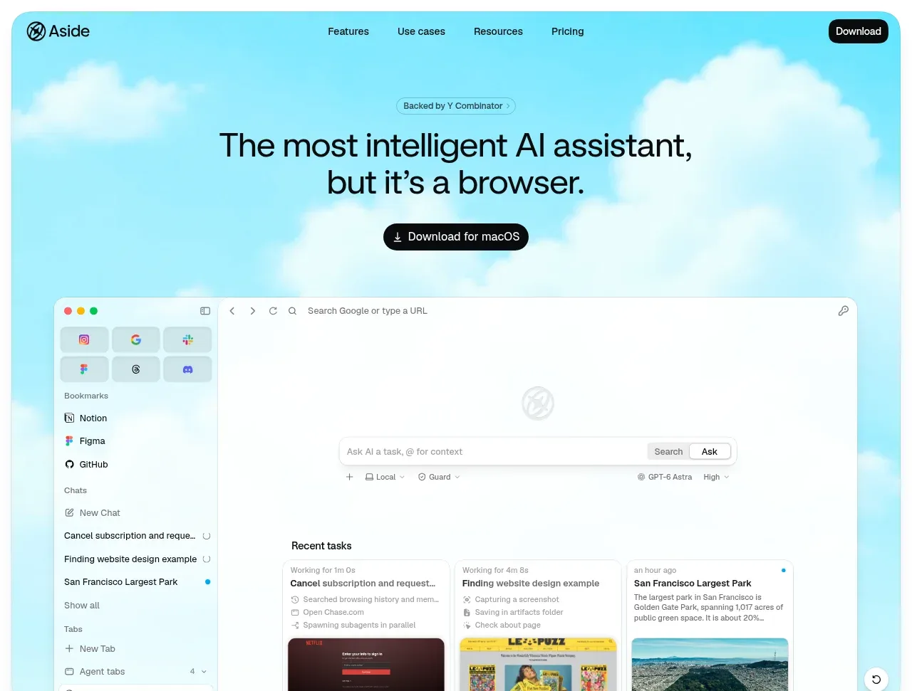
A bright sky-blue, cloud-like hero pairs a short eyebrow with a large two-line promise, a dark download CTA, and a large browser product visual that anchors the page.
Prompt preview
## Reference images

Study these alongside the description below: hierarchy, rhythm, spacing, colour. Build for the product you are asked about, using this design language.

- Component: https://kage-design-assets.t3.tigrisfiles.io/components/aside/f609b01b-1081-4ce1-af9f-cbdda1611f88-1789452074-1.webp
- Full page it was cut from: https://kage-design-assets.t3.tigrisfiles.io/screenshots/aside/f609b01b-1081-4ce1-af9f-cbdda1611f88-1789452037588-full.webp
- Component on Kage: https://kage.design/component/aside-hero

## Before you start
Ask what the user's product is, what outcome it promises, and what brand colours and visual asset are available. Apply the principles below to that product rather than reproducing the reference.

Create an immersive hero directly below the navigation. Use a pale cyan-to-sky gradient background around #BDEFF8, with soft blurred white cloud forms or abstract atmospheric shapes rather than literal copied artwork. Center a small rounded eyebrow, a large two-line headline, one concise supporting line if needed, and a dark pill-shaped primary CTA. Place the product UI mockup below the CTA, centered and wide, with enough overlap into the lower hero to create depth. Headline typography should be black #0B0B0C, 36–46px desktop, tight line-height around 1.05, and medium-to-bold weight. Use 24–32px vertical gaps, a 16px radius on the mockup, subtle shadow, and responsive stacking. The CTA should be #111111 with white text and a download/icon affordance.

Never: copy logos, product names, copy, illustrations, or imagery from the reference.