kage
menlo.ai
Design analysis
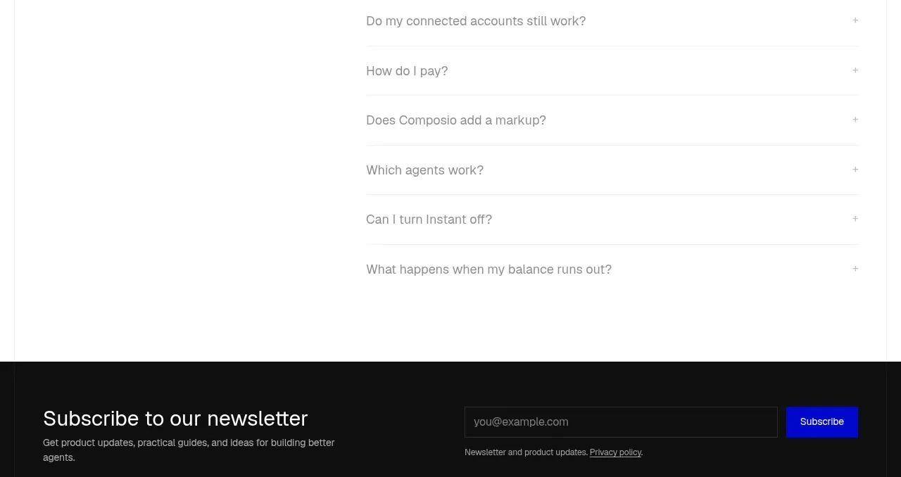
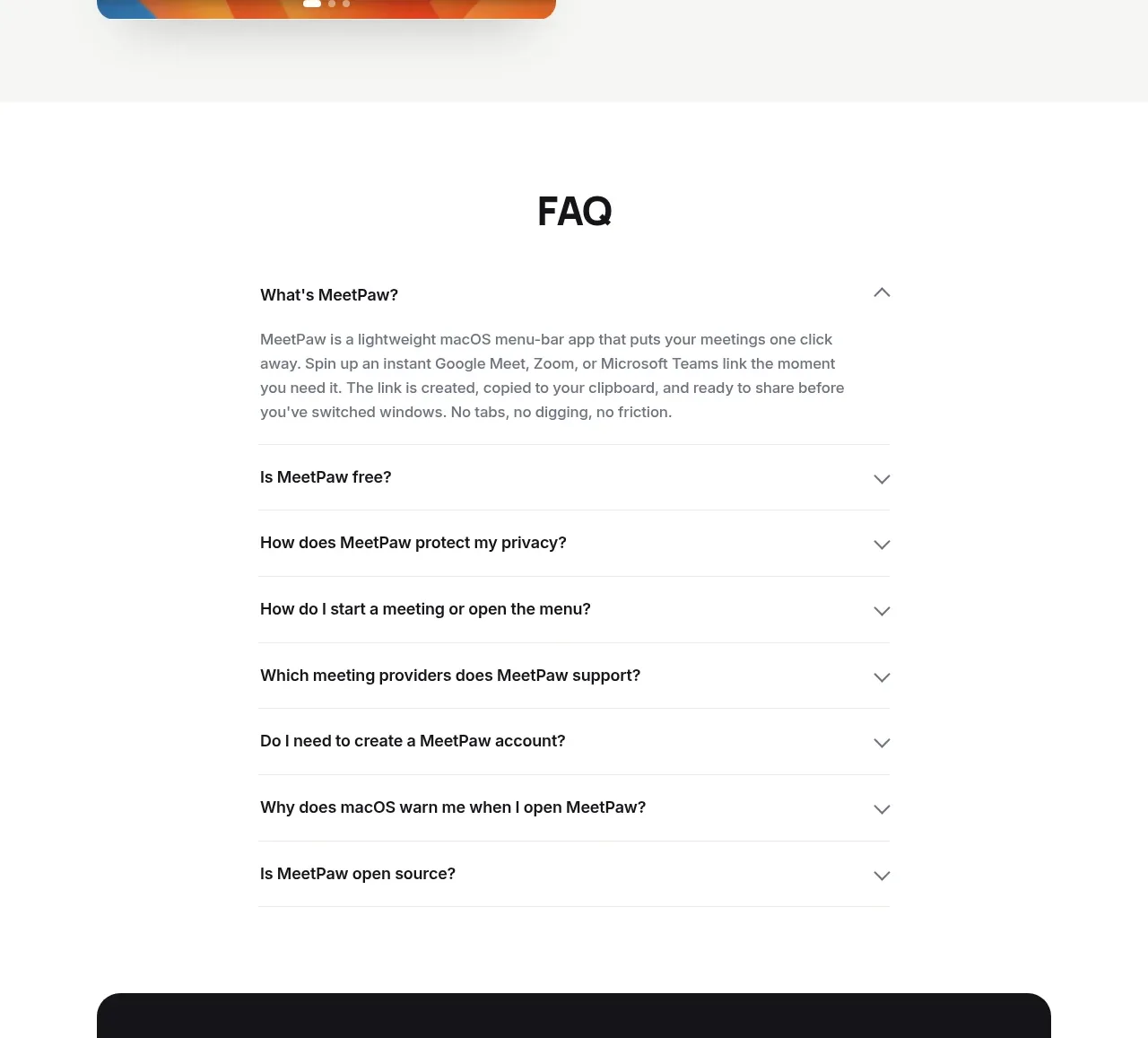
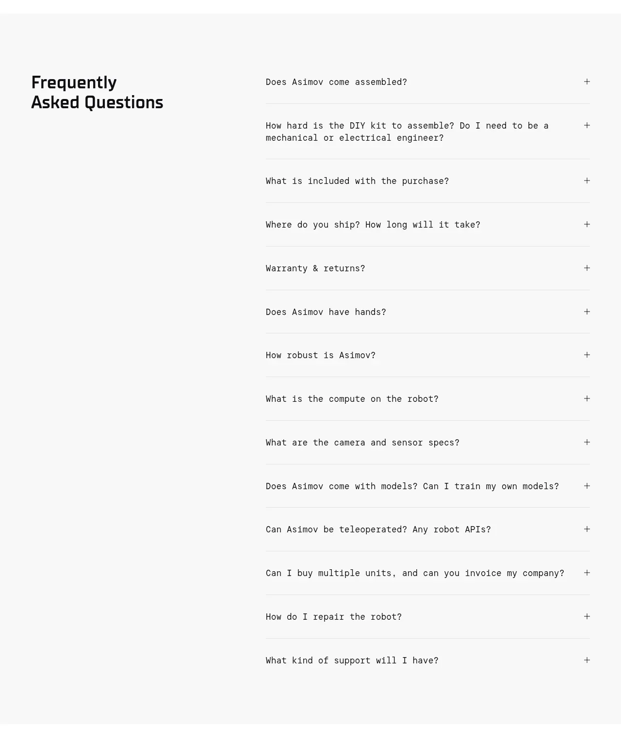
A pale FAQ band uses a strong left-hand heading and a long, neatly ruled accordion list on the right, keeping many practical objections easy to scan.
Prompt preview
## Reference images

Study these alongside the description below: hierarchy, rhythm, spacing, colour. Build for the product you are asked about, using this design language.

- Component: https://kage-design-assets.t3.tigrisfiles.io/components/asimov-1/d16421bf-78be-4064-9aab-fabd3467d820-1792562775-8.webp
- Full page it was cut from: https://kage-design-assets.t3.tigrisfiles.io/screenshots/asimov-1/d16421bf-78be-4064-9aab-fabd3467d820-1792562736076-full.webp
- Component on Kage: https://kage.design/component/asimov-1-faq

## Before you start
Ask what the user's product, audience, and brand are, then apply the principles below to that product rather than reproducing this reference.

Build a two-column FAQ section on a very light grey background (#f7f7f6). Place a large two-line heading in the left column and a vertically stacked accordion list in the right column. Each question row should have compact technical typography, generous 20–28px vertical padding, a 1px divider in #dededb, and a plus/minus control aligned to the far right. Only one item needs to be open initially, or keep all closed for a clean overview. Animate height and icon rotation accessibly, support keyboard focus, and stack the heading above the questions on mobile. Use near-black headings, #555 body text, and a restrained accent for focus states.

Never: use the reference logo, product name, exact questions, illustrations, imagery, or branded assets.