kage
getinboxzero.com
Design analysis
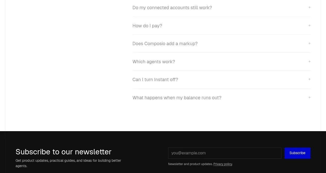
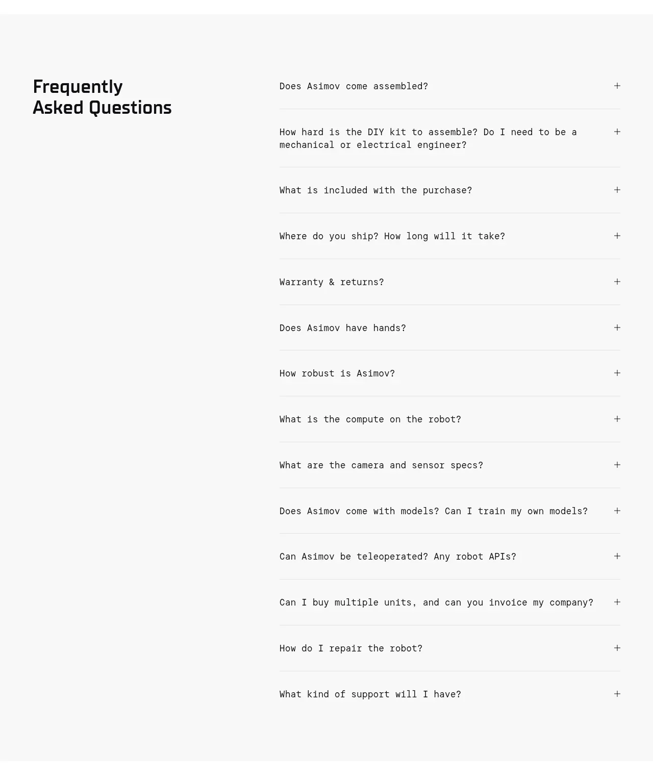
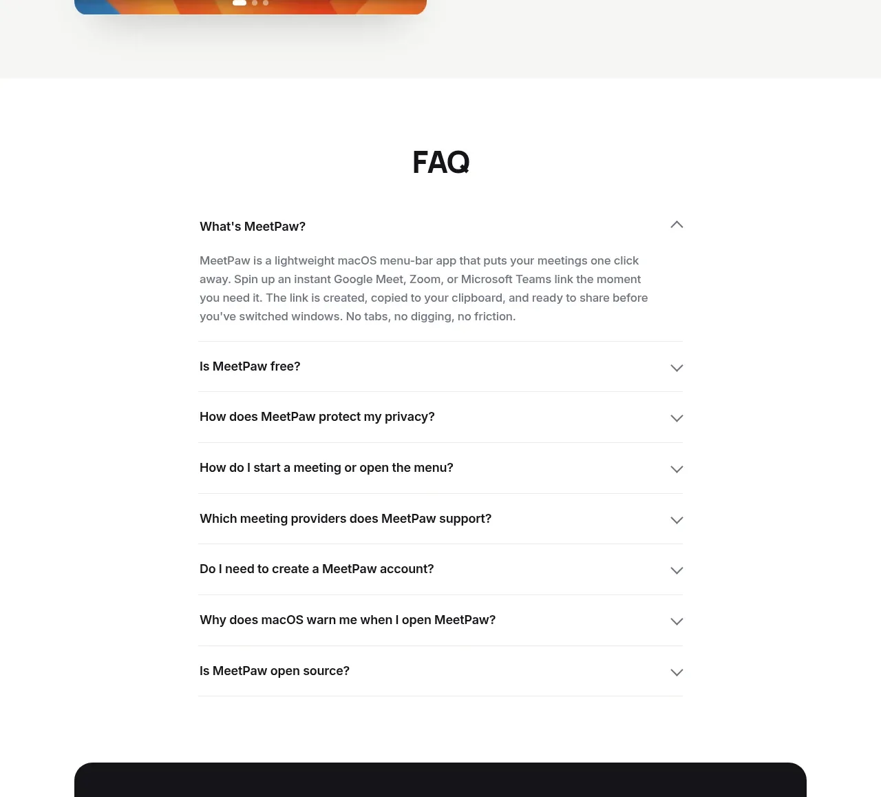
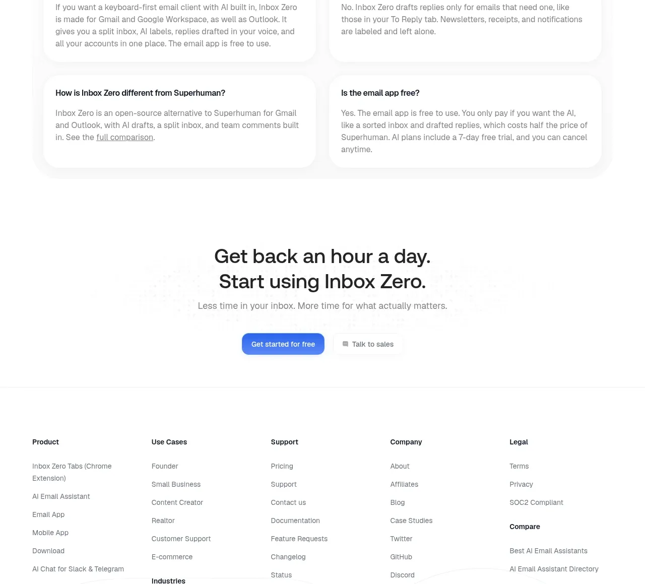
A centered FAQ heading is followed by a spacious two-column grid of rounded answer cards, covering product fit, pricing, AI behavior, and differentiation.
Prompt preview
## Reference images

Study these alongside the description below: hierarchy, rhythm, spacing, colour. Build for the product you are asked about, using this design language.

- Component: https://kage-design-assets.t3.tigrisfiles.io/components/inbox-zero/752b92b1-2db1-4db8-be4f-72f48a430ed6-1792389760-9.webp
- Full page it was cut from: https://kage-design-assets.t3.tigrisfiles.io/screenshots/inbox-zero/752b92b1-2db1-4db8-be4f-72f48a430ed6-1792389697138-full.webp
- Component on Kage: https://kage.design/component/inbox-zero-faq

## Before you start
Ask what the user's product and brand are, then apply the principles below to that product rather than reproducing this reference.

Create an FAQ section with a centered heading and a two-column grid of six rounded question-and-answer cards. Each card should use a clear semibold question, a readable gray answer, generous line height, and consistent height/padding. Use #202020 headings, #737373 answers, white cards, #f0f0f0 borders, 16px radius, and a very subtle shadow. On mobile, switch to one column; optionally make each item an accessible accordion with visible plus/minus controls, but preserve the airy card rhythm. Keep the section width constrained for comfortable reading.

Never use the reference's logo, product name, copy, illustrations, or imagery.