kage
composio.dev
Design analysis
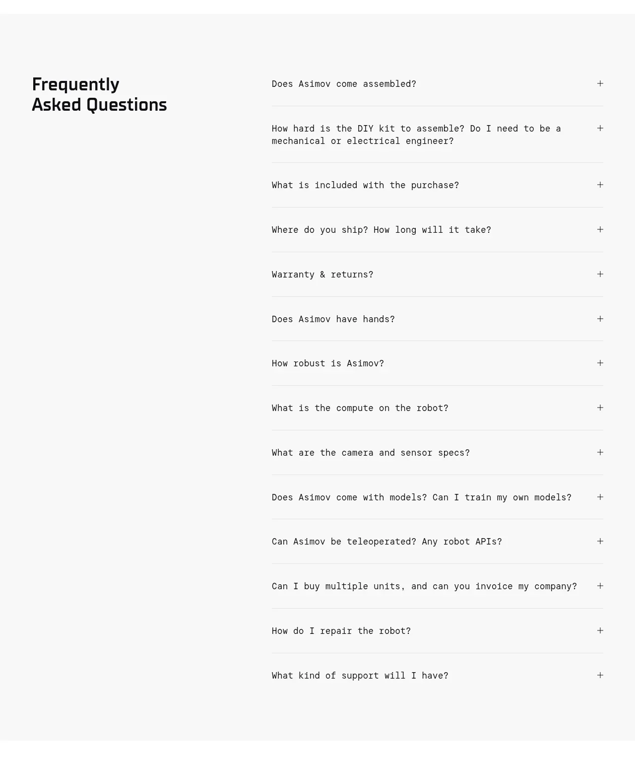
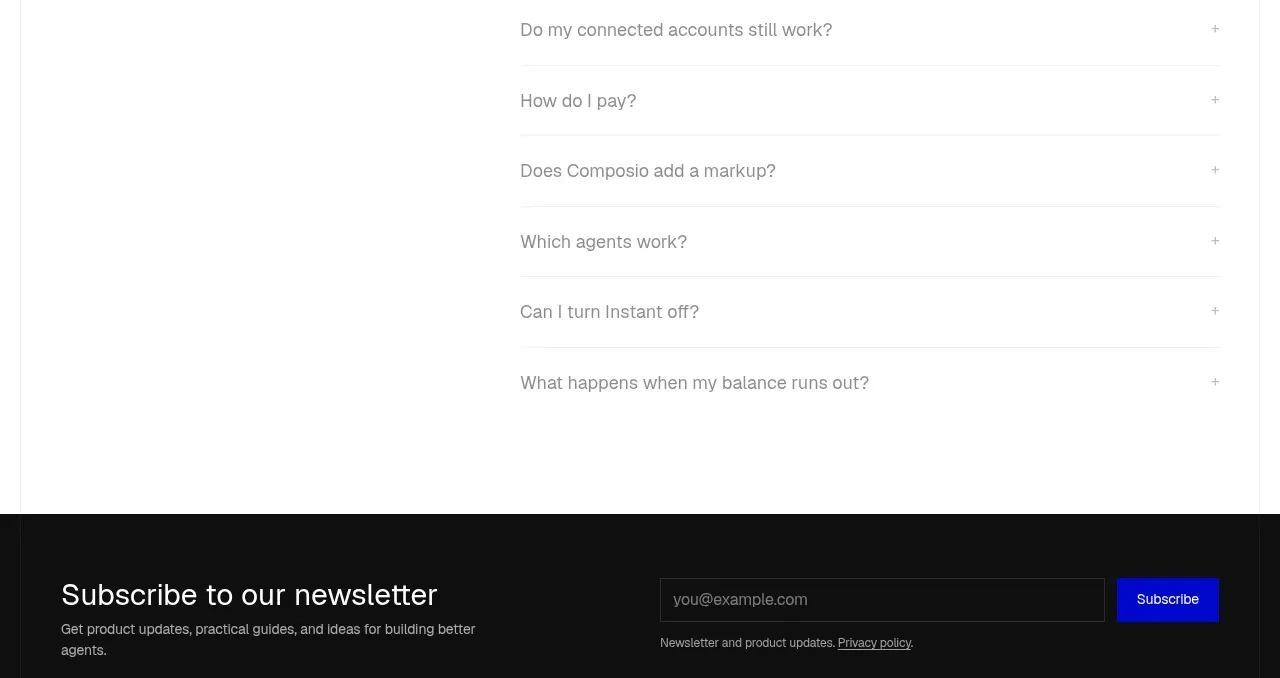
A two-column FAQ places a large heading beside a long, quiet accordion list with clear separators and plus affordances.
Prompt preview
## Reference images

Study these alongside the description below: hierarchy, rhythm, spacing, colour. Build for the product you are asked about, using this design language.

- Component: https://kage-design-assets.t3.tigrisfiles.io/components/composio-instant/90b73b03-e2b9-4385-8074-6e8e2bc32f62-1792562875-9.webp
- Full page it was cut from: https://kage-design-assets.t3.tigrisfiles.io/screenshots/composio-instant/90b73b03-e2b9-4385-8074-6e8e2bc32f62-1792562787795-full.webp
- Component on Kage: https://kage.design/component/composio-instant-faq

## Before you start
Ask what the user's product is, who it serves, and what its brand voice and visual identity are. Apply the following principles to that product rather than copying the reference.

Create an FAQ section with a large left-aligned heading occupying roughly one-third of the width and an accordion list on the right. Each question row should have 18–20px text, a plus icon aligned to the far right, and a 1px #ededed bottom rule. Keep the section spacious with 64px vertical padding, black heading typography, gray question text, and no heavy card container. Clicking or pressing Enter/Space should open one answer with a smooth height transition; support keyboard focus and aria-expanded. Stack the heading above the list on mobile.

Never: use logos, product names, copy, illustrations, or imagery from the reference.