 kage
menlo.ai
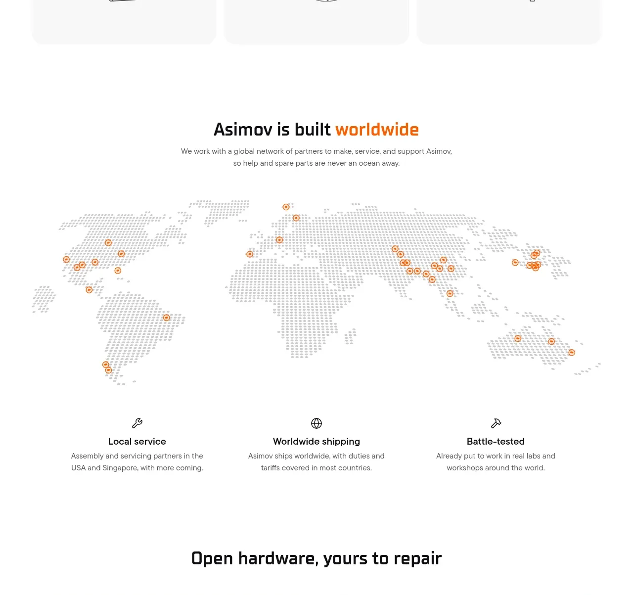
Design analysis
A centered promise is supported by a dotted world-map visual and three evenly distributed proof points, communicating service reach without overwhelming the page.
Prompt preview
## Reference images

Study these alongside the description below: hierarchy, rhythm, spacing, colour. Build for the product you are asked about, using this design language.

- Component: https://kage-design-assets.t3.tigrisfiles.io/components/asimov-1/d16421bf-78be-4064-9aab-fabd3467d820-1792562774-4.webp
- Full page it was cut from: https://kage-design-assets.t3.tigrisfiles.io/screenshots/asimov-1/d16421bf-78be-4064-9aab-fabd3467d820-1792562736076-full.webp
- Component on Kage: https://kage.design/component/asimov-1-feature-grid-2

## Before you start
Ask what the user's product, audience, and brand are, then apply the principles below to that product rather than reproducing this reference.

Build a global availability section with a centered heading and two-line supporting copy, followed by a wide, lightweight geographic visual. Use a dotted or abstract map-like pattern in pale grey and add a small number of orange location markers to communicate coverage. Beneath it, place three equal columns with simple line icons, bold short labels, and compact descriptions. Keep the background white, use generous whitespace, and let the map remain decorative rather than interactive unless the product needs location exploration. Typography should use a technical condensed display face for headings and a neutral sans for body copy. Use #1a1a1a, #8b8b8b, pale #e8e8e8, and orange #ff6500; markers can have a subtle ring. On small screens stack the proof points and reduce map height.

Never: use the reference logo, product name, exact copy, map artwork, illustrations, imagery, or branded assets.
More components
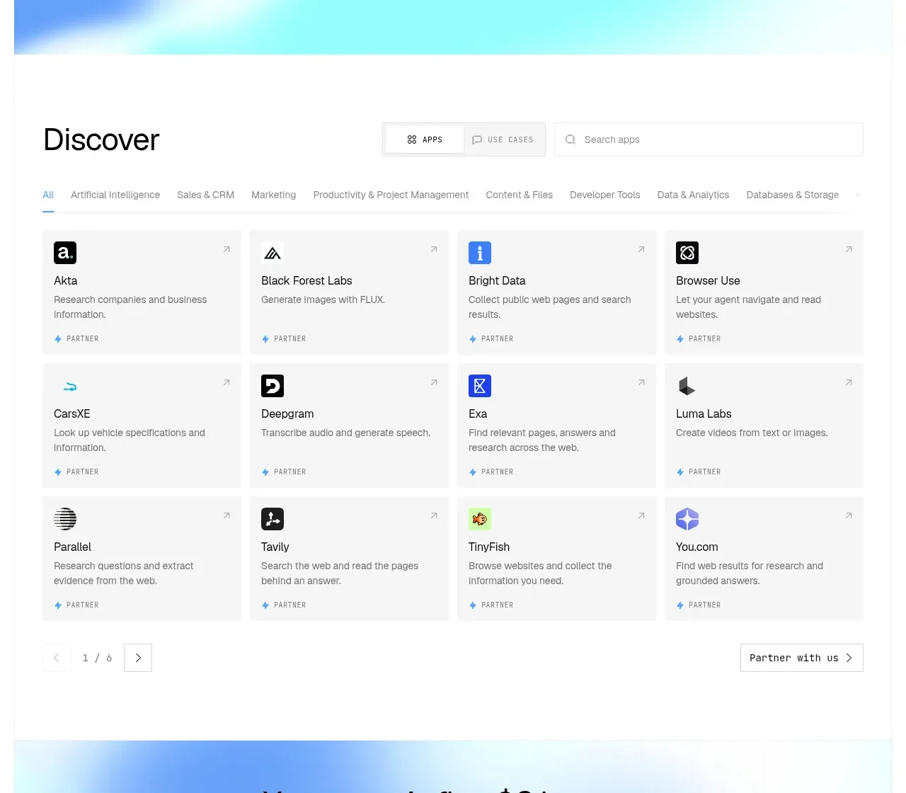
 Discover app directory
Composio Instant · Feature grid
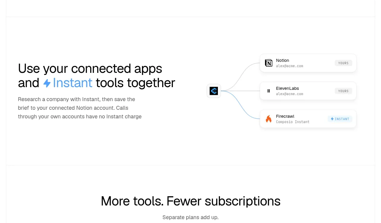 Connected apps workflow
Composio Instant · Feature grid
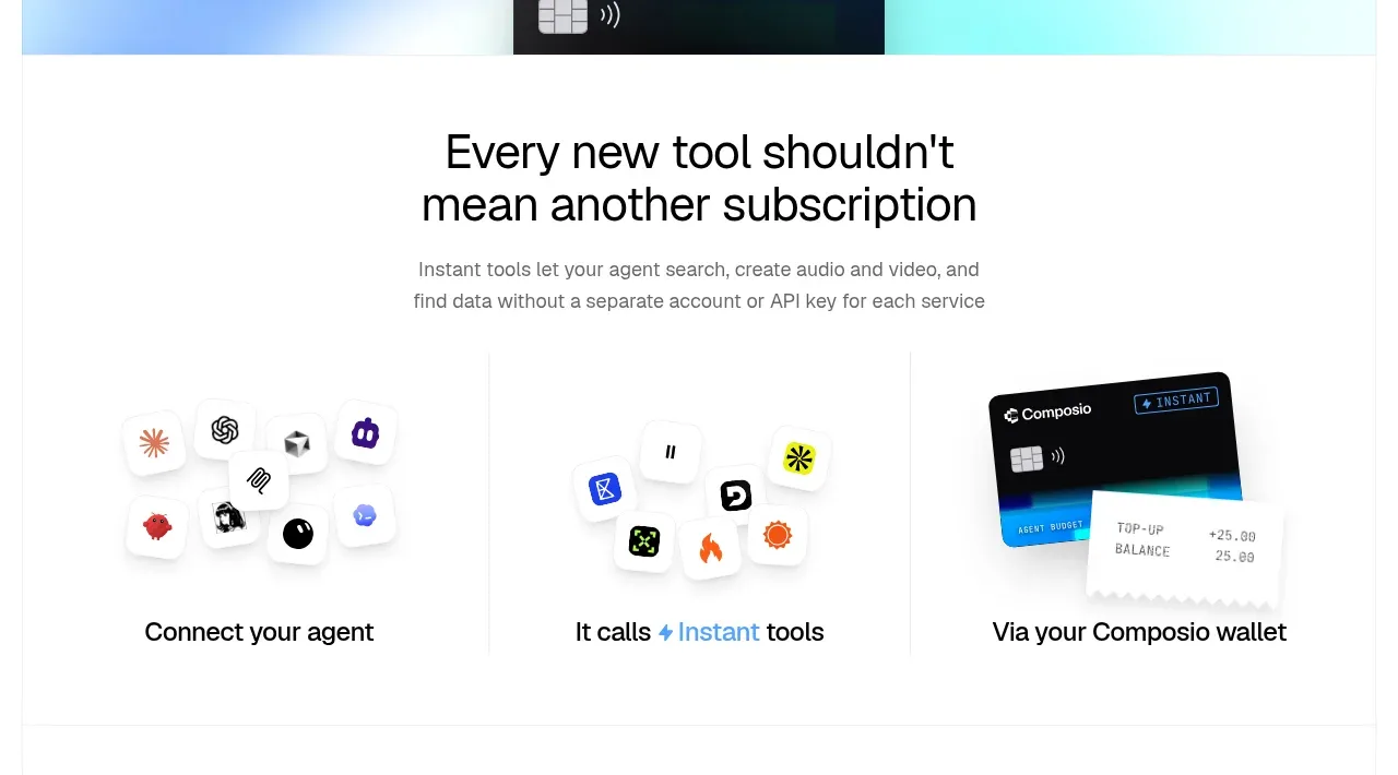 Three-part product workflow
Composio Instant · Feature grid
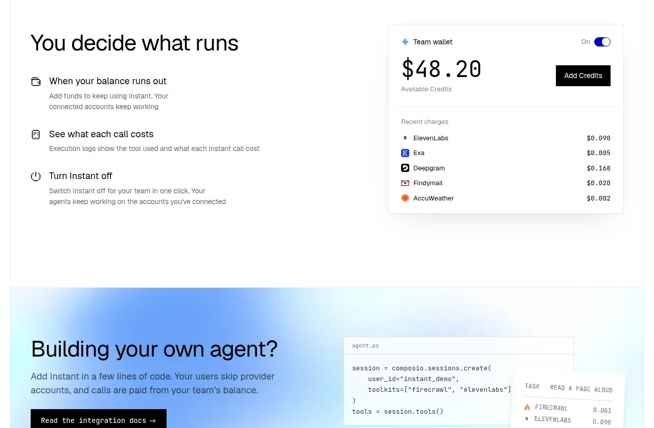 Spending controls
Composio Instant · Feature grid
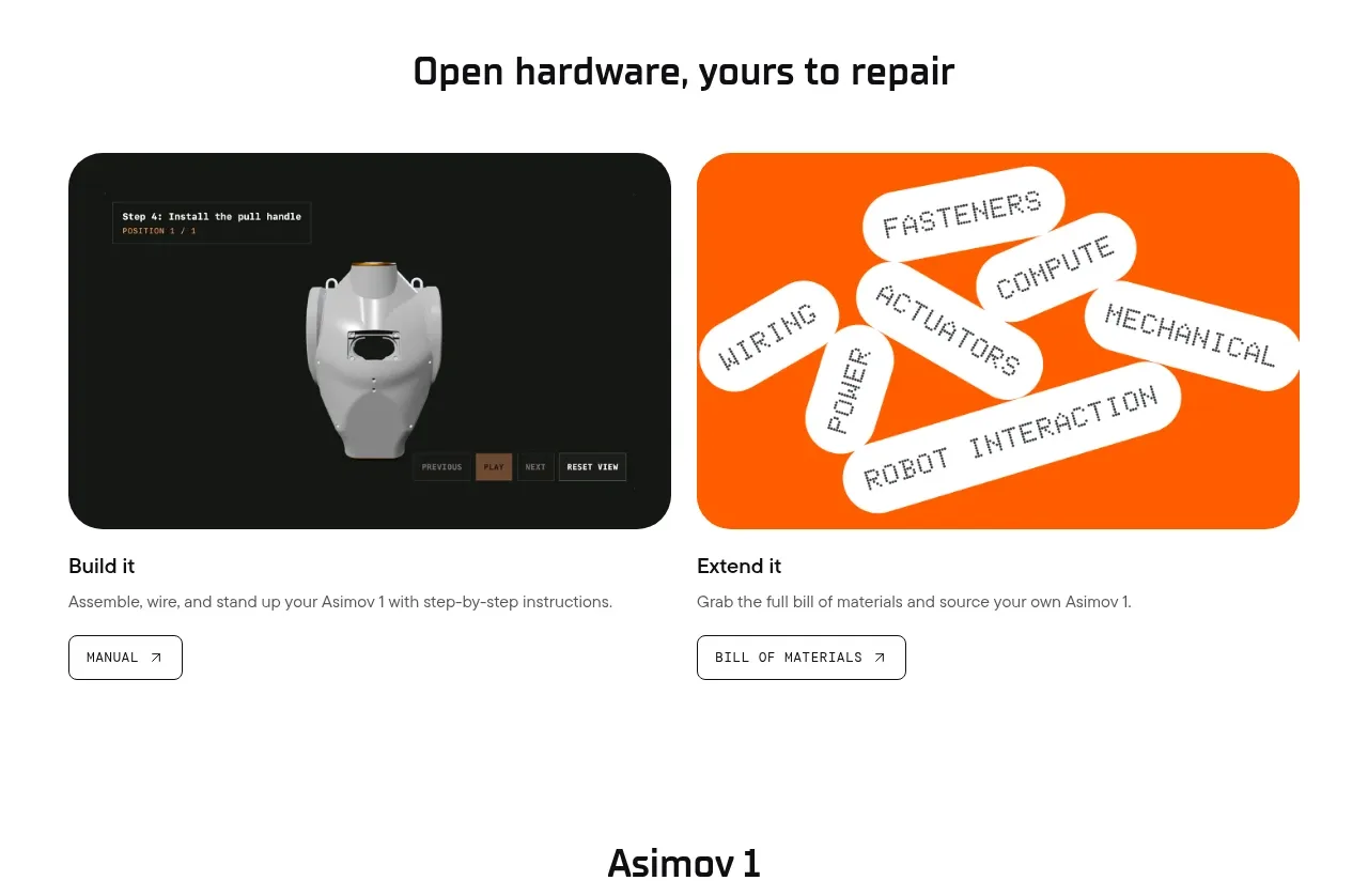
 Open hardware pathways
Asimov 1 · Feature grid
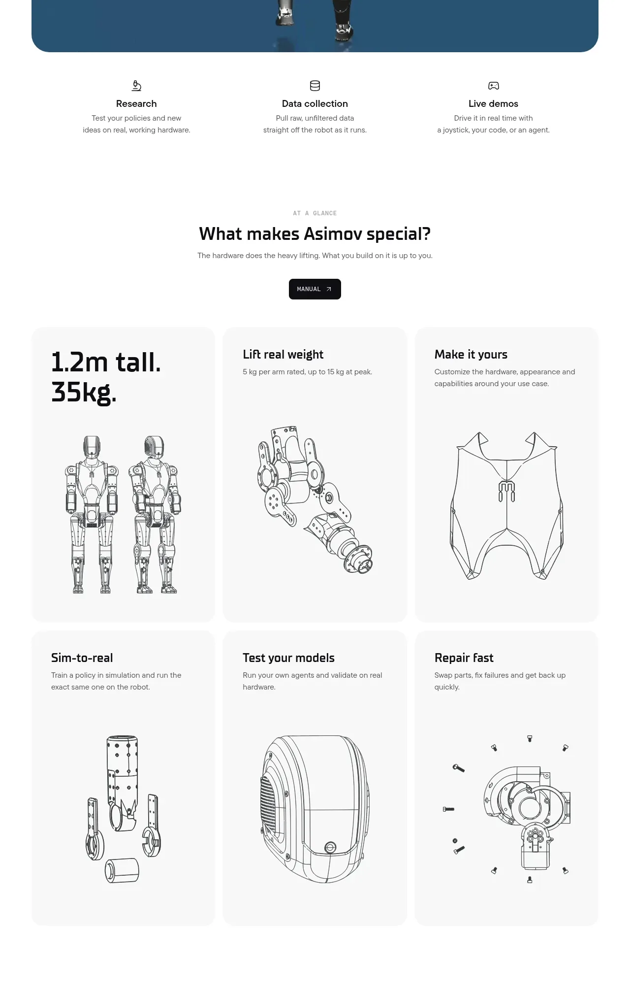 Capability overview and specification cards
Asimov 1 · Feature grid