 kage
kage
astro.build

Design analysis
A compact, high-contrast benchmark chart that turns a small set of ranked metrics into an immediately scannable visual. The highlighted top result, muted comparison bars, and source note create a strong hierarchy without making the data feel overly technical.
Prompt preview
## Reference images

Study these alongside the description below: hierarchy, rhythm, spacing, colour. Build for the product you are asked about, using this design language.

- Component: https://kage-design-assets.t3.tigrisfiles.io/components/astro-build/2448cc02-1e48-497c-9333-8941f9d81557-1789073851-4.webp
- Full page it was cut from: https://kage-design-assets.t3.tigrisfiles.io/screenshots/astro-build/2448cc02-1e48-497c-9333-8941f9d81557-1789073818-full.webp
- Component on Kage: https://kage.design/component/astro-build-chart

## Before you start
Ask what the user's product is, who the audience is, and what visual brand it uses. Then apply the principles below to create an original benchmark chart for that product rather than reproducing the reference.

## Design language

Build a responsive performance-comparison section for a dark, developer-oriented product website. The component should communicate one primary metric across several competing options, with the leading option visually emphasized.

### Layout and alignment
- Place the chart inside a wide, centered container with a generous maximum width, approximately 1100–1250px.
- Above the chart, use a small accent eyebrow, a strong section heading, and a concise explanatory paragraph. Keep this intro aligned to the left and constrain its text width to roughly 500px.
- Put the data visualization in a separate inset panel below the intro. Use a two-column bar-row structure: a fixed-width label column on the left and a flexible bar track on the right.
- Keep every row aligned to a consistent vertical rhythm. Labels should be right-aligned on larger screens so they sit naturally against the chart tracks; switch to a stacked or left-aligned layout on narrow screens if needed.
- Make the first row the visual focal point. Use a wider, brighter fill and a prominent value treatment, while keeping the remaining rows quieter.
- Add a compact source or dataset note beneath the rows, with an underlined link treatment for the primary reference.

### Typography hierarchy
- Use a clean sans-serif or product UI typeface with a technical, modern feel.
- Eyebrow: 14–16px, semibold, with a saturated accent colour.
- Heading: approximately 32–40px, bold, tight line-height, and near-white.
- Supporting paragraph: 16–18px, regular, relaxed line-height, and a muted cool-gray colour.
- Chart context label: 15–16px, medium weight, muted gray.
- Row labels: 20–24px, bold, near-white.
- Metric values: 28–32px for the highlighted value and 18–20px for comparison values; use tabular numerals where available.
- Source note: 14–16px with subdued contrast, while links remain clearly identifiable through underlining and brighter text.

### Colour
- Page background: very dark navy, approximately `#070B17` to `#0A1220`.
- Chart panel: slightly lifted near-black navy, approximately `#0B0E1A`.
- Primary text: `#F5F7FA`.
- Secondary text: `#A5ACBC`.
- Faint borders: `#273142` with low visual contrast.
- Comparison bar fills: desaturated slate gray, approximately `#363B49`.
- Highlight bar: a left-to-right gradient such as `#4167D8` → `#39D4B9`, with enough saturation to stand out against the dark panel.
- Highlight value: bright mint or aqua, approximately `#45E6C0`.
- Eyebrow accent: a warm pink-to-red tone, approximately `#D34C76`.
- Ensure all text and controls meet accessible contrast requirements; do not use colour as the only way to distinguish the leading result.

### Borders, radius, and depth
- Use a 1px border around the chart panel, approximately `rgba(120, 150, 180, 0.22)`.
- Give the panel a 14–18px corner radius and generous internal padding, around 30–34px on desktop.
- Each bar row should have a thin outlined track with a 12–15px radius and a subtle inner background.
- Keep the visual depth restrained: use a soft ambient glow behind the panel or highlighted bar rather than heavy shadows.
- Avoid excessive cards, gradients, or decorative effects that compete with the data.

### Chart behaviour and interaction
- Represent each result with a proportional horizontal fill based on a shared maximum or clearly documented scale.
- Place the numeric value at the end of the filled area, ensuring it remains legible when the bar is short. On very narrow screens, move values into a dedicated right-hand column if necessary.
- Preserve the ranking and exact values in semantic HTML, not only in visual styling.
- If the chart is interactive, support hover and keyboard focus states that slightly brighten the relevant row and reveal optional explanatory metadata. Keep interaction subtle and never hide the primary values.
- Allow the dataset note to link to a full methodology or data page. Use visible focus rings and clear hover states.
- Make the chart usable with screen readers by providing an accessible title, row labels, values, and a concise summary of the comparison.
- On mobile, allow horizontal breathing room while preventing clipped labels; reduce heading size and panel padding before reducing text legibility.

## Never
- Never copy the reference's logos, product names, competitor names, benchmark values, source names, or exact marketing copy.
- Never reuse the reference's illustrations, imagery, branded iconography, or proprietary assets.
- Never assume the user's product is a developer tool; adapt the metric, labels, tone, and accent colours to the user's brand.
- Never make the chart decorative at the expense of readable values, accessible semantics, responsive behaviour, or a clear data source.
More components
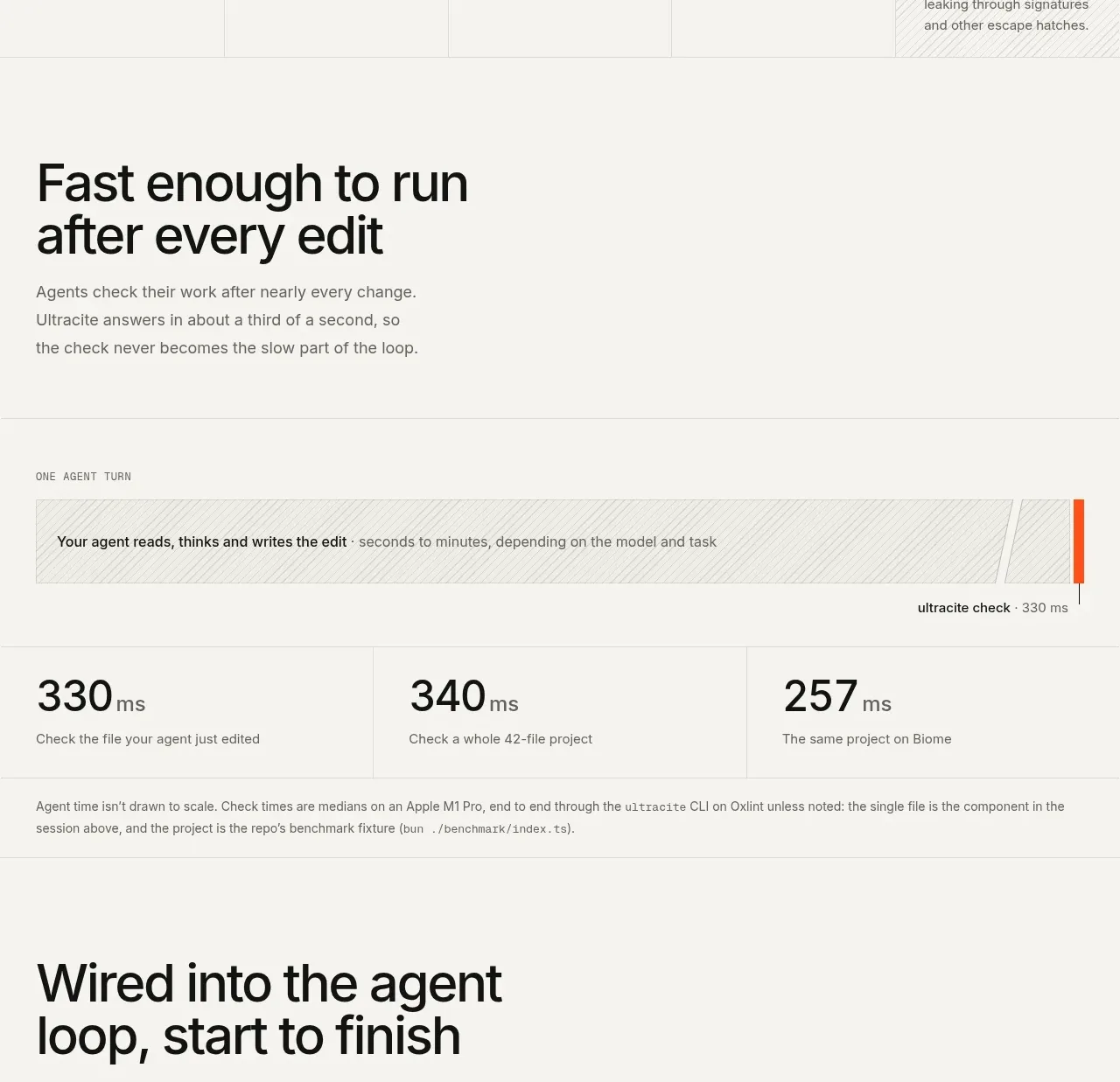
 Fast feedback timing comparison
Ultracite v8 · Chart
Fast feedback timing comparison
Ultracite v8 · Chart
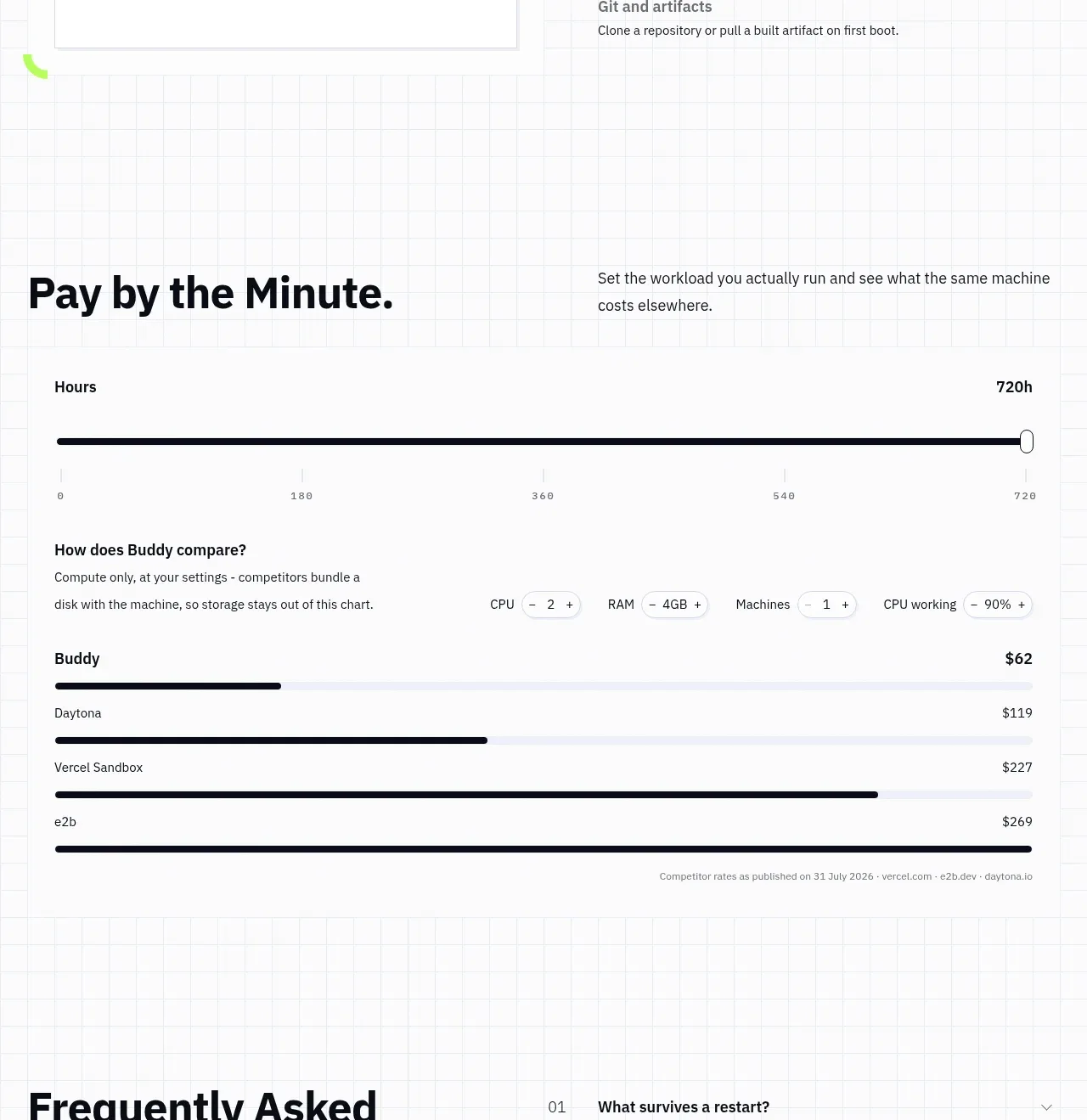
 Usage and cost comparison
AI Sandboxes by Buddy · Chart
Usage and cost comparison
AI Sandboxes by Buddy · Chart
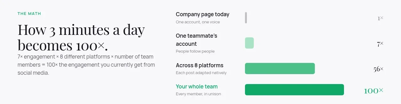
 Time-to-impact comparison
Agent Craft · Chart
Time-to-impact comparison
Agent Craft · Chart
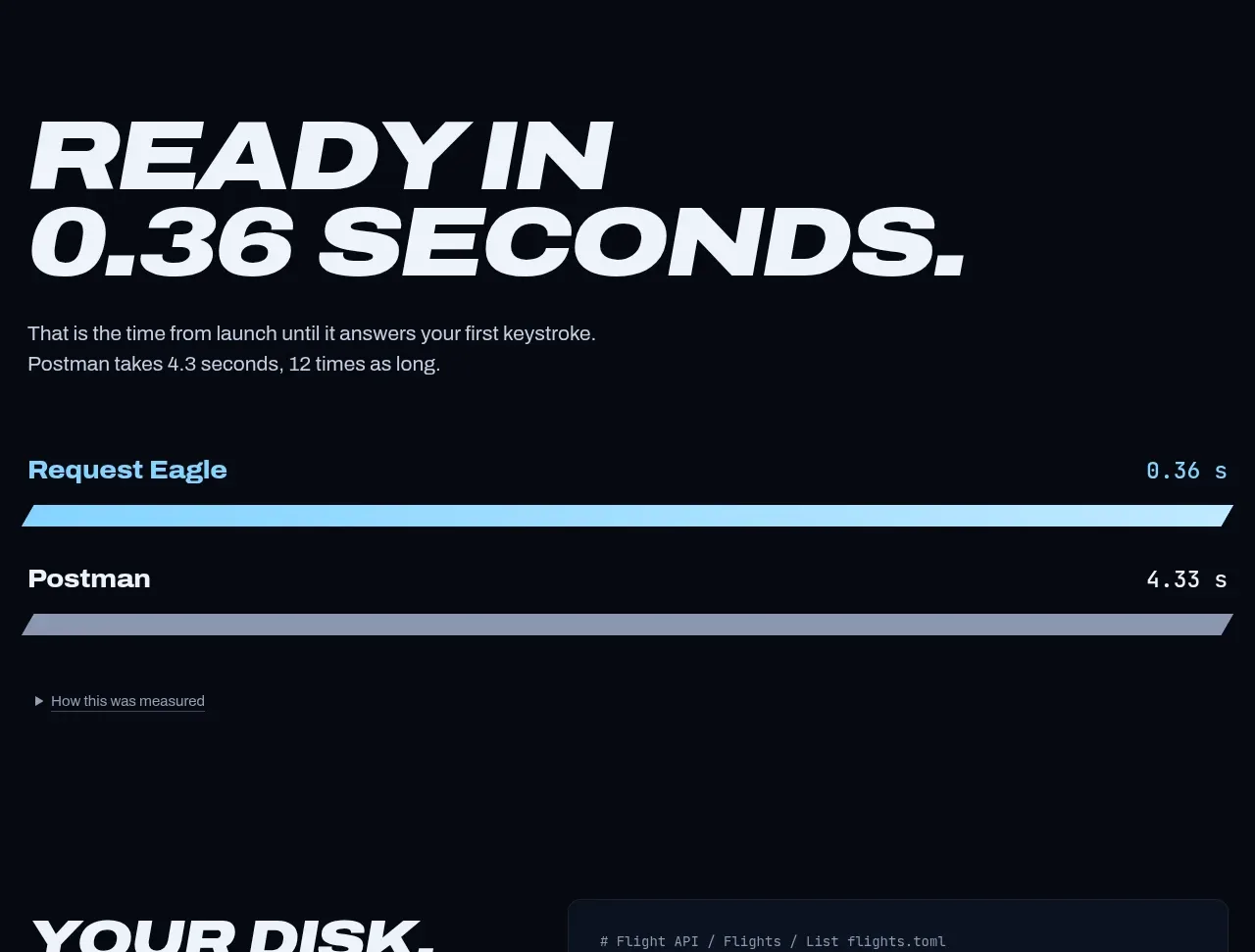
 Performance comparison chart
Request Eagle · Chart
Performance comparison chart
Request Eagle · Chart
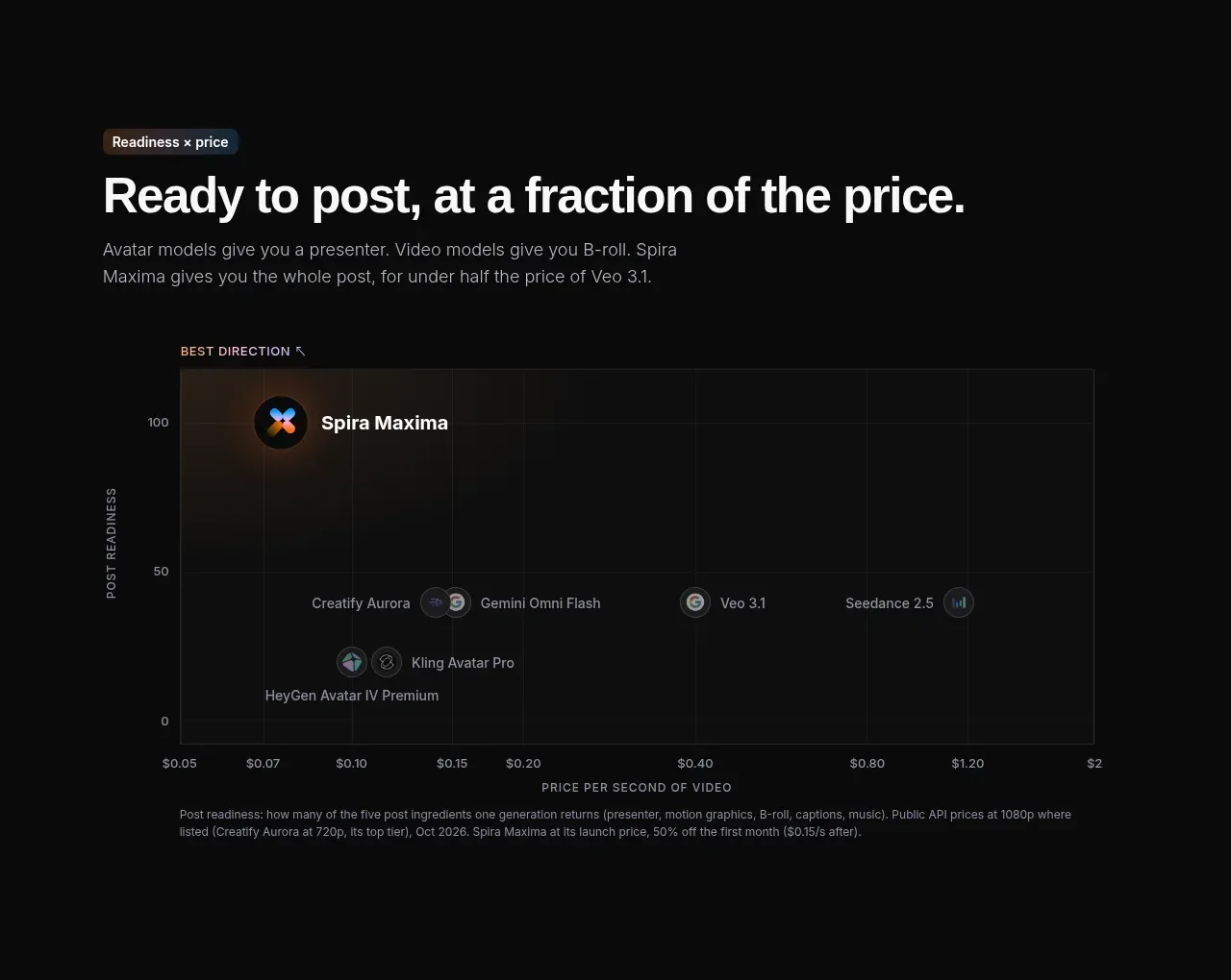
 Value positioning scatter chart
Spira Maxima · Chart
Value positioning scatter chart
Spira Maxima · Chart
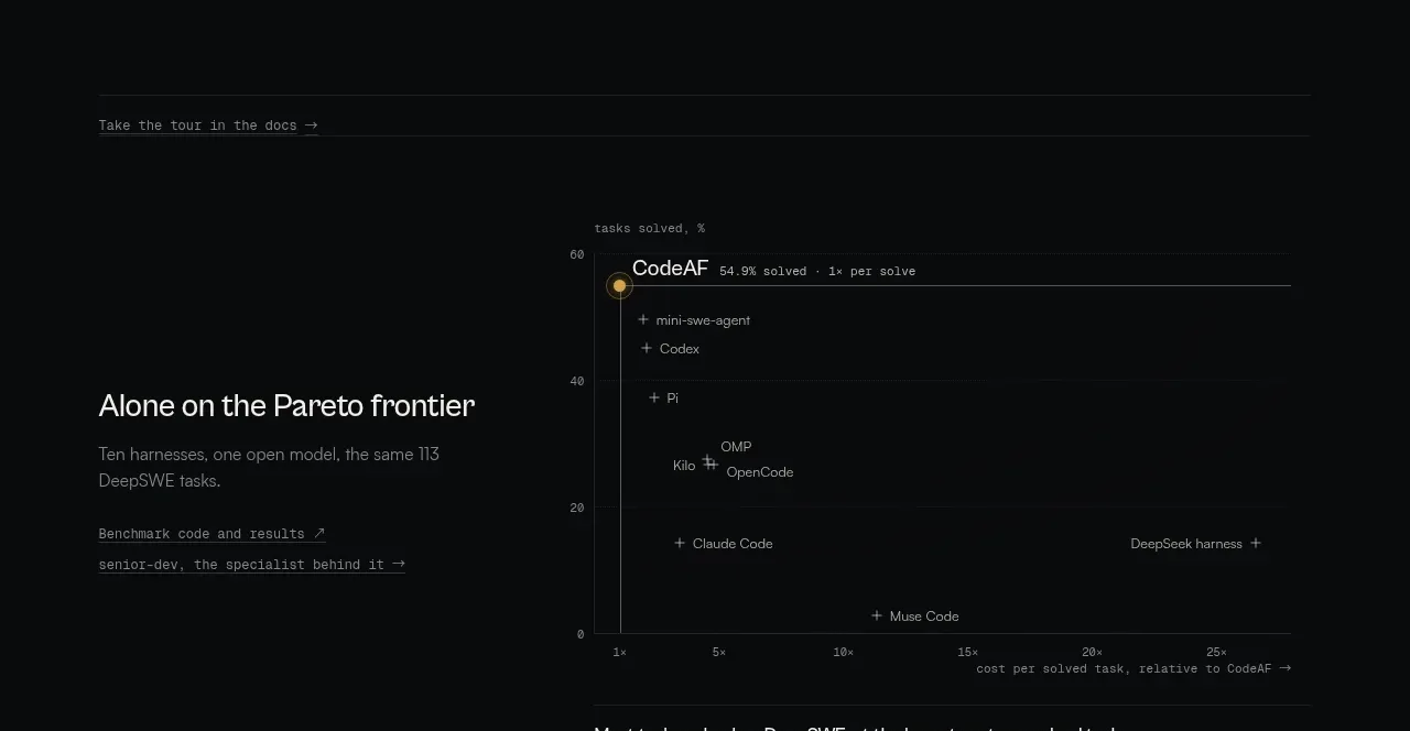
 Benchmark and Pareto proof
CodeAF · Chart
Benchmark and Pareto proof
CodeAF · Chart