 kage
kage
audimate.ai
Design analysis
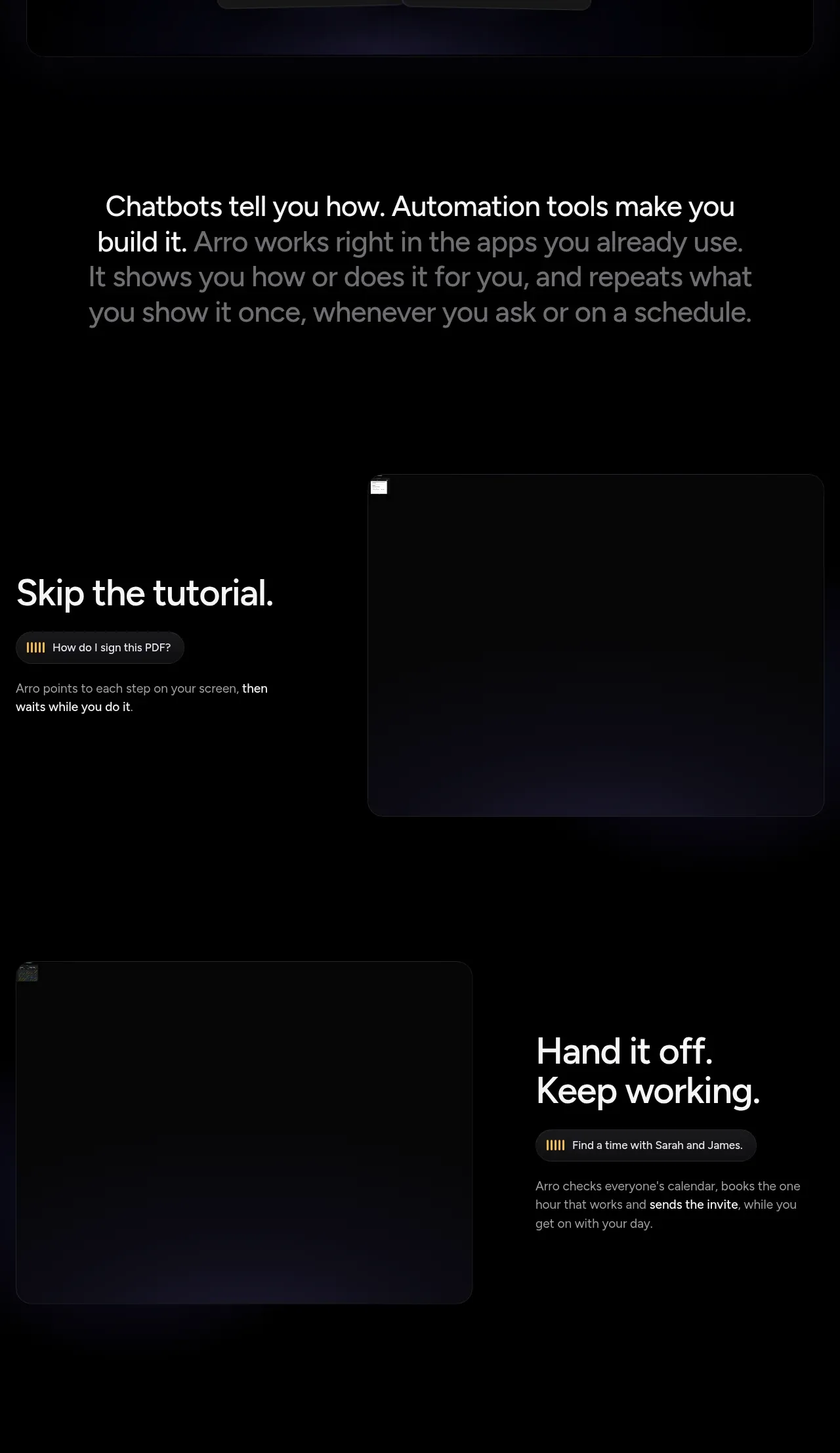
A sequence of alternating feature bands explains guided assistance, handoff, repeatable playbooks, and team sharing through short copy paired with dark UI visual placeholders.
Prompt preview
## Reference images

Study these alongside the description below: hierarchy, rhythm, spacing, colour. Build for the product you are asked about, using this design language.

- Component: https://kage-design-assets.t3.tigrisfiles.io/components/audimate/f5eee044-0aa0-46f8-a989-58039412e614-1792130730-3.webp
- Full page it was cut from: https://kage-design-assets.t3.tigrisfiles.io/screenshots/audimate/f5eee044-0aa0-46f8-a989-58039412e614-1792130546049-full.webp
- Component on Kage: https://kage.design/component/audimate-feature-grid

## Before you start
Ask what the user's product and brand are, then apply the principles below to that product rather than reproducing the reference.

Build a vertically stacked feature section for an AI productivity product. Start with a centered statement explaining the shift from instructions to automation, then use alternating two-column feature rows. Each row should pair a concise heading, a small pill-shaped example prompt, and two or three lines of supporting copy with a large dark UI visualization or abstract product panel. Alternate the media side to create rhythm, while keeping all content inside a consistent max-width grid. Use black (#000) backgrounds, white headings, muted gray body copy, violet accents (#9b72ff), small yellow activity markers, 16–20px rounded panels, and substantial vertical spacing. Use scroll-reveal only as a subtle enhancement; content must remain available without animation.

Never: use the reference's logo, product name, copy, illustrations, imagery, or exact visual identity.
More components

 Data-to-action engine
Salience · Feature grid
Data-to-action engine
Salience · Feature grid
 Actionable alert workflow
Salience · Feature grid
Actionable alert workflow
Salience · Feature grid
 Trust proof and core outcomes
Salience · Feature grid
Trust proof and core outcomes
Salience · Feature grid
 Three-step implementation flow
Salience · Feature grid
Three-step implementation flow
Salience · Feature grid
 What analytics misses
Salience · Feature grid
What analytics misses
Salience · Feature grid

 Workflow features and capabilities
CrewTower Mod for Claude Code · Feature grid
Workflow features and capabilities
CrewTower Mod for Claude Code · Feature grid