 kage
kage
autocaptioner.com
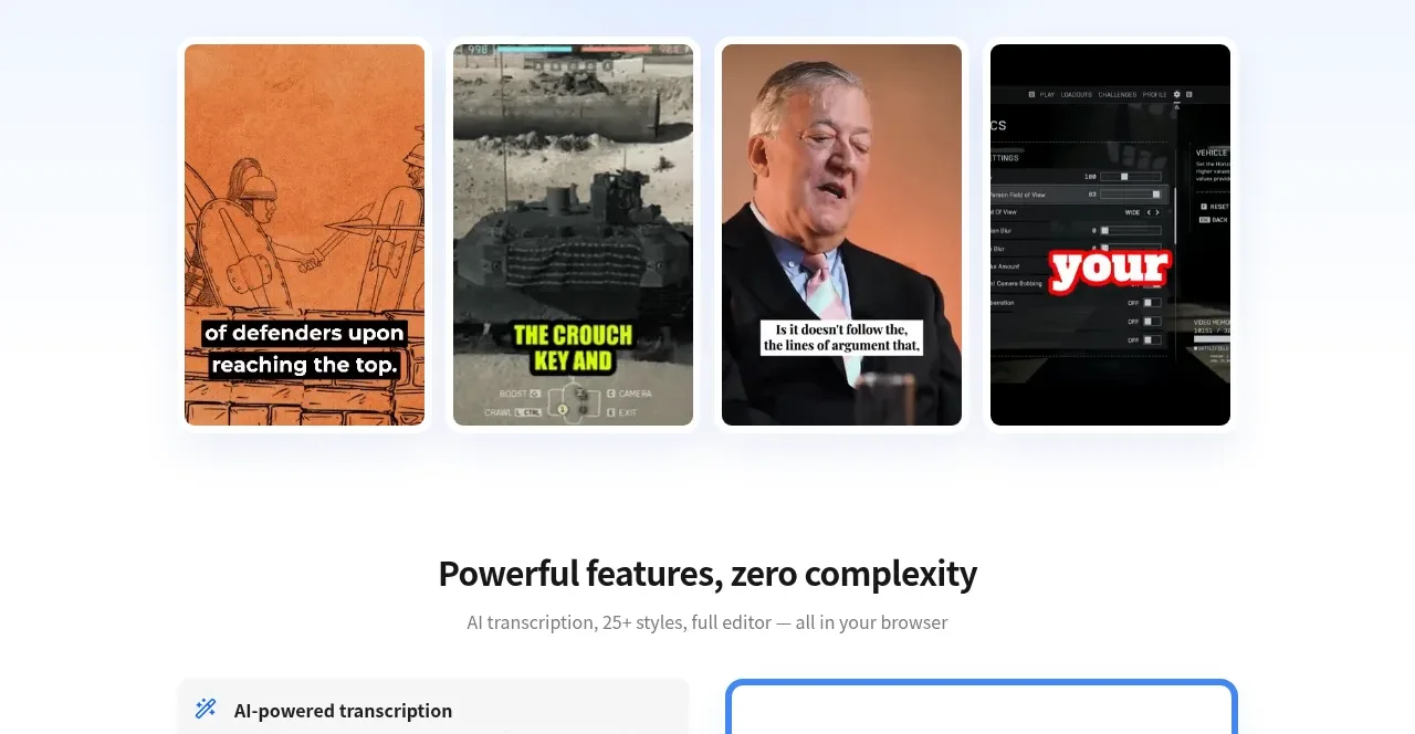
Design analysis
The section pairs a concise heading with a left-side selectable feature list and a bordered transcription preview on the right, making capability claims tangible.
Prompt preview
## Reference images

Study these alongside the description below: hierarchy, rhythm, spacing, colour. Build for the product you are asked about, using this design language.

- Component: https://kage-design-assets.t3.tigrisfiles.io/components/autocaptioner-com/ff4d8c71-c21f-4141-9075-b069f1384c25-1792109432-2.webp
- Full page it was cut from: https://kage-design-assets.t3.tigrisfiles.io/screenshots/autocaptioner-com/ff4d8c71-c21f-4141-9075-b069f1384c25-1792109412255-full.webp
- Component on Kage: https://kage.design/component/autocaptioner-feature-grid

## Before you start
Ask what the user's product, audience, and brand are, then apply the following principles to that product rather than copying this reference.

Build a feature showcase section on a white background with a centered heading and muted subtitle. Below, use a two-column layout: a left vertical list of five capabilities and a right product-preview panel. The active feature should sit in a lightly tinted card with a small blue icon, bold label, and short description; inactive rows should be compact, spacious, and separated by consistent vertical rhythm. The preview should have a 3–4px blue border, around 12px radius, and display an abstract waveform above stacked light-gray transcript rows with timestamps. Use #2677dc as the accent, #171717 for headings, #6b7280 for body copy, and #f4f4f4 for transcript rows. On smaller screens stack the columns and make feature rows selectable tabs.

Never use logos, product names, copy, illustrations, or imagery from the reference.
More components

 Data-to-action engine
Salience · Feature grid
Data-to-action engine
Salience · Feature grid
 Actionable alert workflow
Salience · Feature grid
Actionable alert workflow
Salience · Feature grid
 Trust proof and core outcomes
Salience · Feature grid
Trust proof and core outcomes
Salience · Feature grid
 Three-step implementation flow
Salience · Feature grid
Three-step implementation flow
Salience · Feature grid
 What analytics misses
Salience · Feature grid
What analytics misses
Salience · Feature grid

 Workflow features and capabilities
CrewTower Mod for Claude Code · Feature grid
Workflow features and capabilities
CrewTower Mod for Claude Code · Feature grid