 kage
kage
autocaptioner.com
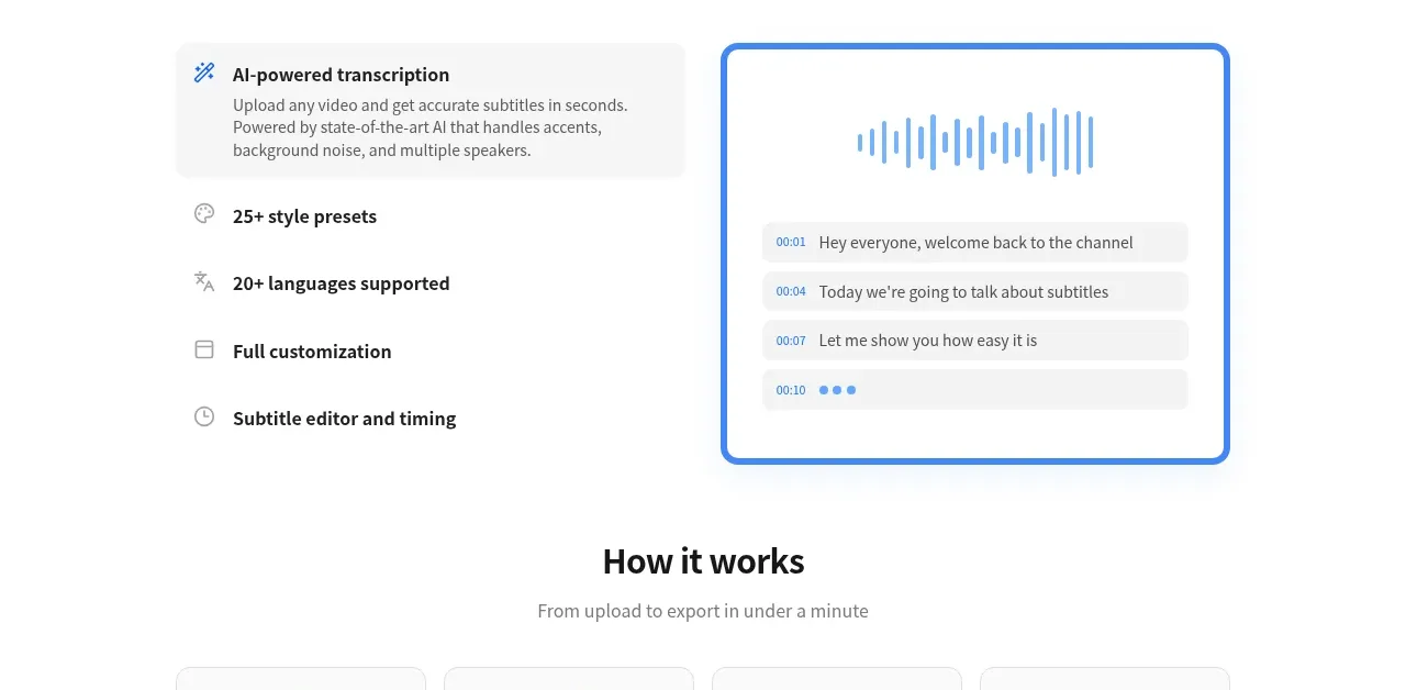
Design analysis
A four-card process explains the product in sequence, with simple blue line icons, clear step titles, supporting text, and a repeated upload CTA underneath.
Prompt preview
## Reference images

Study these alongside the description below: hierarchy, rhythm, spacing, colour. Build for the product you are asked about, using this design language.

- Component: https://kage-design-assets.t3.tigrisfiles.io/components/autocaptioner-com/ff4d8c71-c21f-4141-9075-b069f1384c25-1792109432-3.webp
- Full page it was cut from: https://kage-design-assets.t3.tigrisfiles.io/screenshots/autocaptioner-com/ff4d8c71-c21f-4141-9075-b069f1384c25-1792109412255-full.webp
- Component on Kage: https://kage.design/component/autocaptioner-feature-grid-2

## Before you start
Ask what the user's product, audience, and brand are, then apply the following principles to that product rather than copying this reference.

Create a workflow section with a centered heading and short subtitle, followed by four equal-width cards in one row. Each card should use a minimal blue outline icon, a bold step title, and a concise gray explanation. Give cards a white background, #e5e7eb border, 10–12px radius, subtle shadow, and balanced internal padding. Connect the sequence through ordering and visual consistency rather than heavy connector graphics. Finish with a centered primary action button and a small supporting label. Use responsive two-column and one-column layouts as width decreases.

Never use logos, product names, copy, illustrations, or imagery from the reference.
More components

 Data-to-action engine
Salience · Feature grid
Data-to-action engine
Salience · Feature grid
 Actionable alert workflow
Salience · Feature grid
Actionable alert workflow
Salience · Feature grid
 Trust proof and core outcomes
Salience · Feature grid
Trust proof and core outcomes
Salience · Feature grid
 Three-step implementation flow
Salience · Feature grid
Three-step implementation flow
Salience · Feature grid
 What analytics misses
Salience · Feature grid
What analytics misses
Salience · Feature grid

 Workflow features and capabilities
CrewTower Mod for Claude Code · Feature grid
Workflow features and capabilities
CrewTower Mod for Claude Code · Feature grid