 kage
kage
autocaptioner.com
Design analysis
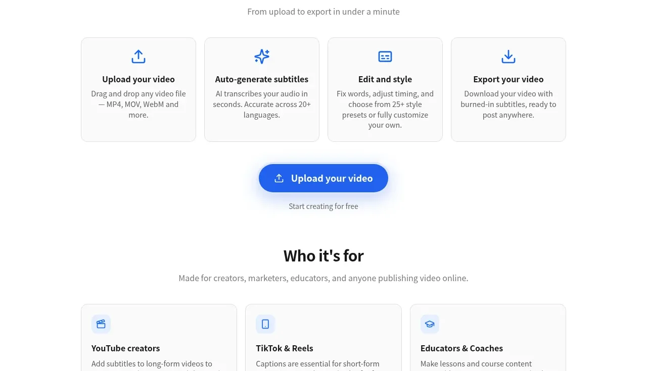
A six-card, three-column grid translates the product into concrete audience outcomes, with compact iconography and practical descriptions.
Prompt preview
## Reference images

Study these alongside the description below: hierarchy, rhythm, spacing, colour. Build for the product you are asked about, using this design language.

- Component: https://kage-design-assets.t3.tigrisfiles.io/components/autocaptioner-com/ff4d8c71-c21f-4141-9075-b069f1384c25-1792109432-4.webp
- Full page it was cut from: https://kage-design-assets.t3.tigrisfiles.io/screenshots/autocaptioner-com/ff4d8c71-c21f-4141-9075-b069f1384c25-1792109412255-full.webp
- Component on Kage: https://kage.design/component/autocaptioner-feature-grid-3

## Before you start
Ask what the user's product, audience, and brand are, then apply the following principles to that product rather than copying this reference.

Build an audience/use-case section with a centered title and subtitle, then a three-column grid of six cards. Each card should include a small blue line icon, a concise audience heading, and two or three lines describing the outcome. Use a very light gray border, 10px radius, white background, restrained shadow, and consistent 18–24px padding. Keep headings near 14–16px and body text around 13px with #666666 color. Use generous row and column gaps, and collapse to two columns then one column responsively. Make cards informative rather than decorative and ensure the entire card is readable without hover.

Never use logos, product names, copy, illustrations, or imagery from the reference.
More components

 Data-to-action engine
Salience · Feature grid
Data-to-action engine
Salience · Feature grid
 Actionable alert workflow
Salience · Feature grid
Actionable alert workflow
Salience · Feature grid
 Trust proof and core outcomes
Salience · Feature grid
Trust proof and core outcomes
Salience · Feature grid
 Three-step implementation flow
Salience · Feature grid
Three-step implementation flow
Salience · Feature grid
 What analytics misses
Salience · Feature grid
What analytics misses
Salience · Feature grid

 Workflow features and capabilities
CrewTower Mod for Claude Code · Feature grid
Workflow features and capabilities
CrewTower Mod for Claude Code · Feature grid