kage
kage
axari.ai
Design analysis
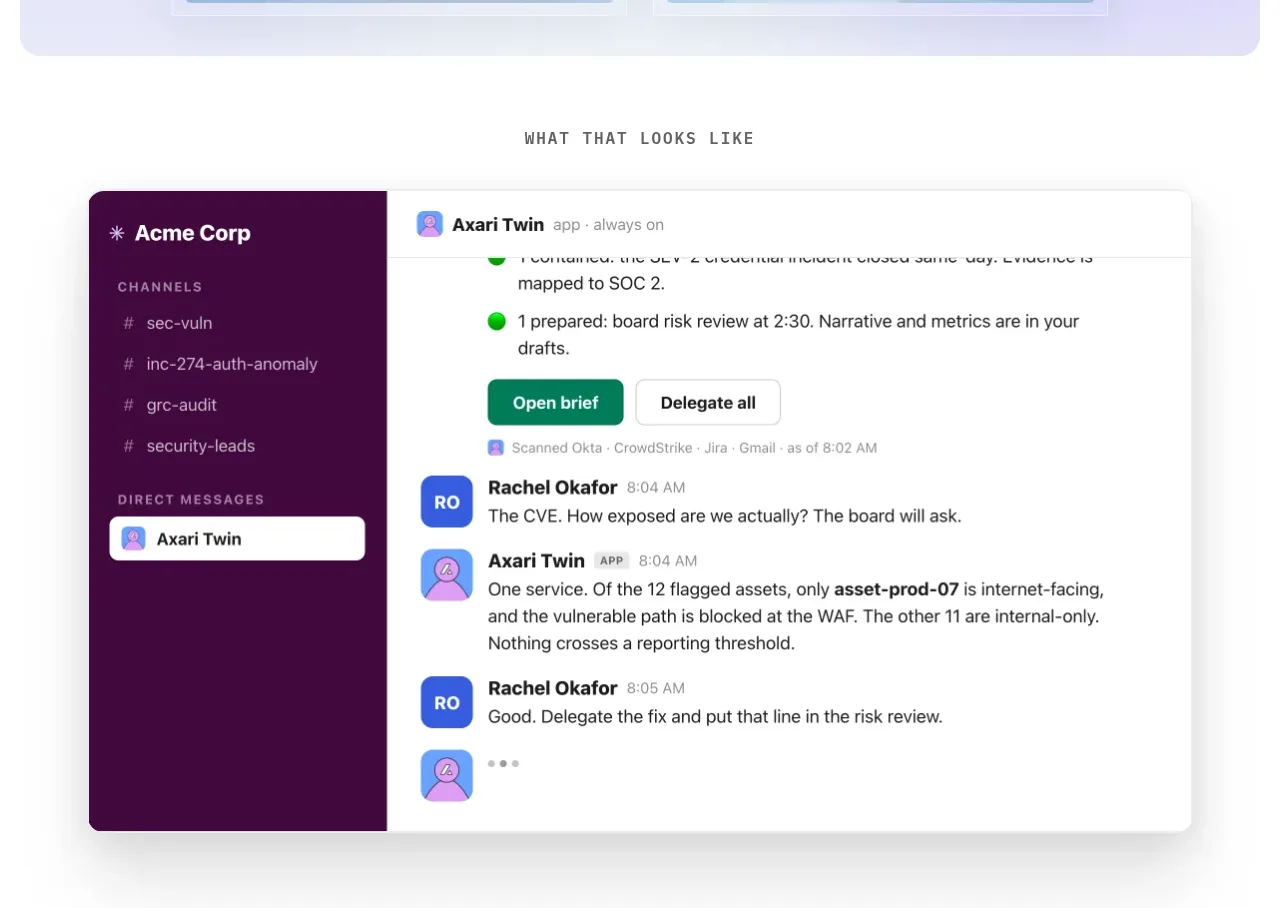
A centered section label introduces a large chat/workspace mockup that makes the product outcome concrete without requiring much explanatory copy.
Prompt preview
## Reference images

Study these alongside the description below: hierarchy, rhythm, spacing, colour. Build for the product you are asked about, using this design language.

- Component: https://kage-design-assets.t3.tigrisfiles.io/components/axari/3e8824e7-9cff-44d5-8739-31a0e173005a-1789538687-2.webp
- Full page it was cut from: https://kage-design-assets.t3.tigrisfiles.io/screenshots/axari/3e8824e7-9cff-44d5-8739-31a0e173005a-1789538612563-full.webp
- Component on Kage: https://kage.design/component/axari-card

## Before you start
Ask for the user's product workflow, the key outcome to demonstrate, and its visual brand system. Build an original proof section around that answer.

Create a white section with a small spaced uppercase label above one large elevated application mockup. The mockup should be a rounded 12–16px card with a subtle border and shadow, a dark colored navigation rail on the left, and a bright conversation/work area on the right. Use restrained UI density, believable status chips, avatars, timestamps, and one or two action buttons to communicate progress. Keep the card centered at about 86–90% of the viewport width, with 56–88px vertical whitespace. Use near-black `#24232b`, plum `#4b0b46`, soft gray `#f5f5f4`, and a single green or cyan success accent. Ensure the visual remains readable on mobile by stacking or cropping intentionally.

Never: copy logos, product names, copy, illustrations, or imagery from the reference.