 kage
kage
axari.ai
Design analysis
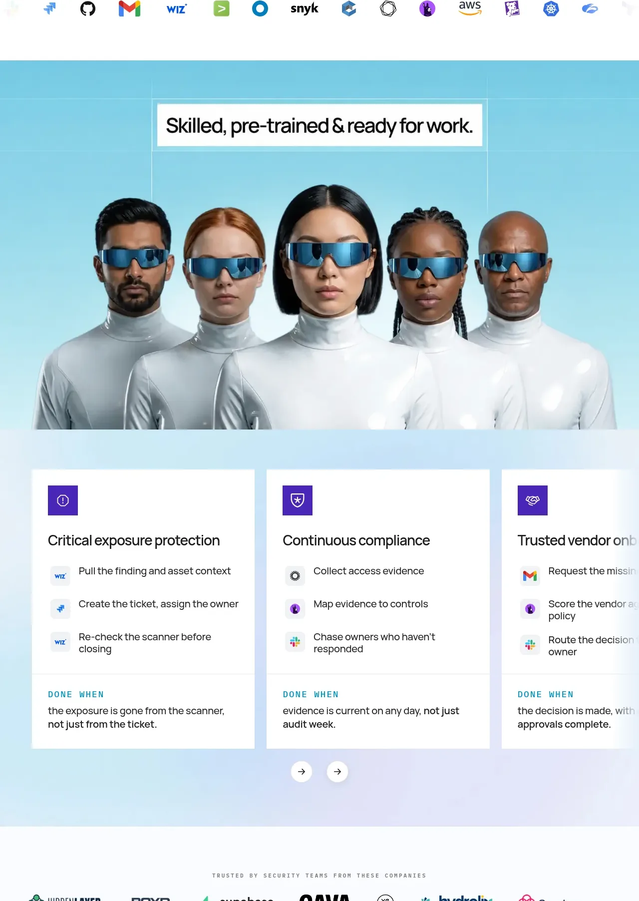
A vivid blue gradient section combines a headline and human-centric visual with three large cards that explain concrete capabilities and completion criteria.
Prompt preview
## Reference images

Study these alongside the description below: hierarchy, rhythm, spacing, colour. Build for the product you are asked about, using this design language.

- Component: https://kage-design-assets.t3.tigrisfiles.io/components/axari/3e8824e7-9cff-44d5-8739-31a0e173005a-1789538688-4.webp
- Full page it was cut from: https://kage-design-assets.t3.tigrisfiles.io/screenshots/axari/3e8824e7-9cff-44d5-8739-31a0e173005a-1789538612563-full.webp
- Component on Kage: https://kage.design/component/axari-feature-grid

## Before you start
Ask what three capabilities best differentiate the user's product and what visual metaphor can represent them. Then apply this structure with original content.

Use a full-width pale cyan-to-lavender background (`#bfeefa` to `#e8e8ff`) with a centered section headline in a white or translucent title plate. Place an original, wide hero visual above or behind the cards, then arrange three equal-width white cards in a horizontal grid. Each card needs a small colored icon tile, a concise capability title, 3–4 workflow steps with lightweight product/tool indicators, and a bottom “done when” outcome separated by a faint rule. Use 16–20px card padding, 2–4px soft shadow, minimal radius (0–4px), black body text, purple accent `#5637b8`, and generous card height. Add small circular carousel controls only if the content becomes horizontally scrollable; make the grid stack on mobile.

Never: copy logos, product names, copy, illustrations, or imagery from the reference.
More components

 Authentication product capabilities
tiun. · Feature grid
Authentication product capabilities
tiun. · Feature grid
 Customer data and user management
tiun. · Feature grid
Customer data and user management
tiun. · Feature grid
 Problem and unified solution narrative
tiun. · Feature grid
Problem and unified solution narrative
tiun. · Feature grid
 Integration and agent workflow
tiun. · Feature grid
Integration and agent workflow
tiun. · Feature grid
 Billing and checkout capabilities
tiun. · Feature grid
Billing and checkout capabilities
tiun. · Feature grid

 Receiving money channels
Payflip · Feature grid
Receiving money channels
Payflip · Feature grid