 kage
kage
axari.ai
Design analysis
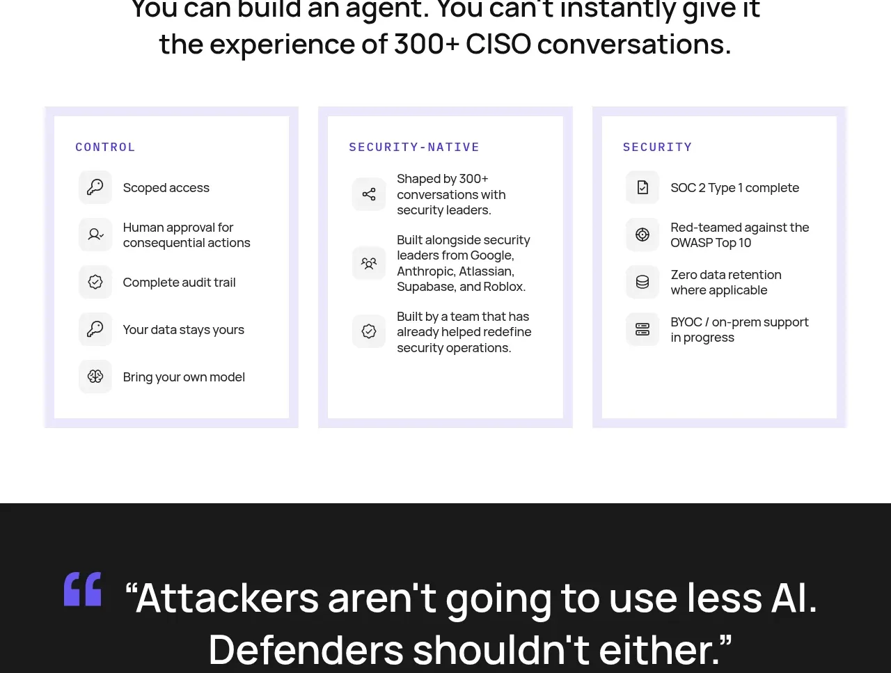
A centered trust statement is followed by three bordered columns that organize control, security-native design, and security commitments into scannable bullets.
Prompt preview
## Reference images

Study these alongside the description below: hierarchy, rhythm, spacing, colour. Build for the product you are asked about, using this design language.

- Component: https://kage-design-assets.t3.tigrisfiles.io/components/axari/3e8824e7-9cff-44d5-8739-31a0e173005a-1789538689-8.webp
- Full page it was cut from: https://kage-design-assets.t3.tigrisfiles.io/screenshots/axari/3e8824e7-9cff-44d5-8739-31a0e173005a-1789538612563-full.webp
- Component on Kage: https://kage.design/component/axari-feature-grid-2

## Before you start
Ask what trust, privacy, compliance, and governance commitments the user's product can genuinely make. Organize them for the intended buyer.

Create a white trust section with a small uppercase eyebrow and a centered two-line statement. Beneath it, arrange three equal columns in pale lavender framed panels. Each panel has an uppercase category label and 4–5 concise bullets, each paired with a small monochrome line icon inside a soft gray square. Use a 2–4px lavender border or layered outline (`#e9e5ff`), white inner surface, 20–28px padding, and 16px body text. Keep language scannable, align bullet rows, and stack panels vertically on mobile. Include a subtle hover lift only if it does not imply unverifiable certification.

Never: copy logos, product names, copy, illustrations, or imagery from the reference.
More components

 Authentication product capabilities
tiun. · Feature grid
Authentication product capabilities
tiun. · Feature grid
 Customer data and user management
tiun. · Feature grid
Customer data and user management
tiun. · Feature grid
 Problem and unified solution narrative
tiun. · Feature grid
Problem and unified solution narrative
tiun. · Feature grid
 Integration and agent workflow
tiun. · Feature grid
Integration and agent workflow
tiun. · Feature grid
 Billing and checkout capabilities
tiun. · Feature grid
Billing and checkout capabilities
tiun. · Feature grid

 Receiving money channels
Payflip · Feature grid
Receiving money channels
Payflip · Feature grid